
What’s worth knowing in the Squarespace world.
For designers, developers, and people building businesses around Squarespace.

14 Best Squarespace Templates of All Time - 2025
Remember your favorite Squarespace 7.0 template?
It's gotten a fresh makeover in 7.1!
If you've been considering upgrading, this guide will help you find familiar layouts and features in the latest version, making your transition a breeze.
Currently, there are over 177 templates, organized into six types and 18 categories ranging from entertainment to home décor. While you won't find exact replicas of your beloved 7.0 templates, several 7.1 options share similar concepts, designs, and demo content. Let's take a look:


This is a great example of what’s different between Squarespace 7.0 and 7.1. Both templates feature mostly the same demo content, based on an environmentally conscious non-profit organization. Bedford is a classic starter template from Squarespace 7.0 because it has all the essentials of a brochure site.
Bailard is one of Squarespace’s most popular templates for the same reason. Both templates feature a bold header image with a call to action button. There’s also another CTA in the header.
I won’t get into the technical differences, but if you’re a blog, non-profit, or service professional, this is for you.
2. Rally / Merida

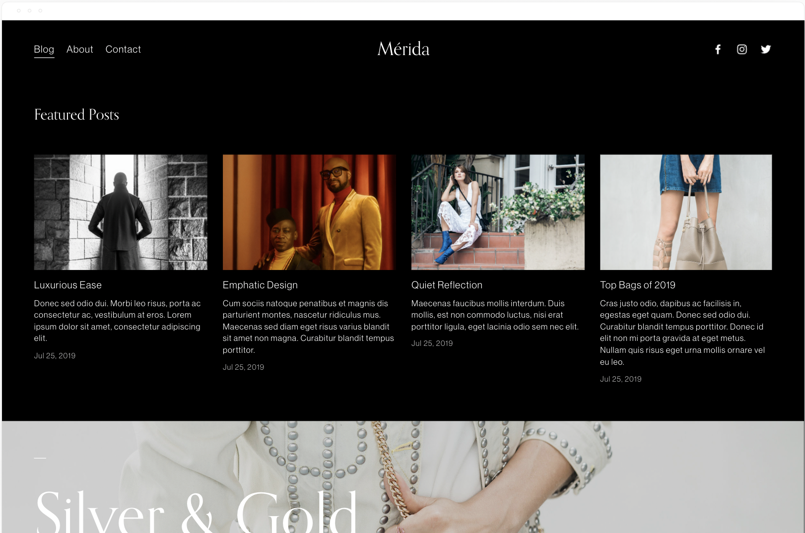
Rally is a popular magazine-style blog template from 7.0 based on the Brine template family. It starts with a summary block or recent or featured posts, followed by more summary blocks.
"Rally empowers your content, streamlining a lot of imagery and text in an alluring way. Its long, scrolling homepage engages visitors by letting you weave various blog post collections with full-bleed banner images." - Squarespace.
Merida has a similar homepage layout except with a masonry-style blog layout.
3. Skye / Vester

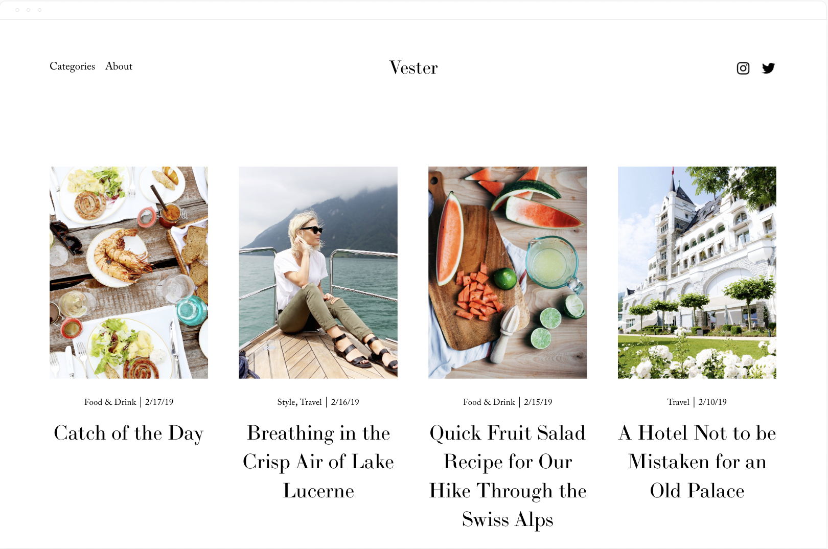
These templates have the exact same demo content. Skye is based on the same Layout template as Foundry. The best part of this template is the mobile style menu. To recreate that with Vester you need a forced mobile menu plugin from SqsMods.
The Skye family is designed with bloggers in mind. You have far more control over the way your blog home (list of your posts) and your individual blog posts pages look and function.
GET UP TO 30% OFF ALL Squarespace PLANS
no coupon code needed


Avenue and Nevins are both ideal for visual portfolio style sites. Photographers, videographers, artists, etc. The only difference between the 2 templates is Nevins’ bolder typography.
“A classic template with a timeless look, Avenue’s clean, straight lines and adaptive grid-based layout are especially popular with photographers, illustrators and designers. See for yourself why Avenue is preferred by so many of our customers.” - Squarespace
Click here for more photography style templates
5. Jasper / Beaumont
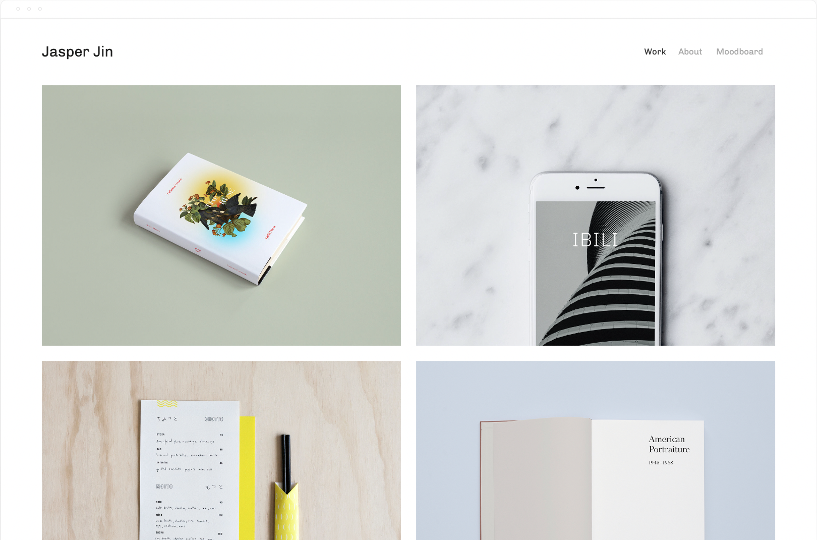

Jasper and Beaumont both have the same 2 column grid layout. Again, ideal for visual portfolios. Brand designers, artisans, photographers, videographers, etc.
“Showcase your work and engage potential clients with Jasper. This portfolio template creates an enticing visual summary of your projects with a dynamic grid-style homepage. Page animations, scaling fonts, and page headers display your work in a bold and immersive way. The special Project Pages arrange images, titles, and captions into elegant layouts, giving your visitors a story-driven experience.” - Squarespace
Click here for more portfolio templates
6. Wexley / Talva


Wexley is almost a 1:1 match with Talva. Both templates feature a portfolio home page, a blog, an about page, and a contact page.
"Wexley’s gallery layout adapts to the size of the images in your visual portfolio and to screen widths, making it perfect for artists, creative professionals and photographers who need a dynamic way to showcase everything." - Squarespace
Click here for more templates for artists
7. Native / Grove
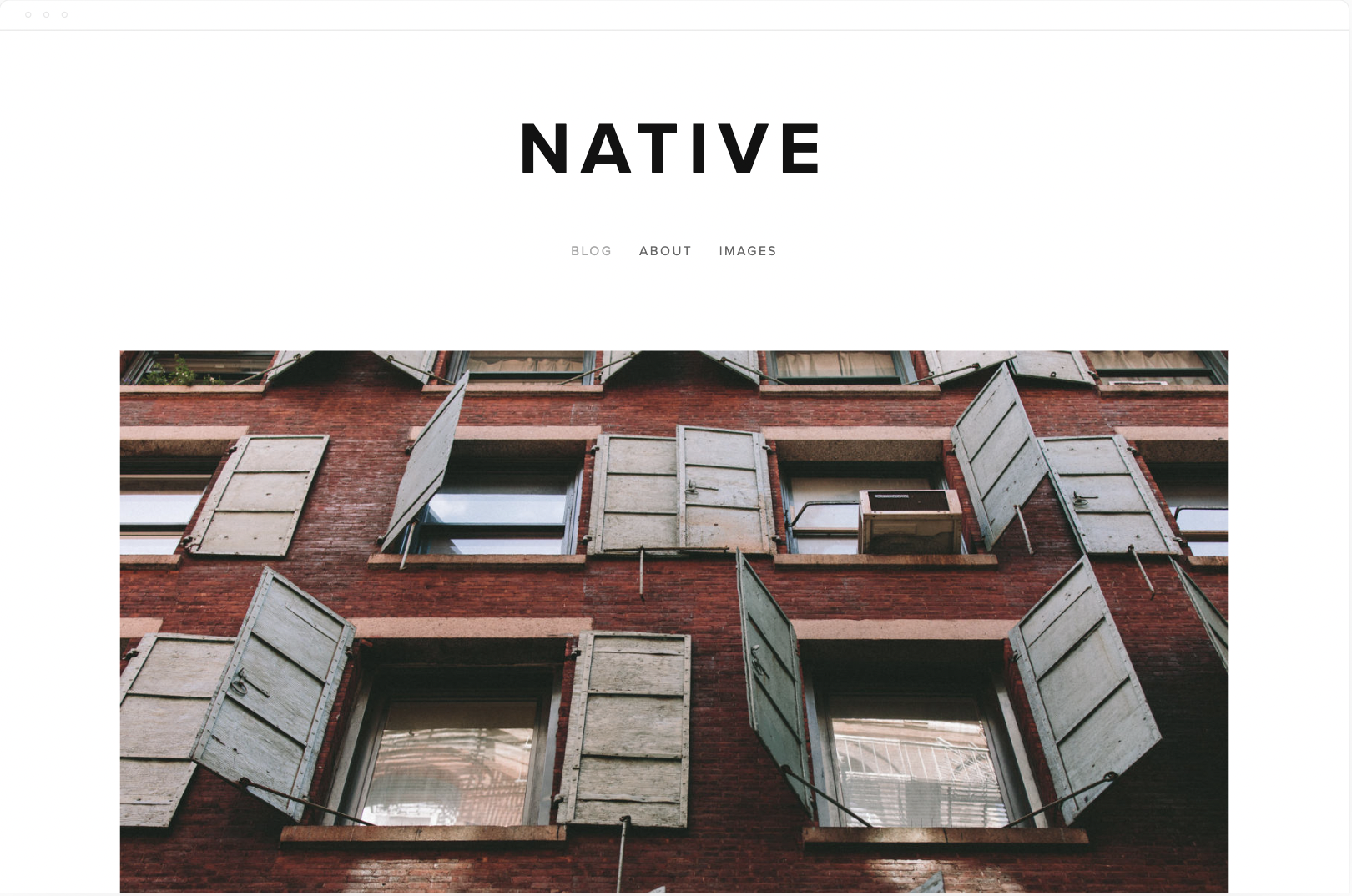
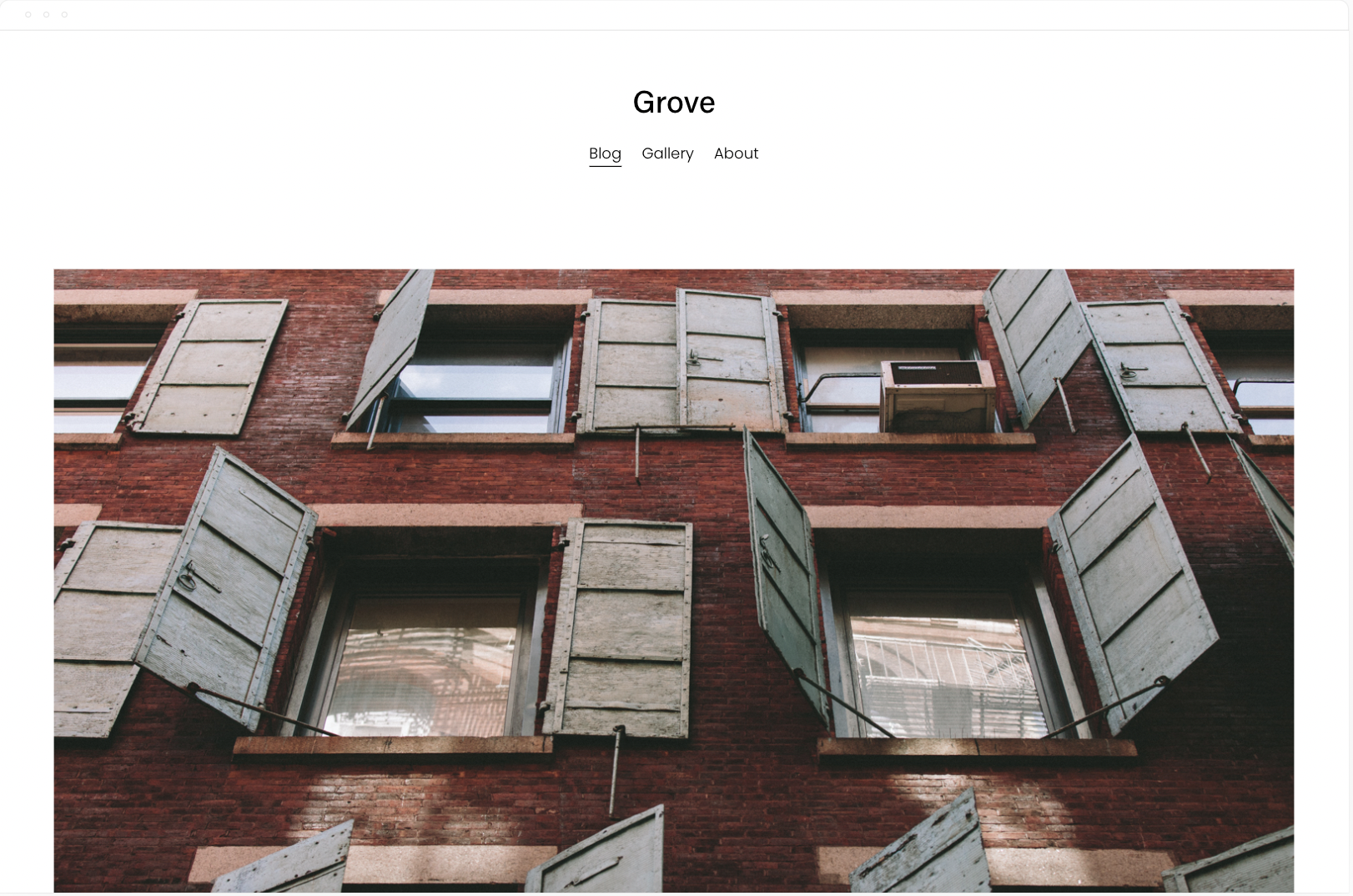
Native was the most minimal blog template on 7.0 and now it goes to grove. According to Squarespace it’s preferred by businesses and bloggers, Native is a versatile and modern template. The Native blog layout adapts to its content, promoting your most interesting media.
“Native is a versatile and modern template for blogs and businesses. The Native blog layout adapts to its content, promoting your most interesting media. Native is favored by businesses and bloggers for its flexibility and contemporary style.” - Squarespace
8. Mentor / Lusaka


The Squarespace Mentor template is a member of the Brine template family. Templates in the same family give you identical features and options but can help you create the look you are envisioning more quickly based on the foundational layout of each template.
The modern design of the Squarespace Mentor template drives action with its bold headers and powerful, full-width banners.
Click here for more nonprofit templates
9. Jones / Loam


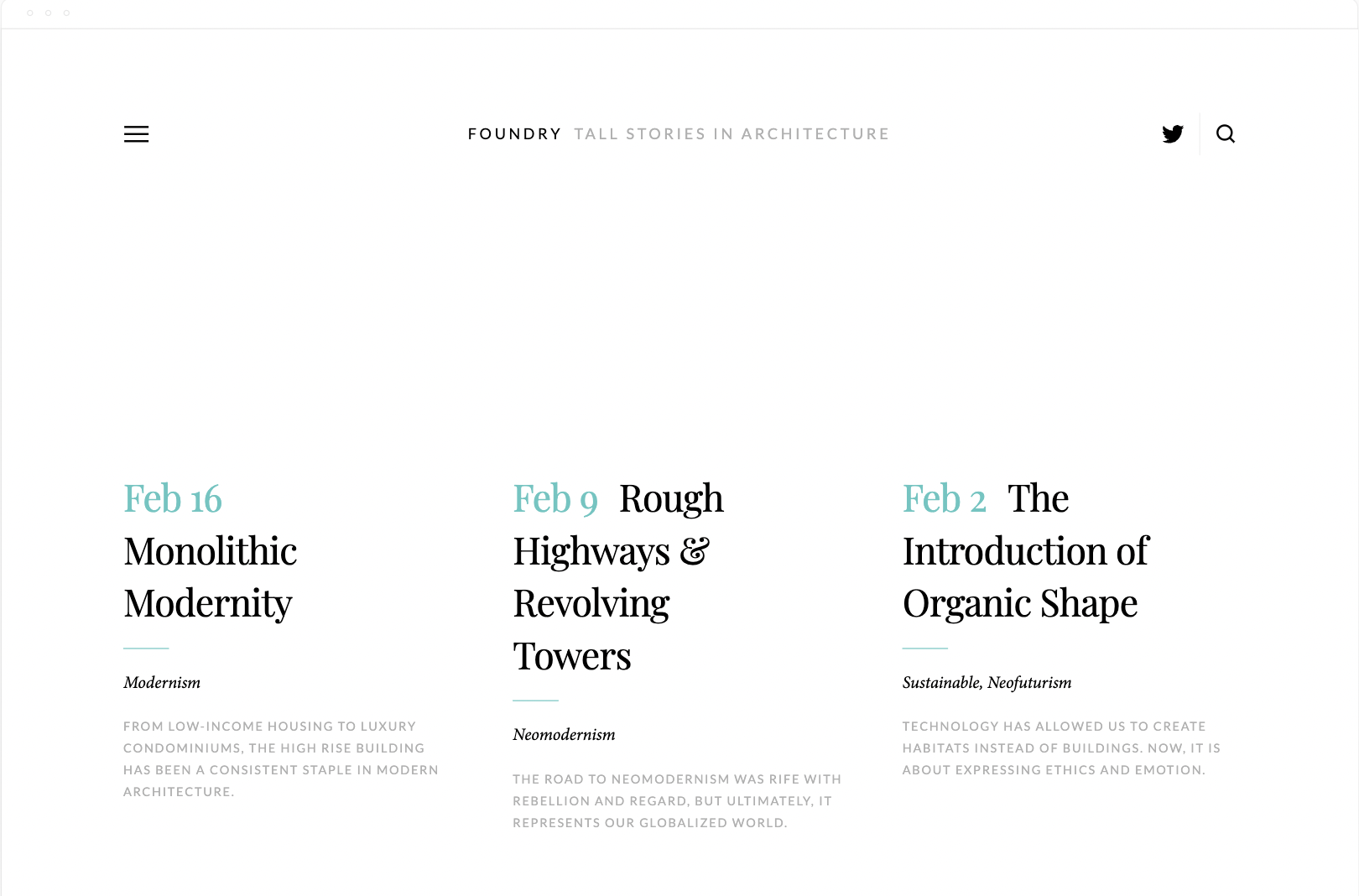
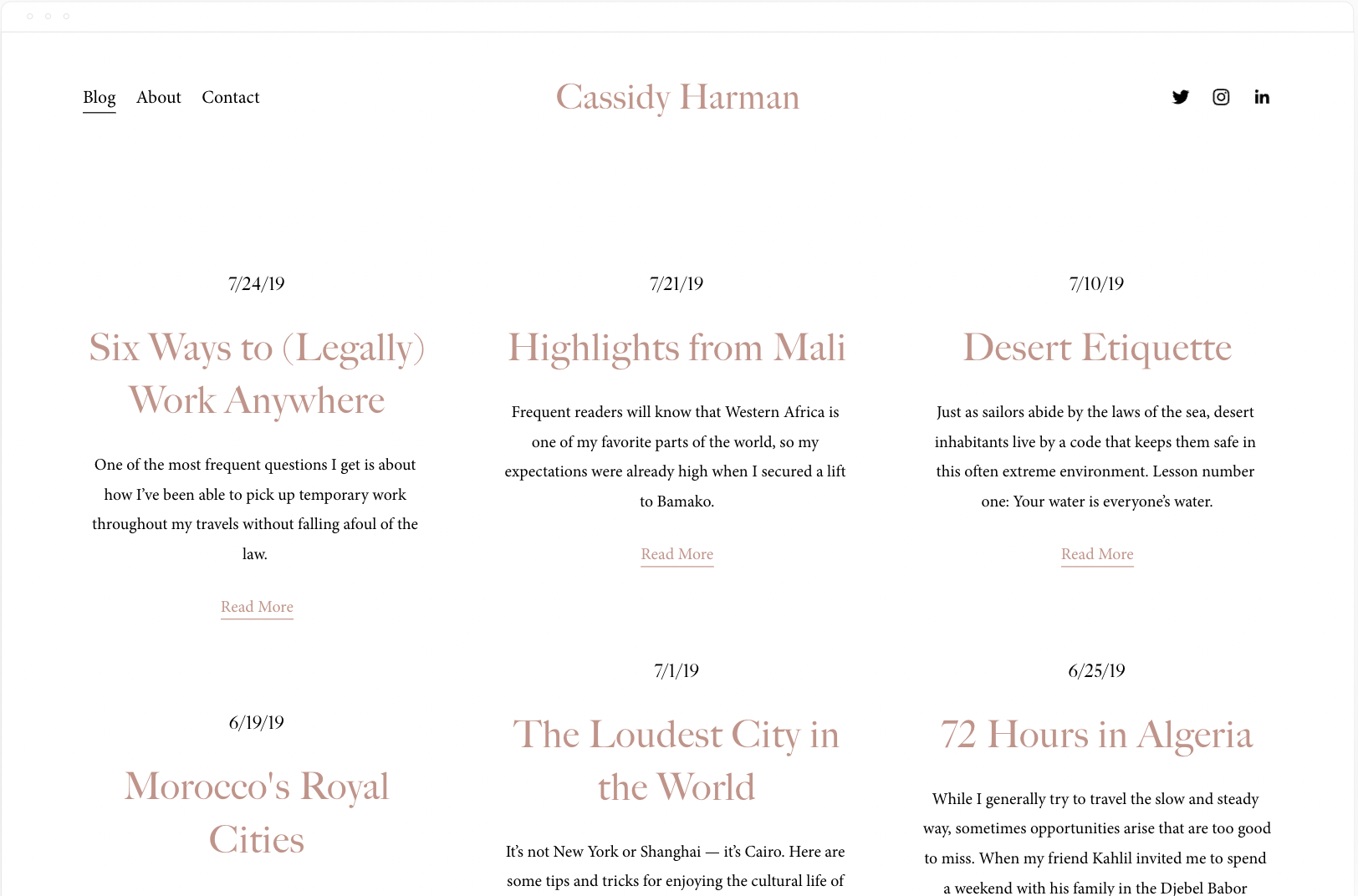
Foundry is based on the same Layout template as Skye. Harman is a simple and minimal blog template with a similar look and feel. The big difference and what I love most about Foundry is the Header and Menu design. The menu slides out and allows for extra content. This isn’t possible in 7.1 unless you use a slideout menu plugin.
12. Brine / Hester


Brine is one of the last most popular templates from 7.0. It has the most flexibility, especially with the header design.
Unfortunately the only thing Hester has in common is the pickle or brine themed product images. That said, they’re both ideal for an ecommerce store and only have 3 simple pages. A Shop, a blog, and an about. Oh, and Hester has a login for a Members Area.
13. Pedro (7.0) / Crosby (7.1)
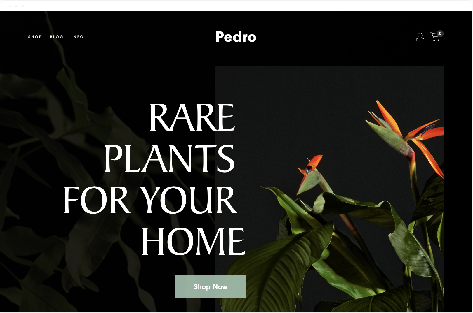

Pedro and Crosby both feature similar demo content. Both templates are designed with a plant or flower shop in mind, and the typography on Pedro is bolder.
Both templates feature a shop and a blog or journal in the navigation, and Crosby has a Story and Contact page, while Pedro has an info page.
As you scroll down the homepage on Pedro, you see moving gifs that lead to different categories on the shop page. There’s a scrolling parallax effect and a newsletter block to capture emails. The footer is what you’d expect for a brick-and-mortar store with location and socials.
Crosby has a more minimal homepage layout, highlights specific products, and features a newsletter block for emails.
14. Keene / Vance


The Keene template is based on a Dental Practice and features 4 primary pages. An about, services, an info page, and a contact page. The search icon in the header is useful if you have a hidden blog or some other searchable collection of content on the site. The homepage is bold with a full bleed background image.
The Vance homepage has a similar layout, minus the full-bleed background. The main difference is Vance Squarespace template is designed for restaurants that take reservations.
Both templates are simple and easy to tailor to a business that only needs 3 or 4 main pages.
Bonus. Cover Pages / One Pagers
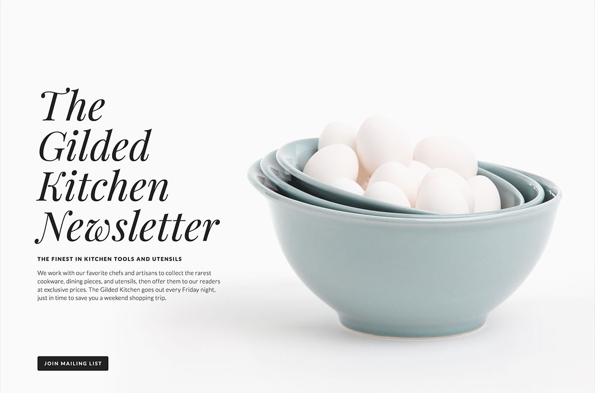

I love how cover pages have been reimagined in 7.1. It’s a shame you can’t mix and match them but maybe it’s in the works.
Want to create a cover page in 7.1? Start with a one page template. These are the 7.1 versions of cover pages.
Looking for more Templates?
Have you discovered amazing 7.1 equivalents to your favorite 7.0 templates? Share your findings in the comments below!
Squarespace Template FAQS
Is Brine still the best Squarespace template?
Brine is still the best Squarespace template from 7.0. All of the templates in 7.1 have the same functionality.
Do all Squarespace 7.1 templates have the same features?
Yes, the core functionality is the same across all 7.1 templates. The primary differences lie in their visual design, demo content, and some pre-built page layouts.
Can I customize my Squarespace template beyond the built-in settings?
Yes! 7.1's Fluid Engine gives you more design flexibility than ever before. With a little CSS knowledge, you can further tailor your template's appearance.
What if I used a lot of custom code on my 7.0 site?
Some custom code may need to be adjusted when switching to 7.1. Always take a backup of your site before upgrading, and test any custom code thoroughly.
How easy is it to upgrade from Squarespace 7.0 to 7.1?
The process is relatively smooth. Squarespace has guides available. However, consider the complexity of your website and any custom features when determining the amount of work involved.
Will upgrading from 7.0 to 7.1 impact my site's SEO?
There shouldn't be significant negative SEO impacts. However, reviewing your site structure and optimizing content after the upgrade is always good practice.
I'm new to Squarespace. How do I choose the right template?
Start by considering the purpose of your website (portfolio, blog, e-commerce, etc.). Browse templates that match this function and select the one whose style resonates most with you.
Can I switch templates in 7.1 after I've started building my site?

Our Favorite Squarespace CSS Codes in 2025

Want complete control over your Squarespace website's look? These CSS codes are your secret weapon! What if you want a design change that Squarespace doesn't offer in its settings, and you can't find the perfect plugin? That's where the CSS Editor comes in. Squarespace gives you the power to add your own custom code. This functionality opens up endless possibilities for adding unique elements, scripts, appearance tweaks, and more!
Want to learn CSS?
If you want to learn CSS for Squarespace, check out these courses.
Want to skip CSS with an Animation plugin?
There are 2 extensions that allow you to customize and style your site without touching any of the snippets below. SquareKicker and Spark Plugin.
Disclaimer
Before we begin, I have to lay down a bit of groundwork. Using the CSS Editor is a powerful tool, but it does come with a drawback: malformed code or improperly handled code can be detrimental to your site.

While you can change many elements of your site with CSS, Squarespace says explicitly, "You should only use CSS to change fonts, colors, and backgrounds. Other CSS changes could potentially harm your site."
That said, nothing prevents you from making other changes to your site. As long as your CSS code is implemented correctly, it won't hurt your site. There are just a few caveats.
If you're using a 7.0 Template and want to change templates, you'll need to reapply custom code; it doesn't transfer over. It does on 7.1.
Squarespace will not offer support or troubleshooting for custom code. If your CSS breaks something, they won't help you fix it.
Squarespace does not consider custom code when they update their platform. So, if they change a CSS class in their design and it breaks your code, well, you have to fix it yourself.
Custom CSS has a 128,000-character limit. This should be way, way more than you'll need, but it's worth keeping in mind if you're doing a ton of CSS customizations.
Finally, keep in mind that the custom CSS editor isn't the only way to make custom code edits to your site. There are several options, which may be a better fit for your use case.
Code Block (Basic): This is a content block that can execute custom CSS, HTML, or Markdown, for a specific page. Suitable for content-level or page-level changes. Available on all plans.
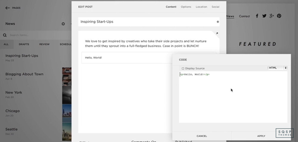
Code Block (Advanced): This is the same block, but it's also capable of adding iframes (not recommended for SEO reasons) and JavaScript. It's only available on Business and Commerce plans.

Code Injection: This option injects site-wide code, like the Facebook Tracking Pixel or a live chat service. Only available on Business and Commerce.
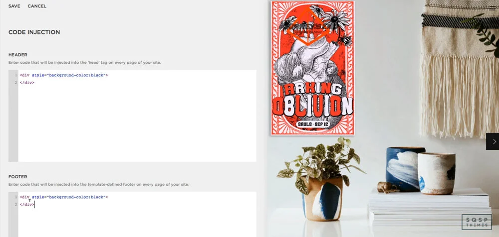
CSS Editor: This is the primary tool we'll be using today. Available on all plans, it allows you to add custom CSS to your site on a page level. Squarespace says not to make layout changes with it, but it's okay if you do it right. For a sleeker-looking CSS editor try Resurface.

Embed Block: This is a unique code block that executes embed code, so you can embed content from sites like Facebook, Instagram, and anything else that uses oEmbed. Available on all plans.

Squarespace Developer Platform: This tool makes significant changes to a template in 7.0 only. Only available in Business and Commerce, think of it as an advanced dev tool.

You're also wholly barred from running server-side code outside of the code injection feature, which is limited. You can't do any SQL, Ruby, PHP, or anything of the like.
Anyway, with all that said, let's dig into the cool things you can do with CSS! There's a lot, so stick around to explore.
Cool CSS Tweaks and Hacks
Sidebar Plugin
Starting with precisely what Squarespace says not to do, check out this sidebar option. It's formatted as a plugin, so you don't have to muck about with too much code directly. Instead, it changes the layout and formatting of your site to add a sidebar, which can display content like an author bio, a recent posts block, or a newsletter opt-in. It's very robust and super beneficial for marketing purposes, so check it out!

CTA Animations
Now this one is cool. Did you know that CSS – pure CSS, no other scripting involved – can make animations? There are some awesome things you can do with this. Many websites with parallax backgrounds and slide-in elements as you scroll use CSS for it, but that's not quite what I have for you here.

On a website, you've probably seen cases where an element wiggles on a timer every 30 seconds or so. A button will occasionally wobble, a call to action will bounce a bit, or a box will lightly flash. Years ago, you had to use animation with a .gif or (shudder) a Flash animation to do that. Today, you can do that with CSS.
Check out https://animate.style/. This site is a massive resource for CSS snippets for tiny little animations, like bounce, flash, pulse, swing, and wobble. There are dozens of them (two scroll bars to the right, if you can't access most of them), complete with demos and installation guides.
Now, this site is aimed at using CSS in any context, not specifically Squarespace. So you'll have to use the code injection feature to embed their core script and then use custom CSS elements to flag the elements you want animated. But it's pretty simple, so give it a try!
Simple Fade
This CSS technique is a straightforward tweak, and you've probably seen something like it before. When you hover over an element, such as an image or a menu button, colors will fade in. For pictures, it can be used to highlight them, add color over them, or fade them out a bit. For menu items, it's excellent for highlighting a background color to show users which item their cursor is on. It's easy, very lightweight, and a perfect upgrade for usability.
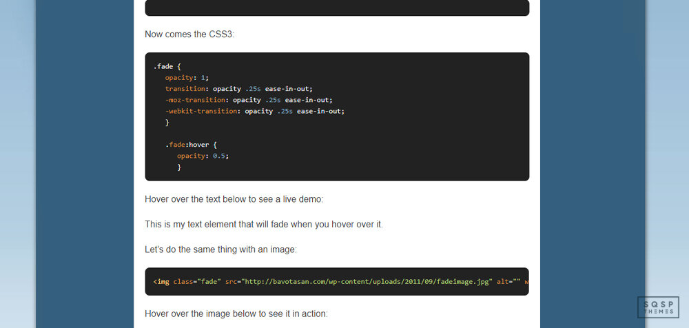
This page has code snippets for three different use cases: fading text, highlighting images, and backgrounds for menu items. Pick your use case, copy and paste the code, and you're good to go.
Color Gradients
If you're not aware, a gradient is when two colors fade into one another by passing through the shades in between. They're great for subtle color transitions and significant variances from one side of an element to another.

In the past, if you wanted something to be a gradient, you had to do a bunch of tricky work with an image manipulator to get the colors just how you liked it. Even then, if users were browsing your site with a larger or smaller screen than you designed for, things would look off and weird.
With CSS, you can implement a gradient that works. You specify the element, you select the colors, and the code does the rest.
"Doesn't it require a lot of tedium to pick and specify colors?" Not at all! It would - if you were doing it manually, but why would you ever need to do that? This generator is an excellent tool for precisely this purpose. It lets you pick anchor colors on either end, transition colors in the middle, and specify how far along the bar you want the transition. You can even click to add more anchor points for additional colors and make a whole rainbow.
You can do both linear and radial (circular) gradients, and you can specify exact hex color codes if you have colors as part of your branding. All of the code generates dynamically below the generator, so you can copy and paste it when you have it tweaked the way you want it.
Rounded Corners
This technique is another one of those elements that are deceptively simple. You wouldn't think it would be challenging to make rounded corners around an image or text element, would you? Yet, if you've ever tried to do it without weird custom code, it's nonsense! Back in the day, you even had to do things with perfectly aligned background images, tables with lined-up elements for borders, and other nonsense.

All of that is in the past now. CSS allows you to make easy, rounded corners for anything. Want rounded corners on an image? Want a rounded box to highlight a call to action? Want your lightbox to have rounded corners? It's easy with a bit of CSS.
This technique is just one of dozens of simple CSS tweaks you can do, provided by W3Schools. W3Schools is a web design organization that provides thousands of simple tutorials on everything from HTML to advanced CSS animation. This page details the rounded corners element, and you can browse all of the other CSS tweaks through the sidebar.
Hidden Elements
Now for one, that's a little more serious.
One issue that many sites have, Squarespace included, is mobile rendering using responsive design. Specifically, the site parses all of the code on the page and loads every element, adjusting what displays based on the viewport's size (aka your browser).
Hidden elements are usually fine. Except for one thing - what happens if you have, say, a sidebar with a couple of images in it? That sidebar isn't going to load on mobile because it would be way too cramped. But, since the site loads the content before determining what displays, you're still spending time loading the images in the sidebar. These resources delay the load speeds on your site.
If you check your Google PageSpeed Insights report and you see "defer offscreen images" as an error, this is what it's referencing.

The solution to this is usually lazy loading, but there's a new CSS element called content-visibility that helps with this. It's relatively new, and it's not supported by every browser just yet, but it's hugely valuable. Lazy loading is most likely going to get more support in the next few years. This page details the element, how it works, and how to use it. Check it out!
Simple Appearance Tweaks
There are a handful of tweaks on this page that do tiny little cosmetic things that, nevertheless, dramatically change the appearance of your site. What tweaks?
Remove the underline from links, which Squarespace adds by default.
Remove hyphens (-) from the text on the mobile display when text wraps.
Remove excess space at the bottom of a Brine-based template.
Narrow the column where your blog content displays.
Limit mobile product page displays to one product per row.
These are all relatively simple, minor tweaks, but they can completely change the feel of your site to make it much more modern and sleeker. It might not seem like much, but give them a try, and you'll see how important they are.
Other Compilations of CSS Hacks
I'm only scratching the surface of what you can do with CSS here. Already, several of the links up above are pages with dozens of CSS tweaks on them, but there are way more out there, including more advanced guides.

Here are a few you can check out.
HUGE LIST OF SQUARESPACE HACKS AND TWEAKS (WITH LINKS AND EXAMPLES). This page has everything from creating a summary block to hiding tags in blog posts. They aren't all CSS, but they're all clever and valuable regardless.
“50 Design Tweaks” from Five Design Co. As it says on the tin, this page has 50 different tweaks you can add to your site. These include adding hover animations and dropping shadows to making images circular, using custom bullet point designs. Almost all of them are simple CSS, too.
“35 Code Snippets” from Paige Brunton. This article is another extensive list of CSS hacks, including adding header styles, customizing your "read more" link, and dividing your backgrounds into two segments. Many of them are niche, but if you like the design options they give you, they're great.
With all of these resources, you should be able to do pretty much anything you can envision for your site.
So what's your favorite CSS hack from this list? Do you have any that you'd like to share that aren't mentioned on this list? Are you stuck on implementing any of these on your site? Let me know!
Looking for more Squarespace plugins?








Squarespace 7.1 vs. 7.0: Should You Upgrade?
So, you’ve been using Squarespace 7.0 for a while, and now you’re hearing about Squarespace 7.1 everywhere. Maybe you’re wondering:
Is Squarespace 7.1 worth it?
Will my site be faster if I switch?
What’s different? And more importantly—should I upgrade?
You’re not alone! I get these questions all the time, so let’s break it down in plain English—no tech jargon, no fluff.
When Was Squarespace 7.1 Released?
Squarespace 7.1 launched in January 2020, replacing 7.0 as the default version for all new sites. Since then, Squarespace has focused all new updates, features, and improvements on 7.1.
What does that mean for you?
Squarespace still supports 7.0, but it’s not getting any major new features. If you want the latest and greatest, 7.1 is where it’s at.
Is Squarespace 7.1 Worth It?
Alright, let’s get to the big question: Should you switch to 7.1?
Here’s the good and the not-so-good to help you decide.
What’s Better in Squarespace 7.1?
✅ Easier Design & No More Template Lock-In
In 7.0, choosing a template was a big decision—some had features others didn’t.
In 7.1, all templates work the same way, meaning you can change layouts freely without limitations.
It’s way more flexible and future-proof.
✅ Smoother & Faster Site Editing
7.1 introduced Fluid Engine (a more advanced drag-and-drop builder).
Page layouts are easier to adjust without code.
✅ Faster & More Mobile-Friendly
7.1 is optimized for better speed and responsiveness—especially on mobile.
Your site will likely load faster than on 7.0.
✅ New Features Keep Coming to 7.1
Squarespace 7.1 gets all new updates (animations, layout tools, etc.), while 7.0 is mostly left behind.
If you want access to future features, upgrading makes sense.
Reasons You Might Not Want to Upgrade
❌ You Can’t Switch Back
Once you move to 7.1, there’s no “undo” button—it’s a one-way trip.
❌ Some Features Are Missing or Different
No Blog Sidebars – If you rely on a sidebar for your blog, that’s not built into 7.1.
Gallery Blocks Work Differently – 7.1 handles image galleries differently than 7.0 (some people prefer the old way).
❌ You’ll Have to Rebuild Some Parts of Your Site
Upgrading isn’t a simple “click and done” process—you’ll need to reformat and tweak some things.
👉 Bottom line? If your 7.0 site is working great and you don’t need new features, you can stay put for now. But if you want more design freedom and long-term updates, moving to 7.1 is a smart move.
How Do I Switch to Squarespace 7.1?
There are two ways to upgrade your 7.0 site to 7.1:
Option 1: Use Squarespace’s Upgrade Tool (Best for Most People)
Squarespace recently introduced an upgrade tool to make the switch easier.
How it works:
1️⃣ Start the upgrade – In your site settings, choose to migrate your site to 7.1.
2️⃣ Preview & tweak – Squarespace will generate a 7.1 version of your site for you to adjust.
3️⃣ Go live – Once everything looks good, hit publish! Your old 7.0 site stays live until you’re ready.
✅ Pros: Saves time, moves most content automatically.
❌ Cons: You’ll still need to review and adjust layouts.

Option 2: Rebuild Your Site in 7.1 (Best if You Want a Fresh Start)
If your site is small or you were planning a redesign anyway, you can:
Start a brand-new Squarespace 7.1 site.
Manually copy content over.
Use new design tools to build from scratch.
✅ Pros: Full creative control, clean rebuild.
❌ Cons: More work upfront.
👉 Best approach? Try Squarespace’s upgrade tool first—if you don’t love how it looks, you can always rebuild from scratch instead.
Does Squarespace 7.1 Use Templates?
Yes—but not the way 7.0 did.
In Squarespace 7.0:
Different templates had different features, layouts, and quirks.
If you picked the wrong one, you had to switch templates (which often meant rebuilding pages).
In Squarespace 7.1:
All templates work the same—they’re just starting points for different looks.
You can fully customize any template without restrictions.
👉 Translation: You don’t need to stress about choosing the “right” template anymore—just pick a design you like and tweak it however you want.

Is Squarespace 7.1 Faster?
Yes, 7.1 is generally faster than 7.0.
The underlying code is more efficient, meaning pages load quicker.
It’s optimized for mobile—your site will perform better on smartphones.
However, your actual speed still depends on images, third-party scripts, and content—so keep those optimized.
Bottom line: If speed is a concern, 7.1 is the better long-term option.
Final Verdict: Should You Upgrade?
Here’s my take—if you’re happy with your 7.0 site and don’t feel limited, you can stay put for now.
BUT… if you want:
✅ More design flexibility
✅ Better performance
✅ Access to new features
✅ A future-proof site
👉 Then it’s time to switch to 7.1.
Since Squarespace 7.0 isn’t getting many updates anymore, you’ll likely have to switch at some point anyway—so why not get ahead of the curve?
If you do upgrade, use the built-in migration tool and give yourself time to adjust to the new setup.
Have any questions? Drop them in the comments—I’ve helped plenty of folks transition, and I’m happy to help you too! 🚀
That’s it! Hopefully, this helps you decide if Squarespace 7.1 is right for you. If you’re thinking about upgrading and need advice, drop a comment—I’d love to hear your thoughts! 🚀
✅ Squarespace 7.0 and 7.1 compatible • ✅ All templates supported • ✅ Mobile responsive
⚠️ Requires Squarespace Business Plan or higher for full functionality.
💡 Personal Plan users can use the alternative markdown method. See FAQ below.
Add a Lightbox Popup to Squarespace
Lightbox Anything lets you open custom content in a popup from buttons, images, text links, galleries, and more.
Use it for forms, videos, team bios, product details, portfolios, promos, gated content, upsells, galleries, and custom page sections — without sending visitors to another page.
Click to View Demo →
Want to see the setup process first?
▶️ Click to Watch Setup Video