
What’s worth knowing in the Squarespace world.
For designers, developers, and people building businesses around Squarespace.

Upgrade your Squarespace layouts using CSS Container Queries
CSS Media Queries already make Squarespace websites responsive, but there will frequently be times when you’ll need to make elements responsive to their containers, not just to the viewport. Thankfully, CSS Container Queries are now widely implemented in browsers, and there are ways to use them on Squarespace websites.
Since Ethan Marcotte coined the term, our primary tools for making products and websites “responsive” have been CSS Media Queries like this:
@media (min-width: 48rem) {

section {

display: grid; }

}
Media queries are global properties that target media types, including print or screen, orientation, height and width, and colour scheme preferences. Sometimes, you need to apply styles conditionally, for example, based on the width of an element’s container.

Container queries have been a feature that developers have wanted for a long time, and now you can apply conditional CSS based on an element’s container. Best of all, the syntax should already be familiar:
@container (min-width: 48rem) {
p {
font-size: 1rem; }
}
Implementing a product card
To demonstrate container queries, I designed a set of product cards which display an album’s cover image, title, release date, and rating.

Left: Cards without product details.
Right: Product cards using CSS Container Queries.
At this size, the cards appear narrow, so their content stacks vertically within a column.

Narrow cards and stacked content.
However, container queries enable the card’s content to adapt. So now, when arranging cards in a flexible grid, each one will adjust its content layout according to the available space, independent of the viewport size.

Wider cards with adjusted content layout using CSS Container Queries..
The HTML for these cards is straightforward, using multiple layout items, one for each card:
<div class="layout-item">

  <article class="card">…</article>

</div>


<div class="layout-item">…</div>

<div class="layout-item">…</div>

<div class="layout-item">…</div>

<div class="layout-item">…</div>

<div class="layout-item">…</div>

<div class="layout-item">…</div>

Each article contains two direct descendants: a card-figure image and the card-content division:

<article class="card">

  <figure class="card-figure"><img></figure>

  <div class="card-content">

    <h3>The Space War Chronicles</h3>

    <p>2025</p>

    <svg></svg>

    <button>…</button>

  </div>

</article>
I defined each layout item as a container using the container shorthand. This applies a name to the container plus the axis on which its content styles will be based:
.layout-item {

container: card / inline-size; }
CSS container queries work by defining a container, of which the characteristics will determine when styles are applied to its descendants. I set the container-type value on each layout item to inline-size, which commonly flows left–right, although I could also choose block-size, which typically flows top–bottom, or simply size.
I also added background-color and border-radius properties to each layout item plus Flexible Box (Flexbox) properties, which switch the card’s orientation from a vertical column to a horizontal row when the space inside a card changes:
.layout-item {
container: card / inline-size;
display: flex;
flex-direction: column;
padding: 15px;
border-radius: 10px;
background-color: rgba(0,0,0,.25); }
I gave each card Flexible Box properties, setting the initial flex-direction value to column so that its contents stack vertically. Then, I applied a flex value of 1 to share any available space equally between the card-figure image and card-content division:
.card {

display: flex;

flex-direction: column;

gap: 15px; }

.card-figure,

.card-content {

flex: 1; }
Finally, I used the container query to change a card’s flex-direction value from column to row when its minimum width exceeds 300px:
@container card (min-width: 300px) {

.card {

flex-direction: row;

align-items: center; }

}
As more space becomes available, a browser will rearrange the cards’ layout from a single content column to two columns.
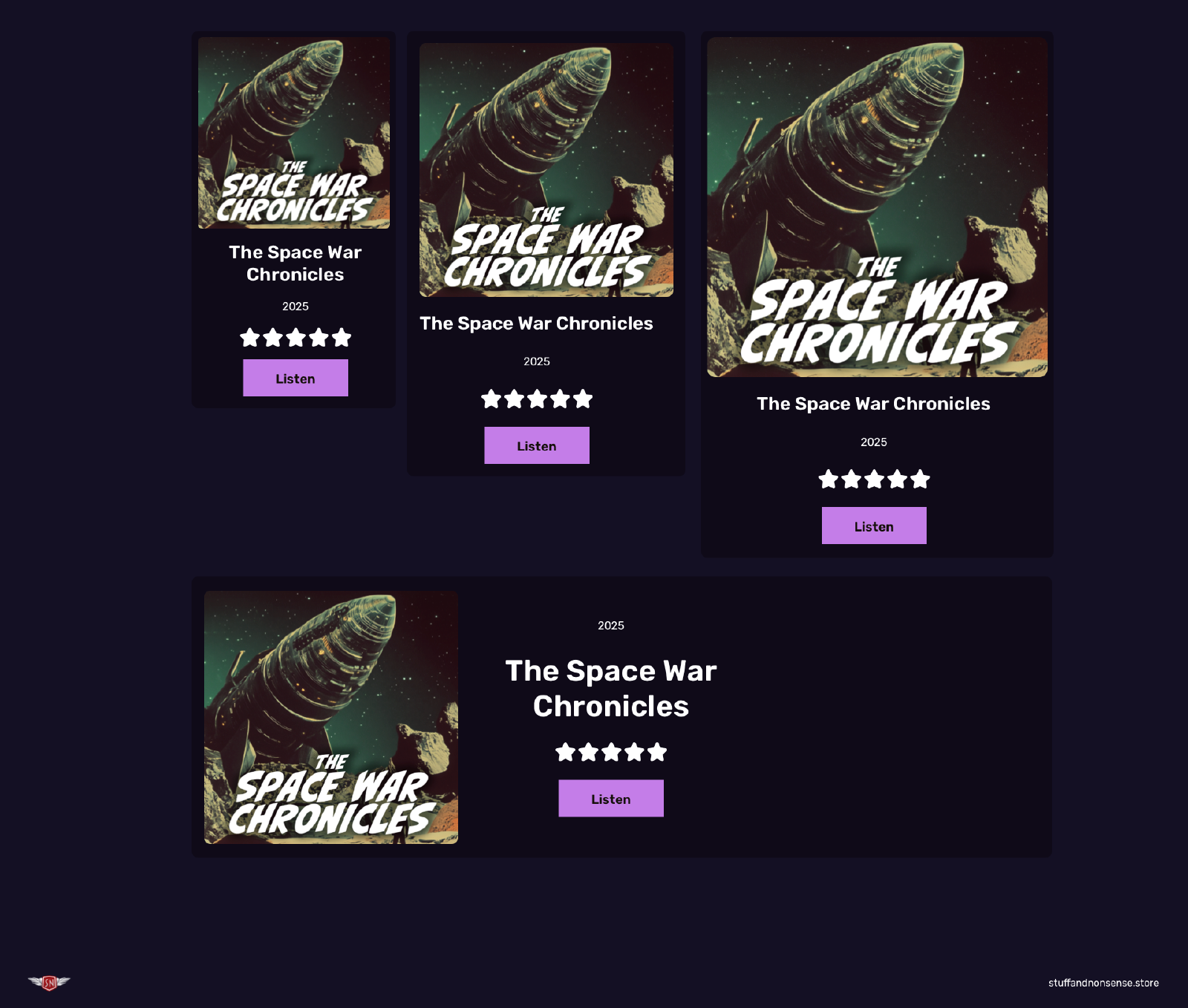
Product cards using CSS Container Queries.
Hint: You can see the effects of this container query on my demonstration page for this article.
Using CSS Container Queries in Squarespace
Container queries are a relatively recent addition to CSS, but all major browsers now support them solidly. I’ve found that the best way to integrate container queries into Squarespace websites to create new elements is by adding custom HTML into code blocks.

HTML for container queries inside a Squarespace code block.
You can either add your CSS to the code block, or—if an container query will be used multiple times across your Squarespace website, add their styles to your Custom CSS.

CSS for container queries in Custom CSS.
Have you tried using CSS Container Queries in your Squarespace websites? What other design elements do you think they can improve? Let me know in the comments or on social media.

Andy Clarke
Often referred to as one of the pioneers of web design, Andy Clarke has been instrumental in pushing the boundaries of web design and is known for his creative and visually stunning designs. His work has inspired countless designers to explore the full potential of product and website design.
Andy’s written several industry-leading books, including ‘Transcending CSS,’ ‘Hardboiled Web Design,’ and ‘Art Direction for the Web.’ He’s also worked with businesses of all sizes and industries to achieve their goals through design.
Visit Andy’s studio, Stuff & Nonsense, and check out his limited edition Premium templates for Squarespace.

Sendowl Review: 10 Reasons Why We Love It for Selling Digital Products
If you’ve ever Googled “How do I sell a PDF online?” or asked ChatGPT “What’s the easiest way to sell digital products?”, one of the top answers you’ll find is SendOwl.
I didn’t come across SendOwl because of ads or hype. I discovered it years ago while buying ebooks from PersonalityHacker.com. The checkout was fast, clean, and frictionless — exactly the kind of flow I wanted for my own customers.
In January 2018, after testing the pros and cons between Gumroad and SamCart, SendOwl won. It gave me the right balance of control, simplicity, and cost. Since then, we’ve run over $1M in sales through the platform — and I can confidently say, for digital products, it’s been a game-changer.
Here’s why.
Why We Switched to SendOwl
The short answer: control and conversions.
Squarespace Commerce was fine for physical goods, but when we started building a business around digital products — ebooks, templates, memberships — it quickly felt limiting.
SendOwl gave us:
A checkout experience that matched our brand.
More ways to increase revenue per customer.
Built-in marketing tools that would normally cost extra.
For us, that meant less friction, more sales, and more recurring revenue.
10 Features That Actually Make You More Money
1. Frictionless Checkout → Higher Conversions
When customers don’t have to fight through endless forms, they buy more. SendOwl’s 2-click lightbox checkout skips shipping details and distractions. We saw an immediate bump in completed orders the week we switched.
2. Custom Branding → Professional Trust
Redirects kill trust. SendOwl lets your checkout look and feel like your site. That seamless brand experience keeps customers from second-guessing their purchase.
3. One-Click Upsells → Bigger Orders
After checkout, SendOwl can instantly offer a related product. That one feature alone has added 20%+ to our average order value. It’s like finding money you didn’t know was there.
4. Cart Recovery → Saved Sales
Abandoned carts aren’t lost sales anymore. SendOwl automatically emails people who don’t finish checkout, giving them a nudge back. Those “second chances” put real revenue back in our account.
5. Email Integrations → Long-Term Value
SendOwl plugs right into ConvertKit, Mailchimp, and others. That means every customer gets tagged in your email system, ready for upsells, product launches, and future offers.
6. Affiliate Program → Other People Sell For You
Why hustle alone? SendOwl has built-in affiliate tracking so your customers, fans, and partners can promote your products — without needing another piece of software.
7. Product Bundles → Higher Perceived Value
Bundling makes digital products feel like a “deal.” We’ve packaged templates and guides together and watched average order value climb without extra effort.
8. Memberships & Subscriptions → Recurring Revenue
One-time buyers are fine. Subscribers are better. SendOwl makes it easy to sell memberships or subscriptions so income comes in every month like clockwork.
9. Automatic Product Updates → Better Experience
Digital products evolve. With SendOwl, when you update a file or template, customers get the new version automatically. That builds loyalty and repeat buyers.
10. Content Protection → Peace of Mind
Download limits, expiration dates, and content dripping protect your intellectual property. You can sell with confidence, knowing your work isn’t being passed around for free.
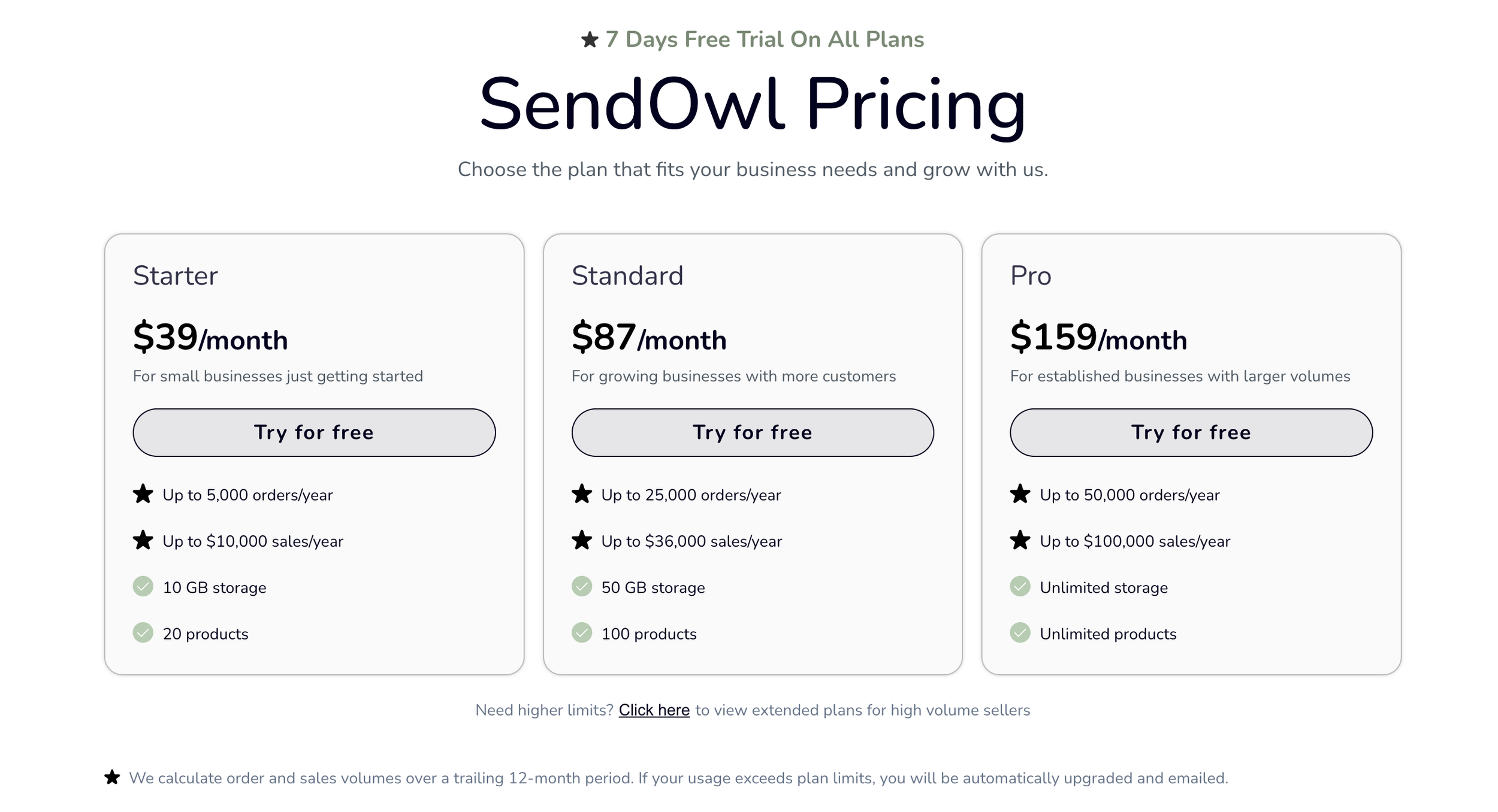
Using this and a Squarespace business plan combined should be under $50/mo - or about the cost of the advanced commerce plan.
How to integrate Sendowl with Squarespace
When you create a product in Sendowl you can use the checkout link to create your own buy buttons and product pages. Again very flexible.
Frequently Asked Questions (FAQs) About SendOwl
How does SendOwl work?
SendOwl is an easy-to-use digital sales platform. When a customer purchases a digital product, SendOwl automatically sends them a secure download link. Beyond delivery, it provides tools for marketing, analytics, upsells, and affiliate management — making it a complete sales solution.
Does SendOwl cost money?
Yes. SendOwl offers several pricing plans ranging from $9 to $39 per month, designed to suit businesses of different sizes and sales volumes.
Can I sell physical products on SendOwl?
Yes. While it’s built for digital products, SendOwl also supports physical product sales.
Are there restrictions on the types of files I can sell?
No. SendOwl supports a wide range of file formats including .doc, .exe, PDF, images, videos, and more.
Where is SendOwl based?
SendOwl was founded in London, UK, and operates globally.
Is SendOwl a payment gateway?
No. SendOwl is not a payment gateway itself. Instead, it integrates seamlessly with Stripe, PayPal, and other popular gateways to handle payment processing.
Does SendOwl have an app?
SendOwl does not have its own standalone app. However, it integrates with Shopify via a dedicated app in the Shopify App Store.
What fees does SendOwl charge?
SendOwl charges a fixed monthly subscription (no percentage cut of your sales). Your chosen payment gateway (Stripe or PayPal) will have its own transaction fees — for example, Stripe charges 2.9% + $0.30 per transaction in the US.
What is the file size limit on SendOwl?
You can upload files up to 1GB directly. For larger files, you can use FTP. To sell multiple files together, SendOwl’s Bundle feature makes it easy.
Final Verdict: Is SendOwl Worth It?
For us, absolutely. After testing Gumroad and SamCart, SendOwl won — and it’s been the backbone of our digital product sales ever since.
We’ve processed over a million dollars in revenue through it since 2018. If your business is built on digital products — ebooks, templates, courses, memberships — SendOwl gives you control, flexibility, and growth features at a fraction of the cost of other platforms.

5 Essential CSS Rules For Any Squarespace Website
From a CSS perspective, Squarespace covers almost everything. However, here are five CSS rules you should consider adding to your Squarespace Custom CSS boilerplate to enhance accessibility, text rendering, and user experience.

1) Scroll behavior
The scroll-behavior property defines whether a browser jumps instantly to a fragment identifier (ID) or scrolls to it smoothly when someone presses a link. There are two value options: auto and smooth. …
auto is the default and jumps instantly between elements
smooth is a transition between elements
html:focus-within {

scroll-behavior: smooth; }
2) Reduced motion
It’s essential we remember that not everyone wants to experience a website the same way. Some people think animations or transitions are slick and stylish, while others might find them annoying or distracting, so respecting their preferences is important. …
With these rules, smooth scrolling behaviour will revert to default, animation duration is reduced to a barely perceptible 1ms, and looping animations will stop after 1 iteration:
@media screen and (prefers-reduced-motion: reduce) {
html:focus-within {
scroll-behavior: auto;
animation-duration: 1ms !important;
animation-iteration-count: 1 !important;
transition-duration: 1ms !important; }
}
reduced-motion doesn’t mean there’ll be no motion at all; it just means animations and transitions are reduced for people who choose that option on their device.
3) Text rendering
CSS gives you the choice between text rendering quality or rendering speed or vice versa. There are four available values, but only two I regularly use: optimizeLegibility or optimizeSpeed. It’s important to know that optimizeSpeed disables a font’s kerning and ligatures which may be critical to a typographic design. …
body {

text-rendering: optimizeLegibility; }
Some browsers have implemented a font-smooth property with values including auto, always, and never. WebKit and Mozilla have implemented similar properties with the values auto, none, antialiased, and subpixel-antialiased. These are non-standard properties, and you should only use them for specific applications:
body {

-webkit-font-smoothing: auto;

-moz-osx-font-smoothing: auto;

font-smooth: auto; }
The font-feature-settings property controls typographic settings, including ligatures, numerals, small caps, and swashes. To activate properties, declare them in quotes followed by either 1 or on. To disable them, use either 0 or off. There are over 20 settings, but only five I use regularly:
frac: fractions
liga: standard ligatures
lnum: lining numerals
tnum: tabular numerals
zero: slashed zero
body {
font-feature-settings: "liga" 1, "tnum" 1; }
The hanging-punctuation CSS property defines whether punctuation sits inside a line box or outside in a margin, which looks better and is is the typographically correct position. …
body {
hanging-punctuation: first allow-end last; }
4) Scroll margin
scroll-margin-top adds extra margin above an element when it’s snap scrolled to, for example, by pressing a link to a fragment identifier (ID) above or below a link. …
[id] {

scroll-margin-top: 1.5rem; }
5) Wrapping text
The text-wrap CSS property is a shorthand for controlling how text wraps inside an element. Its values include balance, pretty, stable, nowrap, and wrap. With balance, a browser will calculate the number of words and divide them equally between multiple lines, instantly making headlines look better. …
h1, h2, h3, h4 {

text-wrap: balance; }
Hint: You can see the effects of these settings and more on my demonstration page for this article.
Adding CSS rules to Squarespace
Adding these five CSS rules to your Custom CSS boilerplate will instantly enhance the accessibility, text rendering, and user experience of your Squarespace website. You can copy the styles below or from my regularly updated Gist on GitHub.
Do you have different CSS rules in your Squarespace Custom CSS boilerplate? Let me know in the comments or on social media.
/*
5 essential CSS rules to add to any Squarespace website
Author: Andy Clarke
Studio: https://stuffandnonsense.co.uk
Template store: https://stuffandnonsense.store
*/

html:focus-within {
scroll-behavior: smooth; }

@media screen and (prefers-reduced-motion: reduce) {
html:focus-within {
scroll-behavior: auto;
animation-duration: 1ms !important;
animation-iteration-count: 1 !important;
transition-duration: 1ms !important; }

*, *::before, *::after {
animation-duration: 0.01ms !important;
animation-iteration-count: 1 !important;
transition-duration: 0.01ms !important;
scroll-behavior: auto !important; }
}

body {
min-height: 100vh;
font-feature-settings: "liga" 1, "tnum" 1;
hanging-punctuation: first allow-end last;
text-rendering: optimizeLegibility;
-webkit-font-smoothing: auto;
-moz-osx-font-smoothing: auto;
font-smooth: auto; }

[id] {
scroll-margin-top: var(--spacing-r); }

h1, h2, h3, h4 {
text-wrap: balance; }

Andy Clarke
Often referred to as one of the pioneers of web design, Andy Clarke has been instrumental in pushing the boundaries of web design and is known for his creative and visually stunning designs. His work has inspired countless designers to explore the full potential of product and website design.
Andy’s written several industry-leading books, including ‘Transcending CSS,’ ‘Hardboiled Web Design,’ and ‘Art Direction for the Web.’ He’s also worked with businesses of all sizes and industries to achieve their goals through design.
Visit Andy’s studio, Stuff & Nonsense, and check out his limited edition Premium templates for Squarespace.