
What’s worth knowing in the Squarespace world.
For designers, developers, and people building businesses around Squarespace.

How to Set Up Email Newsletter Campaigns on Squarespace Sites

Newsletters are among the best possible forms of marketing you can leverage as a website owner, small business, or blogger. Why?
Well, three reasons.
They’re entirely independent of other platforms. You don’t have to worry about Google’s algorithm dropping your site, Facebook’s algorithm only showing you to 7% of your audience, or any other third-party system getting in the way. Even if your mail manager drops you, you don’t lose your list and import it into another system.
The audience is guaranteed to be interested in you. No one signs up for your email list if they aren’t at least somewhat interested in your business, brand, product, or service. Thus, your mailing list is self-selected to be one of the warmest and most targeted audiences you can get.
They keep your audience warm. Even if your users aren’t opening your emails (which you can strive to fix), simply receiving emails from you reminds them you exist and keeps them thinking about you and the reason they signed up in the first place.
The trick is, you need to do a lot of work to get a newsletter up and running. You need to upgrade your site with opt-in forms, you need to deliver compelling offers, you need to make your newsletter attractive, and you need to manage a newsletter to show on your promises.
Don’t get me wrong, a lot of the work in setting up a newsletter only happens once. It’s a steep up-front cost, followed by a lot of maintenance and optimization. Once you have your opt-in forms up and running, all you need are a few simple tweaks to keep them relevant; you don’t have to go through the whole process again.
So, if you’re running a Squarespace site and you want to get a newsletter up and running, how can you do it?
Let’s dig in.
Managing a Newsletter
You first need to decide what system you want to use to manage your mailing list and newsletter. This is your choice of platform, similar to how you chose Squarespace to build your website. Your newsletter platform determines various essential factors. For example, how often or how many emails you can send in a month, or the maximum size of your mailing list, and the pricing for managing it. Or, as another example, what tools do you have access to when developing your newsletters themselves.

There are many different options out there, so I’m just going to list a few and let you explore yourself. You can always change later; your mailing list is your property, and you can export/import it at any time from any system.
Option 1: Squarespace.
First up, did you know that Squarespace has a built-in email manager? You can use specific content blocks in your website to gather email addresses and manage your list and your newsletter directly through Squarespace.

This strategy has a couple of advantages. First and foremost, since it’s Squarespace, it’s all managed in the same place you manage your website. No third-party logins or connections are required. The newsletter creation tools also function very similarly to your website creation tools, so you’ll instantly be familiar with them.
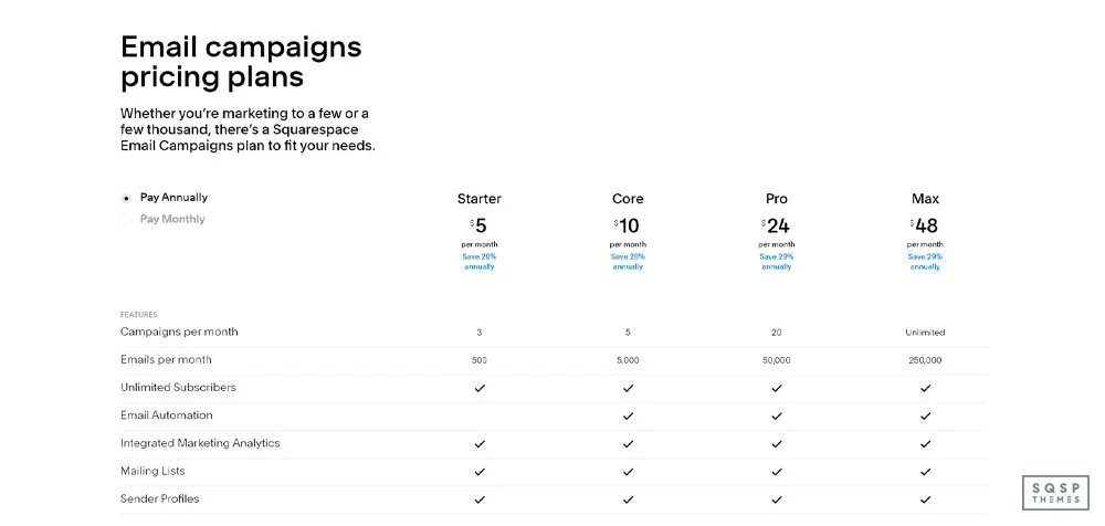
On the other hand, newsletters are a premium feature only available if you purchase an additional email campaign subscription. All paid Squarespace sites have access to a limited trial of email marketing, but if you want to use it seriously, you’ll need to pay that additional fee.
Option 2: Mailchimp.
In the section above, I mentioned that Squarespace has newsletter blocks. These are content blocks that include opt-ins for your mailing list. They’re critically important for building your mailing list. They also can be connected to systems other than just Squarespace Email. You have three options: Squarespace Email, Mailchimp, and Zapier. You can also choose to send email data to Google Drive for use in other systems.
For now, let’s talk about Mailchimp. Mailchimp is one of the most widely recommended beginner email campaign managers, and for a good reason. They have a wealth of features and advanced content available to anyone looking to manage email campaigns. They’re very flexible and have a ton of options. They even have a free plan you can use to try out their system!
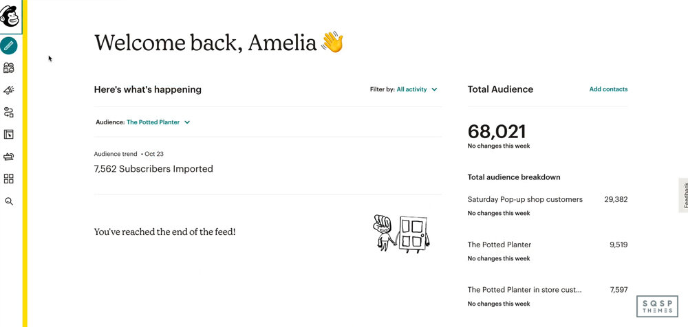
Since Squarespace blocks can link directly to Mailchimp, I like to recommend them as the go-to if you want email managed separately from your Squarespace account. It’s the easiest one to set up, anyways.
Option 3: Zapier Systems.
Zapier is an automation engine.
It’s a system that hooks up APIs that don’t directly connect, working as an intermediary. Using newsletter blocks, you can send data to Zapier, sending it to other email systems that Squarespace doesn’t natively support.

Through Zapier, you can send your email opt-ins to other email management systems, including ActiveCampaign, HubSpot, Constant Contact, and ConvertKit. There are well over 100 different systems you can link with Zapier, so you’ll have to explore them yourself if you want to know for sure.
Option 4: Other Systems.
Suppose you don’t like Zapier and don’t want to use Squarespace or Mailchimp to manage your emails. In that case, you can export data directly to Google Drive and import that data manually into any other system. It’s less automatic and more roundabout, but hey, some people prefer that.

Which option should you use?
Honestly, I say go with Squarespace to start. You can always change later, and Squarespace has the least hassle setting everything up.
What Is a Double Opt-In?
Something I need to touch on before we go too much further is the concept of a double opt-in.
Having your newsletter flagged as spam and automatically filtered by email systems like Outlook and Gmail is one of the worst things that can happen to a marketer. There’s a lot you can do to avoid that happening, but a double opt-in is one of the most important. As you might guess, there are both single opt-in and double opt-ins, so what’s the difference?

A single opt-in means that you have a form on your site that users can put their email address into.
When they do, they are automatically enrolled in your newsletter. It’s quick, easy, hassle-free, and you can deliver content to your audience member immediately. However, it also has no verification, which means you can flood your list with low-quality leads, spam, and users who didn’t use their email to sign up.
A double opt-in, as you might be able to guess, begins the same way. The user puts in their email address to sign up. However, before you can send them messages, you need to get confirmation. Your system sends a confirmation email, and the user signs in and clicks it, adding them to the list. This filters low-quality leads, spam, and typos. However, you have to deal with issues like users failing to confirm their address or the confirmation email being filtered as spam.
Studies generally show that a double opt-in is better for marketing, so that’s what I always recommend.
Setting Up Opt-In Forms
Just having a newsletter system set up does you no good if you don’t harvest emails. Whether it’s a slide-in or pop-up lightbox, or just a newsletter block embedded in your content, you need to have some way for users to give you their email address. That means you need to use forms on your site.

Squarespace has complete documentation for using their newsletter blocks here. This is going to be the bread and butter of your opt-in campaigns on Squarespace. You can use other forms, but none of them are as smooth as these.
You can also make your opt-ins more visually attractive by displaying them in unique ways. For example, if you use a lightbox plugin, you can show your opt-in in a lightbox pop-up. You can also use third-party opt-in forms using a code block. I recommend adding as many call-to-action boxes as you can reasonably support, testing which positions work best, and then pruning out the ones that get no attention.
How to Encourage More Opt-Ins
Once you have your back end set up and tested, you need to get people signing up. So, how do you encourage more sign-ups?

There are a lot of options.
Put your call to action in innovative places. In Squarespace, anywhere you can put a custom code block or a newsletter block is a place you can put a call to action. Mid-content, in a sidebar, in your announcement bar, on a landing page; these are all great options.
Don’t ask for too much. Some custom forms allow you to ask for a bunch of information like name, location, company name, and so on just to sign up. The more fields a user has to fill out, the less likely they will sign up at all.
Gather testimonials about your newsletter. Sometimes all it takes is one or two testimonials from prominent, recognized authority figures in your niche to convince people your newsletter is worthwhile.
Give something away. A coupon, a free trial, an e-book; you have many options for free items to give to people who sign up. Just be aware that this can result in people signing up for the product but never opening your newsletters down the road.
Advertise your newsletter elsewhere. Facebook, Twitter, your email signature, your business cards; anywhere you can showcase a link to a landing page designed to get email opt-ins, the better.
Enroll users who make a purchase. Whether you’re creating a user account or just asking for a contact email, anyone interested enough to make a purchase is interested enough to be on your mailing list.
You can use any of these techniques in conjunction with one another. When your primary goal is to get more sign-ups, it doesn’t matter if you’re coming at a user from all angles; something has to work.
How Often to Send Newsletters
Once you have a mailing list, you have to decide on two things. First, are you doing email blasts or automated campaigns? Second, how often do you send?
So, what’s the difference between a blast and a campaign? Well, a blast goes out to everyone on your mailing list at the same time.

An automated campaign is like a drip campaign that begins when the user signs up and sends at an interval custom to them.
My recommendation?
Use both. When a user signs up for the first time, start a drip campaign for a few weeks or months. When the drip campaign ends, transition them to your regularly scheduled blasts.
How often should you send blasts? That’s up to you. Some companies send them daily, and others do weekly; some even monthly or quarterly. There’s no correct answer here; it depends on how much content you share and how much value you want to deliver. You might find that more frequent emails end up opened more often because people are constantly aware of you and your content. You might find that less frequent messages work better because they’re guaranteed to have more value per message. You need to test to be sure.
Newsletter Housekeeping
A mailing list isn’t fire-and-forget. You need to maintain it, which means taking steps to ensure that you only send messages to people who want them.
The biggest tool you have in your arsenal is seeing when users open your email through mail tracking. Most email systems offer this. When you notice that a user is failing to open any of your messages, you can move them to a triage list. The triage list receives a “hey, we noticed you aren’t opening our messages” email.
Users who open that message can be moved back to your mail list; those who do not can stay on the triage list for 1-2 more attempts before being removed from your list entirely.

The more people who archive/delete/mark your messages as spam without opening them, the more likely systems like Google will start to flag your domain as a spam domain and filter your messages. Avoid this situation as much as you can.
Another thing to watch for is bounced emails. Sometimes an email address is broken, is fake, or is deleted, which causes messages sent to the address to fail.
Remove those emails from your list.
Pruning your list improves your email metrics and helps you reach your audience more accurately.
Overall, the maintenance and growth phase is easy and straightforward, just time-consuming and ongoing. Still, when you realize how many additional sales you get from users on your mailing list, you’ll wonder why you didn’t start one sooner.

A Guide to Social Proof and Trust Badges on Squarespace

When someone lands on your website, how do they know they can trust you? Conversely, when you land on a website, how do you know that you can trust it?
We all know the big retailers and brands. We know that if we purchase from Amazon, or Nike, or Disney, we're going to get what we paid for. There may be issues relating to shipping or the quality of the product, but that's not an issue with trusting the website; it's just the nature of the product.
What about a small business running a website on Squarespace? How do you know whether or not to trust the site? What do you look for?
In general, there are four categories of "things to look for" on a website that indicate it can or cannot be trusted. These are:
Design and structure elements that indicate trust.
User interaction elements that indicate trust.
Trust seals and badges that provide trust from a verified third party.
Statements that proclaim the site is trustworthy.
They can be subtle, or they can be overt. They can be minor elements that only appear on landing or checkout pages or elements at the forefront of the homepage. And, in some cases, they can even backfire. If you say "don't worry, you can trust me" a few too many times; people start to wonder why you're so aggressive about saying it.
These site elements are called social proof. They're ways you inform your audience, via your site design and content, that your brand is trustworthy. Since the internet is packed full of people operating sites, and many of those people are doing it to scam others out of money, it's a minefield. It's no wonder that central authorities like Amazon, eBay, and Etsy have taken over so much commerce; they provide protections, verification, and trust. Of course, the tide is turning, and public opinion on sites like Amazon is shifting away and back to small sellers, but that's just the ebb and flow of commerce.
So, here's our situation.
You're a small business owner, an individual freelancer, or another seller online. You have a Squarespace website (excellent!), and you want it to be more trustworthy, so users feel more confident in shopping with you. How can you do it?
The answer is to implement social proof. The only question is how. Let's go through each of the four categories and cover what you can do to implement them.
Category 1: Design and Structure
Have you ever visited a site, and you've just felt that it was super shady? Sure you have. Who hasn't?
You probably just left, though, rather than looked into why you felt like that. What it comes down to is a combination of a shady offer and the design of the site. It's like spam email; you know an email is a spam message when it's full of typos, filter-avoiding symbol replacements, and too-good-to-be-true claims.

You can boost how trustworthy your site looks and feels with structural and design elements for a website.
A graphical logo. This one is important on Squarespace. The default Squarespace site lets you use a textual element for your "logo," but many sites appear less trustworthy when they don't have a graphical image as a logo. It doesn't necessarily matter how unique the logo is – a simple circled letter or name in a box (like mine) is enough – but it's better than a plaintext brand name up in the corner.
Why? Well, it's one of many signs you'll see on this list of "effort put into the site." Most scam sites online are created with the barest minimum of effort and expense.
The more energy, time, and money it takes to launch a scam site, the worse the returns will be for the scammer, right? So by putting effort into things, you show that you're concerned about something other than profit. A clean and well-built site is one of the most important trust signals.

A robust and modern design
This tip follows from the previous statement. While it's relatively easy to get an excellent, sleek design on Squarespace, having a customized website with care put into it is so much better. For example, using plugins to expand functionality, using a customized theme instead of one of the defaults, and generally customizing the design of your site to be unique are all core signs of trust.

A custom domain name. Using a .squarespace.com URL, or a .blogger.com or .typepad.com or whatever other free services you find is a sign that minimal effort or time is being put into the site.
It's okay for personal blogs, but for a business? If you're not even willing to pay the $15 a year it costs to register a domain name for your brand, how can your customers expect you to provide quality products or services?
Luckily, Squarespace makes it easy to link up a domain name.

SSL implementation
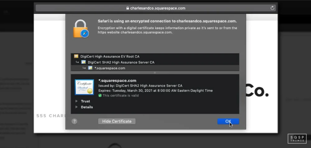
Many different forces are interacting to make SSL a necessity these days. The prevalence of hackers sniffing for data, the increasing concerns about privacy and tracking, the prominence of the green lock in browser windows; all combine to make people more aware of secure websites than ever. Using SSL is just enough of a bar for spammers (and still prevents third parties from stealing your data even if a scammer is on the other end) that it's essential to implement.
Integration with trustworthy services.
This one is a bit more nebulous, and not everyone can do it, but let's say you have an app for sale. If you have buttons that link to the Google Play store and the Apple App store, that's a pretty good sign that you're at least somewhat trustworthy since those services have heavy review processes and are trusted installers for devices. If you link to a raw .apk file, it's much less trustworthy.

Availability of contact information
Another source of trust, and one that users may consciously look for rather than subconsciously note, is how easy it is to contact you if they have a question or an issue. They might look for an About Us page, a privacy policy page, or a contact page.

They might check to see if you have a physical address or just an email address, if you have a phone number, or if you have identifiable information they can use to reach you. You can also implement something like a live chat plugin, which your customers can use to contact you directly. These are resources that your customers will look for as soon as they land on your website.
Category 2: User Interaction
The second category is user interaction signs. These are visible signs that people other than just you are using the site successfully.
Studies have shown that 92% of people will trust a recommendation from a peer, and 70% of people trust recommendations from people they don't even know. That's a pretty powerful incentive to add in user-generated social proof!
There are a few ways you can do this.

Testimonials
Asking for and receiving positive recommendations from your customers in a format you can use (with their name and attribution) is a great way to boost a site's credibility, especially if you have customers who are themselves noteworthy in some way. If I got a shoutout from the CEO of Squarespace, that'd be excellent social proof for me.
Reviews
Typically on product pages rather than dedicated testimonial pages or homepages, reviews are real customers' honest thoughts and experiences. It can sometimes be a pain to solicit these, but they're valuable when you have them.
Company features
You may have seen brands with lists of logos, typically news agencies and industry blogs, where they've been mentioned, linked to, or featured. Big, authoritative sites usually don't recommend scam sites, so this is another form of social proof.
Activity
Plugins like this one create a little pop-up in the corner showing other customers are actively buying what you have for sale. They cheat a little bit (showing within a given period, so it's not precisely real-time), but they're still a useful little tool. As a bonus, this can trigger FOMO (the fear of missing out) and get people on the fence to convert before a time-limited offer or quantity-limited product is gone.

Other signs of user interaction can be beneficial, though in a more roundabout way. For example, you're probably running a blog for your site (and if you're not, you should be), and you likely have a comments section.
If your blog posts are getting comments, even if it's only a few of them on each post, that's a sign that users like and trust you. Just make sure the comments are genuine and are not spam!
Category 3: Trust Badges and Seals
Trust badges and trust seals are tiny graphics you can display on your site showing that you've been verified as trustworthy by a third-party service. A restaurant lists its health department inspection certificate, for example.

On a website, you'll see trust seals from sites like:
BBB: Better Business Bureau accredited business.
Google Verified Customer Reviews
Amazon Best Seller
VeriSign
McAfee Secure
PayPal Verified
TRUSTe Certified
There are dozens if not hundreds of sites that provide these badges. Unfortunately, it's pretty easy to go overboard here in two ways.
The first is by using a third-party service that is not trustworthy. After all, if your only trust seal comes from a company you can pay $5 to get a trust seal from with no review or further inspection – or from a company that no one has ever heard of – it's not a verification. It would be like if I went around and started "inspecting" restaurants and giving them seals of approval. I'm not even a food blogger; my inspection holds no weight. Why would anyone trust me?
The other is by using too many trust seals. Less is more here. You want, at most, four or five badges in strategically placed spots. A PayPal verification and an Amazon Payments verification both on your checkout page are acceptable. A few trust seals on landing pages around an opt-in form are also good. Are you plastering 20+ seals all over your product pages?
That's just going to make anyone skeptical.
There's also the idea that many of these trust seals are embedded images from those third-party sites.
If you don't have an account and verify with the site, they'll take down your image, either by removing your ability to link the picture or filing a DMCA. Of course, that's only worthwhile if the user knows that they should check the image source.
Unfortunately, trust seals, in general, aren't all that valuable. You can use a couple of them, but make sure the issuing authority is trustworthy and doesn't go overboard with it.
Category 4: Statements and Claims
The final form of social proof is the claims you make. Your homepage might say, "Trusted by over 100,000 customers worldwide!" Your product page might have "10,000 verified items sold."
These kinds of claims tell the user what scale of operation they're dealing with.

There are, unfortunately, two problems with this.
The first is that the scale matters. If you're a small business and have fewer than 100 customers, proudly proclaiming "90+ customers served!" isn't going to inspire much trust. This is why many social sharing button plugins would hire the number of shares a post has until it reaches a certain threshold.
The second problem is that, well, there's no verification of this. I could say I have over a million customers, and how would you be able to prove otherwise? Your claims need to be true, accurate, and realistic for your brand's prevalence and exposure. It helps to have third-party verification in the form of mentions and reviews from a wide range of other sites, but that's a whole other issue.
Building Trust
Trust is hard-won and easily lost, so doing everything you can to build up the signs of trust is a good idea, and sooner rather than later. The order of categories above is, roughly, the best way to go about it.

Start with structural, design, and user-based signs of trust, and grow from there. Trust seals can be good when you're starting, but they outlive their usefulness outside of the checkout process, and even then, a good SSL certificate is just as comforting for many people.

5 Ways to Format Your Logo on Your Squarespace Website

You’ve decided on a site name and a brand name. You’ve picked a template for your Squarespace site. You’ve tweaked it to look exactly the way you want it. There’s just one thing left; a logo!
A logo is a key part of modern branding. There’s evidence that Google prefers sites that use graphical logos over sites with simple text. Squarespace allows you to use a text site title just fine, but there’s a place for a logo, and it’s almost always a good idea to get one up and running.
Don’t worry too much about picking a final logo right away. As a small site, you have the luxury of being able to change as you grow. A company like Pepsi or Home Depot needs to make a big deal about changing its logo. A small brand can pick a logo and, if it doesn’t fit the brand in a year, change it without issue.
My point is this: get a logo up and running! Make one that looks decent and works as a placeholder, that you’re not upset at using, and call it good enough. You can invest in a better one later if you want, but for now, a basic logo is better than nothing.
Squarespace has some quirks and interesting features of its logo system that are worth knowing. Formatting a logo properly, for different forms and positions, is crucial. Sure, you can just put up a square JPG file and call it good, but there’s a better way.
General Logo Formatting
First of all, it’s worth knowing that your site logo takes the place of your textual site header. When you type in the name of your site, that appears under your site title. However, you need to make sure to specify your site title anyway. This is because your site title is what the image uses as alt text when you upload it. Alt-text is hugely important for SEO and accessibility, so you don’t want something as important as your logo to lack it.

Another important note is that, on Squarespace, your logo will always link back to your homepage by default. Now, 99.999% of the time, that’s what you want it to do. Virtually every site on the internet makes their logo link back to their homepage, it’s just a standardized part of the internet these days. However, if you wanted to do gimmicks with your logo or make it link to other pages on specific holidays or something, you have to do it with custom code.

Larger is generally better for the image you use for your logo. However, that doesn’t mean you can upload a 100,000x100,000 pixel file as a logo. Squarespace will scale your image file to fit the display area it is given in your site template. This varies depending on your template on version 7.0 but is standardized across templates on 7.1.

An image that is too small will scale up, and that can make it appear pixelated. Conversely, a larger image will be scaled down. For simple, clean logos, this is fine. For complex images, you can lose some detail. Make sure your logo looks good at different scales!
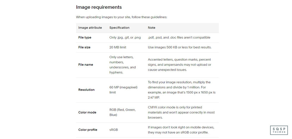
Squarespace has some general requirements for images, including those used in logos.
Only JPG, PNG, and GIF files are allowed. You can’t use things like PDF, DOC, or PSD files.
Your image cannot be larger than 20 MB. However, since site speed is a search ranking factor and images are often the slowest part of a site, you should try to keep your files under 500kb. Consider using an image optimization tool to smush down an image while keeping the quality.
File names for images can only use letters, numbers, underscores, and hyphens. You can’t use symbols like “?”, “&”, or “%”, and you can’t use accented characters, due to how the code on the back end works.
Available resolutions are super high; 60 megapixels. Your logo will probably not be even a single megapixel, so this shouldn’t be an issue. This is of more concern for general images uploaded to your blog and product pages.
The color mode for images is RGB. CMYK images are generally for print, and won’t display properly on a browser without optimization.
The ideal color profile is sRGB. If you don’t know what that means, don’t worry about it; just about every image manipulation app you’ll use for your logo will export properly.
Transparent backgrounds are allowed (so you don’t have to match colors to your site background color), but you need to use a PNG file to save with transparency.
I have a bunch of details, quirks, and exceptions to go over later in this post, but for the most part, this is all you’ll need to worry about.
Creating a Logo Image
Creating your logo is a daunting task, especially if you’re not a graphic designer. Luckily, it’s not actually all that difficult.

While you can use Photoshop or your favorite image editor to produce an image, you can also just use Squarespace Logo. Squarespace Logo is an online tool Squarespace offers, that lets you make a logo out of nothing. You type in your brand name, your tagline, and choose a symbol to add. Positions, fonts, colors; you can choose all of that for each element. The symbol library looks small at first glance, but type anything you want in the search bar and dozens more will show up.
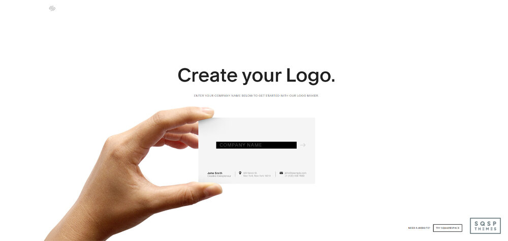
If you find Squarespace’s generator to be a little simplistic or lacking in the design you want – or if you want something more AI-generated, or more custom – you can use a different logo maker. There are a lot of different services out there that allow you to put in a brand name, some keywords, and some other details, and will generate a huge pile of logos you can pick through.

And, of course, there’s always the option to use a service like Canva to create one from scratch with a larger library of custom elements.
Site Header Logo Picture
Adding your logo image is easy. Once you have an appropriate file chosen, you can follow these steps depending on your site version and your platform.
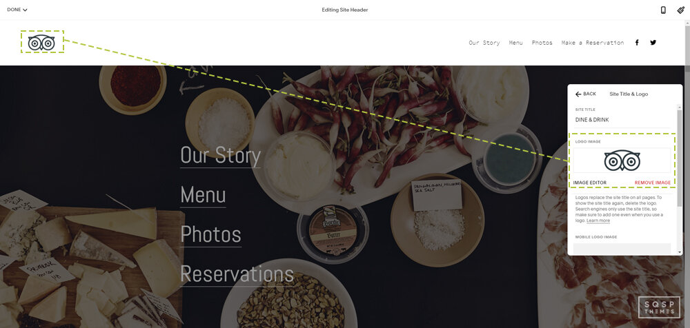
For 7.1 on a computer, click Edit, then hover over the header and click Edit Site Header. Click “Site Title & Logo”, make sure the text is specified, and then drag-and-drop your logo image into the image box. Alternatively, click the box and choose the file. You can scroll down and change the image height for responsive screens. Make sure to save.
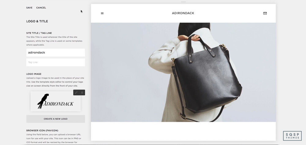
For 7.0 on a computer, hover over your logo on any page and click edit. Alternatively, go to the home menu, click design, and then logo & title. Upload your image, and save it.
For either, using the Squarespace App, tap settings, then logo & title. Tap the logo, then upload your image. Tap back, then save.
Your logo will change in appearance and layout depending on your template. Every 7.0 template has a different way to display the logo, and a different method for changing it, if you can change it at all. For example:
Avenue – Logo can display left, center, or right. You can change this using the Layout Style tweak.
Bedford – The logo only displays on the left and cannot be changed.
Momentum – The logo is on the left, but can be above or below the navigation bar. Use the Navigation Position tweak to change this.
You can read the differences for each set of templates here.
Logo Size Options
When you initially upload a logo to your site, it may be dramatically off in how big you want it to display. Now, you can go in and edit the image so it’s exactly the right size to fit the space. Unfortunately, this means you’ll need a bunch of different logo files for different display modes, and since you can only upload one logo, it doesn’t quite work out. Luckily, Squarespace allows you to set the size.
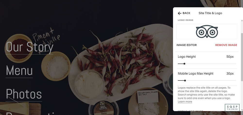
Go into your style editor, and find the section for your logo image size. It’s under the Header Branding section. You have to specify the width of your logo, and the height will be generated based on the dimensions of the image you uploaded. It won’t skew the image, so don’t worry about that. Just keep in mind that images that are too tall will stretch out your page.

If you don’t mind your image skewing, or you want to set a maximum height just to make sure, there are some CSS tweaks you can make. You need to find the CSS image class for your template, so go to your site and right-click on your logo, then inspect the element. You should be taken right to it. Then you can paste in some relevant CSS in your site code, following the instructions on this page.
Logo size is really easy to edit on a 7.1 site. Just go into your site header editor and specify the dimensions there. Boom, you’re done!
Logo Text Options
If you don’t upload an image, you get text styled to match your site design, in place of a logo. If you upload an image, you get the image, but the text becomes alt text. What happens, then, if you want a logo with text, something like TinySeed or BeAligned?
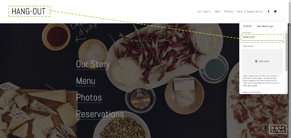
Well, if you inspect their logo, you see the trick. They make the image contain the text. So, all you need to do is produce your logo with text in the image.
The tricky part here is making sure it’s the right size and fidelity to avoid blurring when it’s scaled for different versions of your site. A large image with text that is not overly thin or intricate is the way to go. I can’t give you too many specifics because it all comes down to your font choice, style, and size. Try not to make your initial image too big and you should be fine when it scales.
Favicon Formatting
A favicon, also known as a browser icon, is the symbol that appears in the tab your site is loaded in, on both mobile and desktop browsers. It’s essentially a tiny version of your logo. However, if your logo is larger, more complex, or uses text, it doesn’t fit right in a favicon. How do you produce a good favicon?

First, you should know that the image specifications for the favicon are different than a logo.
Favicons display at 16x16 pixels, but you generally want to upload a larger image, typically between 100x100 and 300x300. Favicons are always square or circular, so rectangles don’t work well.
You should generally use a PNG or ICO file. PNG doesn’t work with really old versions of internet explorer, but I’ve never had a problem with it.
Your file needs to be small. Under 100kb small.
Adding your favicon is simple, at least. In 7.1, click on your home menu, then Design, then Browser Icon.

Upload your image there and save it. On 7.0, click on the home menu, then Design, then Logo & Title. The browser icon will be further down on the page.
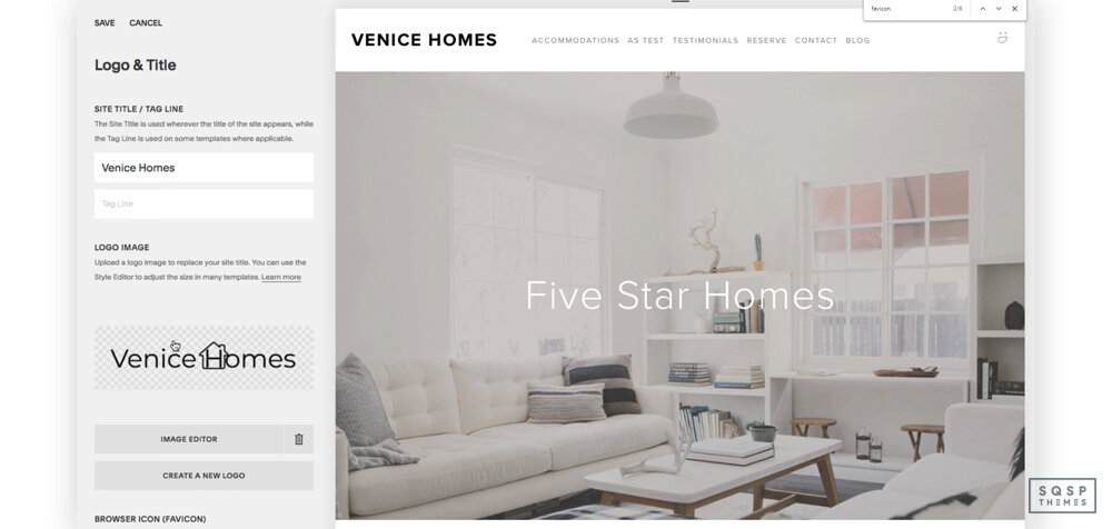
Upload it and save.
Using an SVG Logo
If you’re aware of vector graphics, you might wonder if you can use an SVG file for your site logo. SVGs are essentially text instructions for creating a vector-based image that scales infinitely well. They’re very powerful, very lightweight, and not true image files as we traditionally know them. Unfortunately, Squarespace doesn’t support them by default. However, you can still use them if you want.
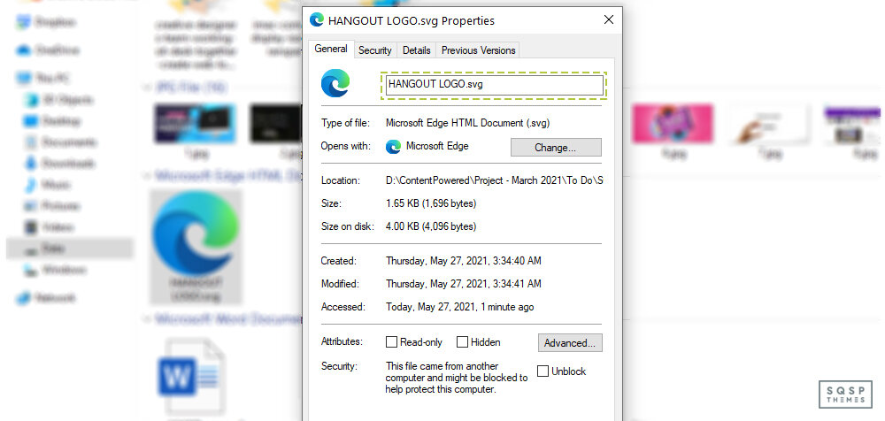

To do this, you essentially need to trick Squarespace into loading the SVG using custom code.
First, replace your header logo image with a transparent PNG file of the right size you want the header image to be.
Next, create your SVG logo. Here’s a guide on how to do it.
Once you have your SVG, you need to upload it. On any page of your site, highlight some text and click the link icon. Instead of linking to a page, click to link to a file, and upload your SVG file. This is basically a workaround for uploading your file to the Squarespace servers, as it doesn’t require any extra software and is a pretty quick process.
Once your logo file is uploaded, click the link to get the file name. It will look like this:
https://yoursitename.com/s/svglogoname.svg
Sometimes it can have a long file name, such as:
https://static1.yoursitename.com/static/605d8c67275bb80d4f-1b1fcb/t/602e9274f59cb32c9e67195c/1613265654987/file-name.svg
That’s fine. Copy that and set it aside. You can delete the link to the file, you don’t need to save it on whatever page you created it.
Next, use some custom code to add CSS to your header. The exact code you need depends on your site template, so I can’t list them all. Just search for “SVG logo in template name” to find a guide, like this one for Brine. Make sure to do the same for your mobile logo as well.
That’s it! You’ll have a perfectly scaled SVG logo all ready to go.