
What’s worth knowing in the Squarespace world.
For designers, developers, and people building businesses around Squarespace.

Inspiring Squarespace Blog Layout Examples (Minimalist, Image‑Heavy, Magazine & Creative)
When I started my first Squarespace blog, I was overwhelmed. Beautiful templates were everywhere, but I couldn't quite pinpoint what made some layouts stand out while others fell flat.
If you're feeling stuck or just looking for inspiration, I’ve curated some of my favorite real-world Squarespace blog examples below. I'll break down exactly why these layouts work so well and how you can borrow their best features to create a blog that your audience won't want to leave.
Along the way, you’ll find actionable tips to make your own Squarespace blog layout more interesting and functional, best practices for structuring content, and SEO considerations (like navigation, mobile responsiveness, and readability) to keep in mind. Let’s dive in!
Minimalist Squarespace Blog Layout – Benedict Evans
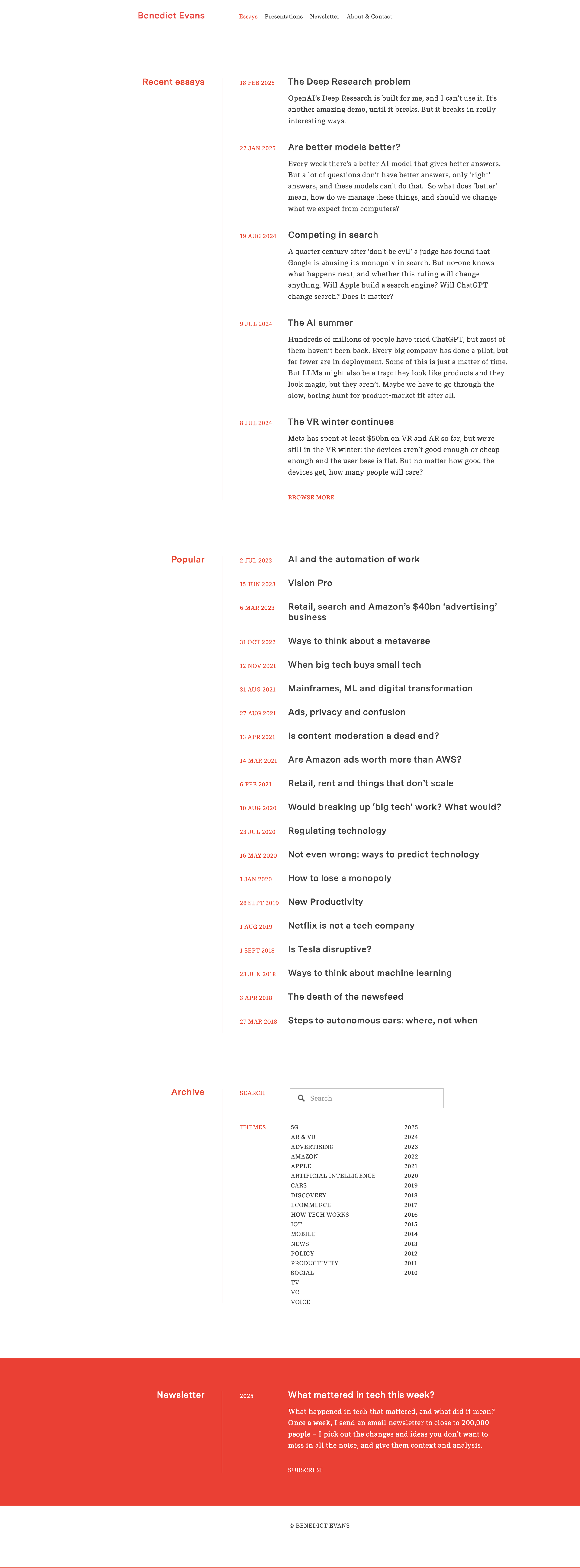
For a great example of a minimalist blog design, look at tech analyst Benedict Evans’s Squarespace blog. The layout is extremely clean: plenty of white space, simple typography, and almost no superfluous elements. The homepage presents a list of essay titles and brief excerpts in a single column, with a basic header menu and no clutter. This simplicity keeps all the attention on the content.
Why this layout works well:
Maximizes readability – High-contrast text on a white background and a legible font size make long-form articles easy on the eyes.
Simple navigation – Just a few links (Essays, Newsletter, etc.), ensuring visitors aren’t overwhelmed.
Fast loading time – No unnecessary images or widgets slowing down the site.
Image‑Heavy Squarespace Blog Layout – Meiwen See

In contrast to minimalist sites, some blogs captivate visitors through image-heavy layouts. Meiwen See’s Squarespace blog is a stunning example of a photography-driven design. The homepage features a grid-style arrangement of posts with bold thumbnail images and minimal text. Inside each post, large photos are accompanied by short paragraphs, making the content easily scannable and visually engaging.
Why this layout works well:
Strong visual storytelling – Striking photographs immediately grab attention.
Balanced text-to-image ratio – Short paragraphs ensure readability while keeping the focus on visuals.
Clean and consistent styling – A simple background and easy-to-use navigation enhance user experience.
Magazine‑Style Squarespace Blog Layout – Deem Journal

For content-rich sites, a magazine-style layout can be very effective. Deem Journal, an online design journal built on Squarespace, exemplifies this style with a bold and organized presentation. Upon landing on the blog section, visitors are greeted with a featured article showcased prominently with a large image and title. Below, the rest of the posts appear in a three-column grid.
Why this layout works well:
Boosts engagement – The grid allows users to scan multiple articles quickly.
Creates an editorial feel – Large images and bold typography make it visually appealing.
Responsive for all devices – The grid collapses neatly on mobile screens, maintaining usability.
Simple Squarespace Blog Layout – AAKS (Brand News)

Some of the most inspiring blog designs take a creative, brand-centric approach. The AAKS “News” blog is a perfect example of a creative Squarespace blog design that aligns with branding. The layout is a colorful grid of post previews with a simple menu bar at the top for filtering categories.
Why this layout works well:
Reflects brand identity – Vibrant colors and imagery align with AAKS’s aesthetic.
Simple but functional – Clean structure with easy-to-navigate filters.
Immersive storytelling – Behind-the-scenes visuals keep readers engaged.
Third-Party Squarespace Blog Layout Examples
Kintsugi by Studio Mesa

Some of the most structured blog designs focus on clarity and accessibility. The Kintsugi Squarespace Template is designed for service-focused businesses and features a clean, calming aesthetic with a structured grid-based blog layout. Each blog post is displayed in uniform card-style previews, making excellent use of whitespace and typography to enhance readability. The inclusion of category tags above each post allows for intuitive navigation, helping visitors browse content based on topics of interest.
Why this layout works well:
Reflects clarity and professionalism – A structured grid layout keeps content visually organized and easy to digest.
Enhances navigation – Category tags provide a streamlined browsing experience, allowing readers to filter content effortlessly.
Balances aesthetics and usability – Thoughtful use of whitespace and typography creates an inviting reading experience without overwhelming the viewer.
Launch Day by Applet Studio

Some blog designs embrace bold, high-contrast visuals to capture attention immediately. The Launch Day Squarespace Template features an energetic and modern blog layout with large, colorful headings that command attention. Blog posts are arranged in a structured grid with rounded image thumbnails, offering a sleek and engaging look. The top section categorizes content into clear, clickable sections, ensuring that visitors can quickly navigate to the topics that interest them.
Why this layout works well:
High-impact visual appeal – Bold typography and color contrast create an engaging first impression.
Clear content segmentation – The structured layout makes it easy to browse different categories at a glance.
Modern and playful aesthetic – Rounded thumbnails and contemporary design elements add a creative touch that resonates with service-based businesses and creative professionals.
Unearth by Big Cat Creative

Some of the most artistic blog layouts combine editorial storytelling with a visually compelling design. The Unearth Squarespace Template embraces an artistic, magazine-style aesthetic that balances imagery with typography. Perfect for designers, artists, and branding professionals looking to showcase their content in a creative yet structured manner. The soft color palette and refined typography enhance the visual appeal, while content categories are subtly integrated to guide the reader seamlessly through different topics.
Why this layout works well:
Balanced imagery and text – Well-placed visuals complement the content without overpowering it.
Elegant navigation – Subtle category organization makes it easy for visitors to explore different topics while maintaining a polished aesthetic.
Tips for Designing an Engaging Squarespace Blog Layout
1. Prioritize Readability with a Clean Design
Use a legible font and ample whitespace.
Keep color schemes simple for better text contrast.
Ensure text is properly spaced for comfortable reading.
2. Use High-Quality Images to Enhance Content
Select striking featured images for each post.
Optimize images to avoid slow loading times.
Use a consistent aspect ratio for thumbnails to maintain visual harmony.
3. Keep the Layout Uncluttered
Avoid excessive widgets, pop-ups, and distractions.
Maintain a consistent design language across all pages.
Stick to a logical content hierarchy.
4. Ensure Clear and Intuitive Navigation
Place the main menu at the top for easy access.
Use category filters or a search bar to help users find content.
Consider a sticky header for quick navigation.
5. Incorporate Branding and Personality
Align colors, fonts, and imagery with your brand.
Create a unique blog identity that stands out.
Use personalized blog post templates to maintain consistency.
SEO Considerations for Blog Layout
Mobile responsiveness is crucial. Testing your layout on different devices ensures that text and images scale properly and that navigation remains user-friendly. A mobile-friendly menu helps users access content easily without unnecessary zooming or scrolling.
Optimizing site structure enhances discoverability. Logical organization of categories and tags, along with internal linking, makes it easier for visitors and search engines to explore your content. Breadcrumb trails or “Related Posts” sections further encourage engagement by guiding readers to additional content.
Site speed plays a key role in rankings. Compressing images reduces file sizes, preventing slow load times, while avoiding excessive animations and enabling lazy loading ensures a smooth browsing experience. Fast-loading pages not only improve user experience but also send positive signals to search engines.
SEO metadata and alt text should be strategically implemented. Compelling SEO titles and meta descriptions improve visibility, while descriptive alt text for images enhances accessibility and increases the chances of appearing in image searches. Using clear, descriptive URLs (such as
yourdomain.com/squarespace-blog-layouts) further improves search engine ranking and user experience.
Conclusion
Your blog’s layout is the framework that supports your content. As we’ve seen through these real Squarespace blog examples, there’s no one-size-fits-all design – you might opt for a minimalist single-column feed, an image-heavy gallery, a polished magazine grid, or a creative brand-centric layout. What matters is that your design serves your content and audience.
Take inspiration from the examples above: borrow ideas like using white space for focus, striking imagery to draw in readers, or organizing posts in a grid for variety. Then, apply the best practices and tips provided—such as maintaining readability, using headings, optimizing for mobile, and keeping your site structure intuitive.
With thoughtful design choices, you can transform your Squarespace blog into an engaging, SEO-friendly, and visually stunning space that keeps readers coming back. Happy blogging!
![How to get a discount on Squarespace [March 2025]](https://images.squarespace-cdn.com/content/v1/558ae872e4b06e5cac195ad7/1617333129395-4ZHX55XALLR4P6LW41QA/Squarespace%2BDiscount.jpeg)
How to get a discount on Squarespace [March 2025]

Use our code SQSPTHEMES10
to save 10%
Squarespace doesn’t have a free plan, though they do have a free trial. This can make it difficult for them to compete against website builders that do have free plans, at least among the audience of people who don’t realize why having ads added to their site is bad.
To ease the burden of that initial price, coupon codes are a great resource. There are always several of them floating around, and there are many different ways to get this discount. I’m going to try to keep this post up to date with any methods of getting coupon codes I can find, so if you know of one (that isn’t just your affiliate code), let me know!
Get up to 30% off ALL plans when you pay annually
no coupon code needed
What to Know About Squarespace Discounts

Before I get into the specific discount codes you can use, I want to make a few general notes about discount codes across the board.

First and foremost, every discount code you find will apply to your first purchase only.
In other words, the discounts are limited to one per transaction, for the first purchase of a new website.
To get the most out of a discount, I have a few tips for you before you sign up:
Get up to 30% off ALL plans when you pay annually
no coupon code needed
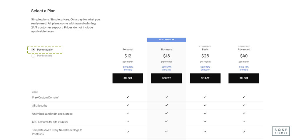
Pay annually. I know it’s a big up-front purchase to buy an annual subscription, but keep in mind that you’re getting double the discounts when you do. Let’s say you’re buying a Business plan, their most popular plan.
Monthly, with no discount: $26 per month, for $312 per year.
Monthly, with a 10% discount: You get 10% off your first payment of $26, so your annual cost is $309.40
Annual, with no discount: $18 per month, for $216 per year.
Annual, with 10% discount: You get 10% off your first payment of $216, so your annual cost for the first year is $194.40.
Thus, using the smallest possible discount while buying an annual plan has you paying $117.60 less than you would if you didn’t bother to optimize your purchase. That’s quite a discount! It’s even better if you take advantage of a larger discount than their basic 10% off deals that they run.

Buy the largest plan you think you might need. Squarespace offers four packages: Personal, Business, Commerce, and Advanced Commerce. You can view their pricing page to see the difference in features between them, as well as the default pricing.
My recommendation is to buy the highest tier plan you need at the outset. If you think you might want Commerce, but might only need Business, you can always downgrade later. However, if you buy Business and decide that you want the features from Commerce, you can upgrade later, for a fee.
The trouble is, you can’t apply a coupon code to a subscription upgrade. You save the most money by buying the larger plan with a discount than buying the smaller plan and upgrading at full price later.

Make use of the educational discount if you can. The last option on my list here is the best one by far. Most Squarespace offers are 10% or 20% off your first payment, but the educational discount is 50% off your first year. It’s harder to qualify for since you need an email address from your educational institution to enroll, but it’s well worth it if you can get it.

Don’t be afraid to wait. Squarespace very frequently offers coupon codes for holidays and special promotions. If a current code has expired, or it’s not the best discount and you want to see if a new code for the next month is better, go ahead and wait for it. I wouldn’t wait an entire month, but if it’s just a few days until the current code expires, it might be worthwhile waiting for the next one.
So, there you go; my tips for getting the biggest discount you can out of Squarespace. Now let’s look at ways you can get those discount codes.
Option 1: Basic Squarespace Discounts
Squarespace has one permanent discount code that is always active and always available on their site. When you sign up and go through the checkout process, you’ll be prompted to enter any discount codes you may have.

One of those discount codes is “GIMME10”. This is promoted directly on the Squarespace coupons page and gives you 10% off of your purchase. It’s only valid for your first purchase, and it’s the single smallest discount you can get. Just about any other offer is going to be a bigger discount, this is just their permanently available offer for anyone looking to sign up.
Option 2: Monthly Discounts
Squarespace often has promotions of its own that they run every month. For example, as I’m writing this at the end of March, they have a banner with the code “MARCH20A” at the top of their site. That code is 20% off your first purchase, much like the code above. The trick is, it expires at the end of March. Squarespace will likely have an April or an Easter or Spring-themed code for next month, for example.

There’s almost always some kind of promotion running. It’s an open secret that Squarespace always has some kind of discount running, so you never have to pay full price for signing up.
How do you find this code? Just check their website. It’s usually in a banner at the top of their page.
Option 3: Work with a Circle Member
Squarespace has a program called Circle. People who are big into Squarespace can sign up to be Circle members. Circle members get a bunch of benefits, including discounts on subscriptions, six-month versions of trial sites, prioritized support from Squarespace directly, exclusive content, guides, and release notes, and a special badge they can add to their sites.

To be eligible for Circle, a developer first needs to be active in running or contributing to at least three active Squarespace sites. You need to apply to be a Circle member, and not everyone makes it.
One of the main benefits a Circle member can offer is that, when you work with them to set up a site, you get an automatic 20% off. There’s no code to apply, but your site needs to be set up by the Circle member. Usually, this means working with a freelancer or agency that sets up Squarespace sites for a living.
The hard part of this discount is finding a Circle member. There’s no directory of Circle members, you simply need to look for the Circle badge on the site of the person you’re scouting, or send them an email or contact message asking if they’re a Circle member and can work with you.
Option 4: Hire an Expert
Working with a Certified Squarespace Expert gets you an automatic 20% discount when you have your site designed by their agency. Squarespace maintains a directory of certified experts. You can browse that directory here.

You can also go through the “get matched” process by clicking the button at the top of that page. You log in with your Squarespace account and fill out a series of forms to create a brief for your website. The brief goes out to relevant experts, and those experts can reach out to you and pitch their services.
Unlike Circle, you don’t need to have the expert make your site for you. Many experts offer training courses, resources, exclusive communities, or eBooks to help you design your first site. They simply have a custom coupon code that can give you a 20% discount when you reach whatever point in their training where they give it to you.
It’s difficult to generalize this option, simply because every expert has a unique process and program that they recommend. You’ll have to experiment with them yourself.
Option 5: Educational Discounts
Squarespace wants to be part of education programs for aspiring web developers, designers, and content creators, as well as those looking to get started in eCommerce while they’re still in school. As such, they offer an educational discount, which is one of the best discounts out there.

Unlike other discounts, the educational discount is 50% off your first year, regardless of whether you’re paying monthly or annually. That’s a lot!
To first claim this discount, you need to have an email address assigned to you by your educational institution. For example, yourname@university.edu is the general email format, though every university already has a domain name. Squarespace will ask you to select your educational institution from their list. If your school doesn’t happen to be on the list, you can fill out a form and they’ll set about adding it, and then reach out to the school to enroll in the program. Once your institution has, Squarespace will send you an email letting you know and giving you their discount offer.
This discount isn’t just for students! Students are the main target audience, but faculty and staff can also take advantage of it. Professors, TAs, teachers, administrative staff, custodial staff; anyone who has a .edu email address can qualify. If you can qualify for this, it’s a great deal, and I highly recommend giving it a try.
Option 6: Additional Discounts
There are quite often a few other discounts and offers available. Forbes does a good job of aggregating these and keeps a handful of discounts available. Some of their “offers” aren’t real offers, though. The “13-30% off annual plans” is just Squarespace’s default annual pricing, but it’s listed as a special offer here.
Wrapping Up
I highly recommend Squarespace as a great place to start a website or online business, but I readily acknowledge that the price can be a little steep when you’re not sure whether or not your idea will pan out and make money. It can take quite a while to build a site up to the point where you’re making back your investment, and some people take years to reach that point.

If you want assistance with setting up a Squarespace site, or if you want custom themes or templates, please drop me a line. I love helping people get started. Feel free to reach out via the site, or just click here to get started with Squarespace. Don’t forget to check for active discounts!

You’ve Done It Before. You Can Do It Again.
These are transcribed notes from my talk at The Website Designer Summit 2025
You built something. You became known for it.
It got you clients, credibility, maybe even a thriving business.
And yet, you feel the pull—toward something more, something different.
But every time you consider making the shift, fear kicks in.
What if I lose everything I’ve built?
What if I have to start over?
What if I pivot and regret it?
What if I disrupt what’s already working?
What if I try, and it doesn’t take off?
These aren’t just passing doubts. They’re the kind of questions that keep people stuck, circling the same ideas without ever moving forward.
But here’s the truth:
You’ve done it before. You can do it again.
The Cycle of Growth
If you’ve built something once, you’re not starting over—you’re stacking on top of what you already know.
The problem is, we’re conditioned to see growth as a straight path—one success leading directly to the next. But that’s not how it works.
Growth is a cycle:
Capture – You get curious about a new idea.
Develop – You experiment, refine, and master it.
Expose – You share it with the world and build credibility.
Evolution – You feel the pull to grow beyond what you built.
And then? The cycle starts again.
You’ve already been through this. The first time you learned web design. The first time you took on a paying client. The first time you built something that actually worked.
That same person—the one who figured it out—is still here.
So instead of fighting the shift, let’s talk about how to move through it with confidence and make this transition sustainable.
How to Process the Transition
Before you can move forward, you have to call out the fears holding you back.
1. What Will I Lose?
The fear of loss is real. You’ve worked hard to build credibility, a client base, and a reputation. But evolution isn’t erasure. What you’ve built isn’t disappearing—it’s becoming the foundation for what’s next.
2. What If I Have to Start Over?
You don’t. You’re not a beginner anymore. You have skills, relationships, and knowledge that you didn’t have the last time you made a leap. The difference between starting from scratch and starting from experience is massive.
3. What If I Pivot and Regret It?
Every pivot is an experiment. It’s not a lifetime commitment. The mistake isn’t changing direction—it’s staying in something that no longer fits just because it feels safer than the unknown.
4. What If I Disrupt What’s Already Working?
If something feels heavy, draining, or uninspiring, then it’s already breaking down. You don’t have to burn everything down to grow—you just have to shift your energy toward what actually excites you.
5. What If I Try and It Doesn’t Take Off?
Then you adjust. Just like you did when you were figuring things out the first time. The difference is, you now have experience, an audience, and a network—so the stakes aren’t as high as they feel.
The Mindset Shifts That Make It Work
Once you’ve named the fear, you have to reframe it. Here’s what that looks like in action:
You Are Not the Thing You Built
Your identity isn’t tied to what you do—it’s tied to who you are. The thing you built was an expression of your skills at the time, but it’s not the end of the story.
You’re Not Starting Over, You’re Stacking
The work you’ve done so far isn’t wasted. It’s leverage. You’re not abandoning your expertise—you’re expanding on it.
You Don’t Have to Be an Expert to Start
Most people don’t hesitate because they lack skill. They hesitate because they don’t want to be seen as a beginner again. But mastery is just a series of cycles, and you’ve already proven you can go from novice to expert before.
Success Isn’t a Trap—Unless You Let It Be
If you feel trapped by what you’ve built, it’s not because the work is too good to leave. It’s because you’re afraid of what happens when you step into something new. But staying in a box that no longer fits isn’t success—it’s stagnation.
Energy Doesn’t Lie—Follow What Feeds You
When something starts to feel heavy, that’s a sign. Ignoring it doesn’t make it go away—it just means you’ll eventually burn out or start resenting your own success.
So, now that we’ve shifted how you think about it, how do you actually move forward?
How to Make the Transition Sustainable
If you’re going to shift, do it in a way that doesn’t cause chaos. Here’s how:
1. Clarify What Actually Inspires You Now
Stop asking what’s profitable and start asking:
What do I talk about, create, or obsess over without trying?
What problems do I feel pulled toward solving?
What do I wish existed in my industry?
2. Find the Overlap: Old Credibility + New Direction
Your evolution doesn’t have to be jarring. It can feel natural—to you and your audience.
Instead of, “I’m quitting web design to do something totally new,” think:
“I’ve spent years helping businesses create better websites. But what I’ve realized is, most of them don’t just need a website—they need a way to grow their brand online. So now, I’m helping people do exactly that.”
This makes it clear: you’re not leaving everything behind. You’re just zooming out.
3. Test Before You Go All In
Big pivots feel risky. Small experiments don’t.
Instead of making a huge announcement, just start doing it.
Post about your new direction.
Offer a small, low-stakes service or product.
See where the energy is.
4. Turn Your Inspiration Into Assets
Your interests don’t just have to be side projects. They can be revenue streams.
If people keep asking you for advice on something, turn it into a product.
If you’re repeating the same insights in DMs, package it into a guide.
If you’re sharing knowledge, create something people can buy.
The key is shifting from only selling time to creating repeatable assets that work for you.
5. Leverage Systems & Partnerships
You don’t have to build everything from scratch.
Who already has access to the audience you want?
How can you set up systems so this work generates income without needing your constant effort?
Success doesn’t just come from working harder. It comes from designing smarter.
You’ve Done It Before. You Can Do It Again.
This isn’t your first time figuring something out. It won’t be your last.
But this time, you get to do it with more clarity. More leverage. More confidence.
So, what’s the next move?
Because the only way to know if it’s the right one—
is to take it.