
Kleemt Review: Ready-Made Squarespace Sections and Blocks Without Code
The problem usually shows up when the page is almost there.
The copy works. The brand direction is clear. The site structure makes sense. The page does not need a full redesign.
But one section still feels too plain.
The proof section needs more weight. The testimonials need a better layout. The map looks generic. The before-and-after images need a cleaner interaction. Something on the page needs to feel more considered than the default Squarespace version.
That is where Kleemt gets interesting.
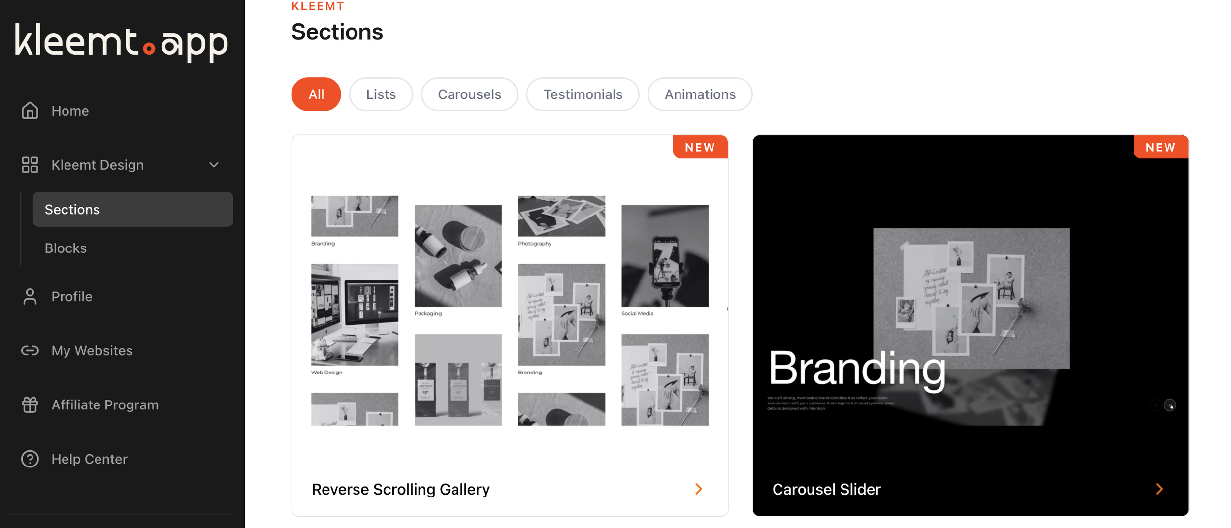
Kleemt is a Squarespace tool that lets you add ready-made sections and blocks directly inside the Squarespace editor. I would not think of it as a replacement for Squarespace, or a substitute for good design judgment. It is more useful than that: a way to keep a build moving when the page is working, but one section still needs a better design moment.
Squarespace gives you the page.
Kleemt gives you more finished sections to work with.
What Is Kleemt?
Kleemt is a no-code section and block library for Squarespace.
Instead of starting from a native Squarespace section, hunting for a code snippet, or asking a developer to build something small, you can add a pre-designed Kleemt section and customize it inside the editor.
That matters because a lot of Squarespace projects do not get stuck at the big strategic level. The offer is clear. The page order makes sense. The content is mostly there. The thing that slows the project down is usually smaller and more annoying.
A logo row needs to scroll.
A comparison section needs to feel cleaner.
A proof section needs more presence.
A visual break needs to feel more custom.
A client wants “just a little more” from a section that Squarespace can technically create, but not quite in the way the page needs.
That is the kind of gap Kleemt is trying to fill.
Native Squarespace Is Usually Enough
I would not add Kleemt to every Squarespace site.
Squarespace already gives you a strong base. You can build pages with text, images, buttons, galleries, forms, products, lists, videos, and layouts without touching code. For a lot of sites, native Squarespace is enough.
And when it is enough, I would leave it alone.
A tool does not need to be added just because another tool exists. If the native section looks good, works on mobile, and gives the client what they need, there is no problem to solve.
The better question is what happens when the native section is close, but not close enough.
That is where the project can start to get heavier than it should.
Where Squarespace Starts to Feel Limited
The phrase I would listen for is:
“I just want this section to feel better.”
That sounds simple. It usually is simple in the client’s mind.
But inside a Squarespace build, that request can send you in five different directions. You can settle for the native version. You can start writing CSS. You can search for a plugin. You can ask AI for a snippet. You can bring in a developer. You can spend too much time forcing a default section into a layout it was not really made for.
None of that is dramatic, but it adds drag.
The page did not need a full custom build. The client did not ask for some wildly specific interaction. The section just needed to carry the content better.
That is the native wall.
Not because Squarespace is bad.
Because every website builder has edges.
The Small Design Change Becomes a Coding Task
This is the part Kleemt is really responding to.
A small visual request can become a coding task very quickly. The desktop version looks right, but mobile breaks. The spacing changes on tablet. The button wraps strangely. The image crop looks off. The section works in one template but not another. You fix one thing and accidentally change something else.
That is fine when the requirement deserves code.
But not every design improvement deserves a mini development cycle.
Sometimes the project just needs a better starting point. A section that already has the bones of the thing you are trying to create. A layout that already understands the pattern. A block that lets you get back to the page instead of opening a new rabbit hole.
That is why “without code” matters here.
It is not anti-code. It is anti-making-small-things-heavier-than-they-need-to-be.
The AI Snippet Loop
AI has made this even more tempting.
You can ask ChatGPT for a Squarespace code snippet and sometimes it works. Sometimes it almost works.
And “almost” is where the time goes.
You paste the snippet. The section looks right on desktop but breaks on mobile. You ask for a fix. It gives you new code. You paste again. Now the spacing is better, but the button moved. You ask again. Now something else changed.
By the time it finally works, the original request does not feel small anymore.
That does not mean AI is useless. It just means copy-paste code is not always the best interface for visual design work.
Kleemt is interesting because it moves the work closer to the place where the design actually lives. Instead of leaving Squarespace to generate a snippet, paste it back in, and troubleshoot the result, you can add a designed section and adjust it in context.
That is a cleaner workflow for this kind of problem.
What It Feels Like Kleemt Is For
Kleemt is best when the page already makes sense.
It is not there to rescue weak strategy. It is not there to magically make bad content persuasive. It is not there to replace the work of deciding what the page needs to say.
It is there for the moment after that.
The moment when you know what the section is supposed to do, but the native version feels too plain.
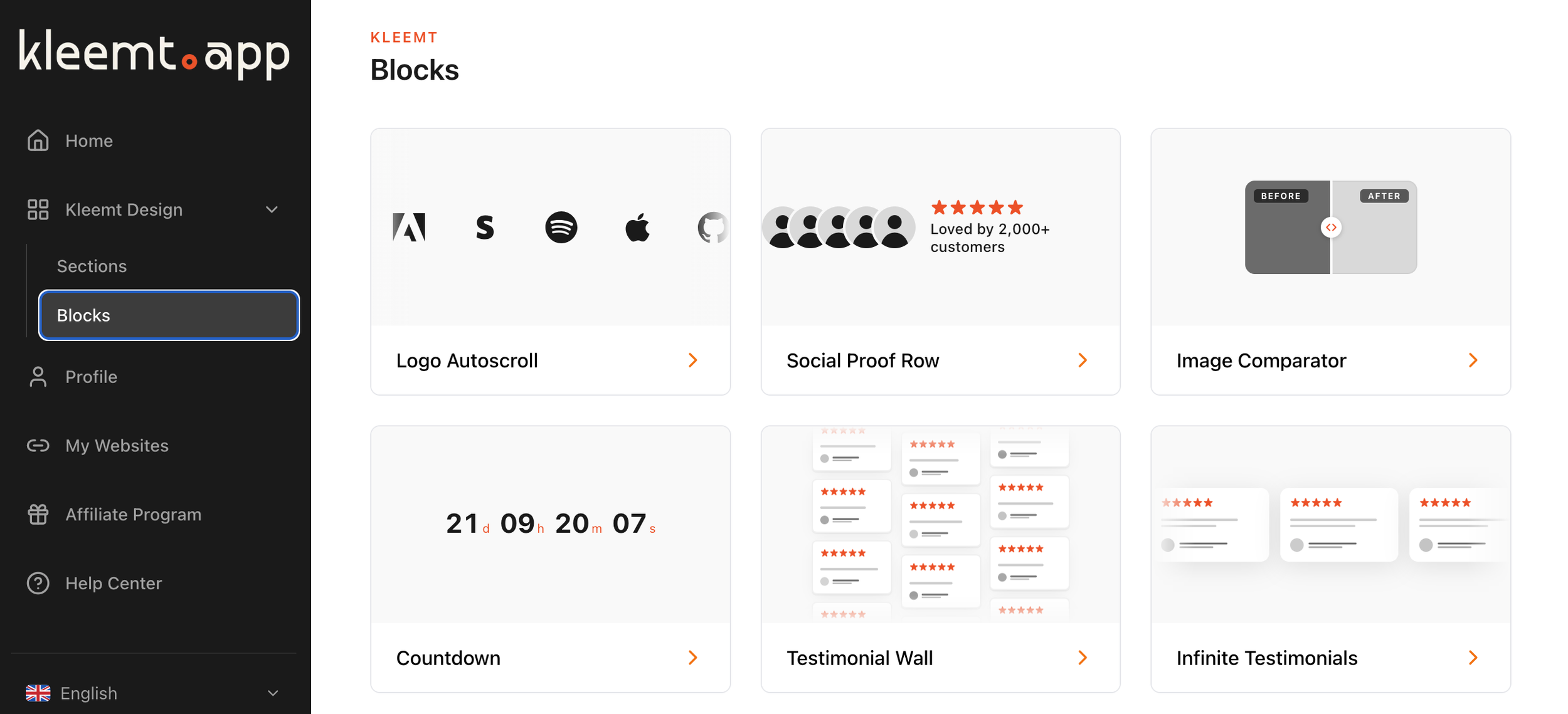
That could be a proof section, a logo strip, a map, a testimonial layout, a comparison section, a before-and-after block, or a more interesting visual break between parts of the page.
The value is not only that the section looks more polished.
The value is that you can keep moving.
That matters during a real build. Momentum is fragile. Every time a small section turns into a separate technical problem, the whole project gets heavier. Kleemt gives you another path: add the section, shape it, keep building.
What Makes Kleemt Different
The cleanest distinction is this:
Kleemt is more about adding ready-made sections and blocks.
SquareKicker is more about giving you deeper design control over existing Squarespace elements.
Spark is more about quick visual enhancements and one-click customizations.
There is overlap. These tools all live in the same general world: making Squarespace sites feel less default without writing everything from scratch.
But the buying question is different.
If you want to style and control the design system more deeply across the site, SquareKicker may be the better fit.
If you want quick effects, visual upgrades, and lighter customizations, Spark Plugin may be enough.
If you need a specific plugin, snippet, template, or component, Ghost Plugins may be the better place to look.
If you want a finished section or block that already feels designed, Kleemt is the one I would look at first.
That is the difference.
Kleemt Alternatives
There are a few ways to solve the “this looks too native” problem in Squarespace.
Use native Squarespace when the default section already works. This is still the cleanest answer when the design does not need anything more.
Use SquareKicker when you want broader no-code design control. It is a stronger fit when you want to push existing sections, spacing, styles, animations, and visual behavior across the site.
Use Spark Plugin when you want fast visual enhancements without getting too deep into custom design control.
Use Ghost Plugins when you need a specific plugin, snippet, template, or component for one particular issue.
Use custom CSS or custom code when the requirement is specific enough to justify building and maintaining it.
Use Kleemt when the page is close, but the section needs to feel more polished than the native option.
That last point is important. Kleemt does not need to replace all the other tools to be useful.
It just needs to solve its particular problem well.
Who Kleemt Is Best For
Kleemt makes the most sense for Squarespace designers, developers, and site owners who want better sections without turning every visual improvement into a technical task.
It is especially useful when a page needs:
A stronger proof section
A better testimonial layout
A more polished logo strip
A custom-feeling map
A cleaner comparison area
A before-and-after interaction
A more interesting visual break
A section that feels less like default Squarespace
The common thread is that the page does not need to be rebuilt.
The section needs to be elevated.
That is the Kleemt moment.
Who Kleemt Is Not For
Kleemt is not for every Squarespace design problem.
If the native section already works, use it.
If you need deep site-wide design control, I would look at SquareKicker.
If you want quick visual effects, Spark may be enough.
If you need one specific function, Ghost Plugins or another dedicated plugin may be better.
If the client needs something highly custom, code may still be the right answer.
That is not a weakness. It is just the category.
The useful thing about Kleemt is that it gives you a middle option for the projects that do not need custom development, but also do not feel finished with native Squarespace alone.
Final Verdict: Is Kleemt Worth It?
Kleemt is worth looking at if your Squarespace page already works, but one or two sections need to feel more polished, more custom, or more useful without becoming a coding task.
That is the simplest way to understand it.
Use native Squarespace when the default blocks are enough.
Use custom code when the requirement deserves custom code.
Use SquareKicker when you want deeper design control.
Use Spark when you want quick visual enhancements.
Use Kleemt when the section already makes sense, but needs to feel better.
The decision test is simple:
Does the page need a new strategy, a new structure, or one better design moment?
If it needs a new strategy, step back.
If it needs a new structure, redesign the section.
If the section makes sense but still feels too plain, Kleemt may be the right tool.
Sometimes the site does not need more code.
Sometimes it just needs a better design moment.
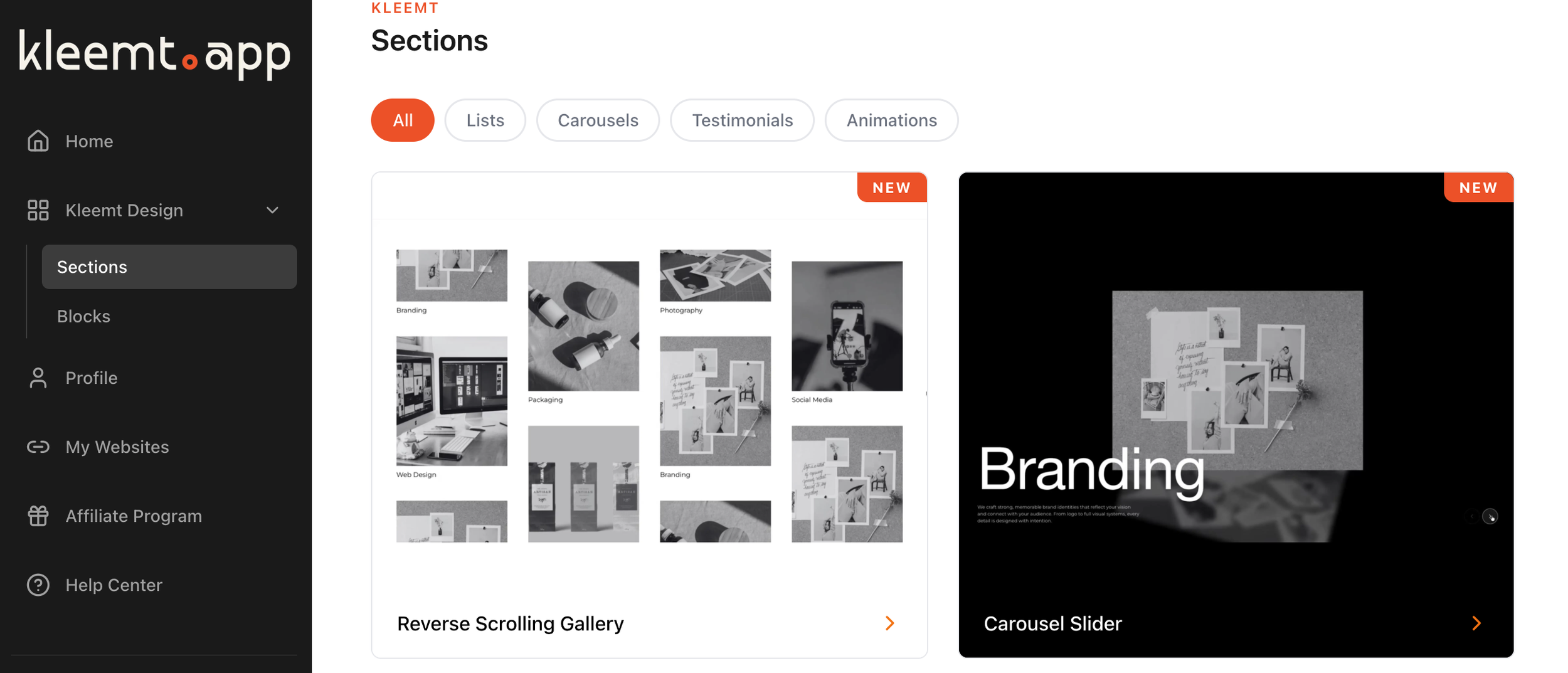
Kleemt is a no-code tool for Squarespace users who want more polished sections without building everything from scratch.
Instead of searching for a code snippet, hiring a developer, or trying to force a native Squarespace section into a layout it was not really designed for, Kleemt gives you ready-made sections you can add into a page and customize.
That makes it especially useful for designers and site owners who are already comfortable building in Squarespace, but occasionally run into the same problem:
The page works, but it needs one better section.
Not a whole new site.
Not a full custom build.
Just a better way to show the content.
What Problem Does Kleemt Solve?
A lot of Squarespace design problems are not really development problems.
They are block and section problems.
You do not always need custom code. You do not always need to redesign the whole page. You do not always need a developer to step in.
Sometimes you need a stronger testimonial layout. Or a better logo section. Or a more useful comparison block. Or a cleaner gallery. Or a more polished visual moment between two important parts of the page.
That is the gap Kleemt is trying to fill.
It is for the moment when native Squarespace is good enough to build the page, but not quite flexible enough to create the section you actually want.
Native Squarespace Is Often Enough
To be clear, not every Squarespace site needs Kleemt.
Squarespace already gives you a strong foundation. You can build pages with text, images, buttons, galleries, forms, products, lists, and layouts without touching code. For a lot of projects, that is enough.
A tool does not need to be added just because another tool exists.
If the native section works, looks good, and the client is happy with it, leave it alone.
The question is not whether Squarespace can build good pages.
It can.
The question is what happens when the page needs a block or section that feels more custom than the native options make easy.
Where Native Squarespace Starts to Feel Limited
The phrase I would listen for is:
“I just want this section to feel better.”
That sounds simple, but it can quickly become a development problem.
A client asks for a more interesting proof section, a better layout, a custom-feeling map, a more polished comparison area, or a block that feels more elevated than the default Squarespace version.
None of these requests sound huge.
But inside a Squarespace project, they often create a choice: settle for the native version, search for a code snippet, buy a separate plugin, ask a developer, use custom CSS, or spend too much time forcing the default section into something it was not really designed to be.
That is the native wall.
The design idea is not unreasonable. The site may not need custom development. But the block or section needs more than Squarespace gives you out of the box.
The Small Design Change Becomes a Coding Task
This is where the project starts getting heavier than it should.
The designer does not need to rebuild the whole site. They do not need to create a custom app. They do not need to turn a small visual upgrade into a technical project.
They just need a better way to make the section work.
That is why “without code” matters.
Not because code is bad.
Code is useful when the requirement is specific enough to justify it.
But if every polished section requires CSS, snippets, testing, and troubleshooting, the project starts to feel heavier than the request.
The design idea should not always become a coding task.
The AI Snippet Loop Is Part of the Problem
AI has made this more interesting.
You can ask ChatGPT or another AI tool for a Squarespace code snippet. Sometimes that works. Sometimes it almost works.
And “almost” is where the time goes.
You paste the snippet. The section looks right on desktop but breaks on mobile. The spacing is off. The button is in the wrong place. You ask for a fix. You paste again. Now something else changed.
Half an hour later, you are still adjusting margins for a design change that should have taken two minutes.
That does not mean AI is useless.
It means copy-paste code is not always the best interface for design work.
The interesting thing about Kleemt is that it points toward a different workflow. Instead of asking for a snippet somewhere else, pasting it into Squarespace, debugging it, and repeating the cycle, you can add and edit the section closer to the place where the design actually lives.
That is a very different proposition.
What It Is Like to Use Kleemt
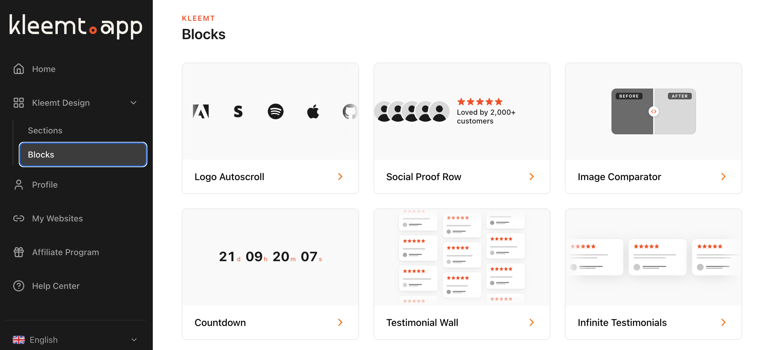
Kleemt is best understood as a section and block library for Squarespace.
You add a section, choose from available Kleemt layouts, then customize the design. The value is not only that the sections look better than a default block. The value is that you can keep moving.
That matters during a real build.
A small design issue can interrupt the whole flow of a project. You stop designing, start searching, test a snippet, fix a bug, check mobile, adjust spacing, and suddenly a small visual request has taken over the session.
Kleemt gives you another path.
Add the section. Adjust it. Keep building.
That is the appeal.
What Makes Kleemt Different
The main difference is that Kleemt is not just about styling what already exists.
It is about adding ready-made sections and blocks that already feel designed.
That distinction matters.
If you want broad design control across a Squarespace site, SquareKicker may be a better fit.
If you want quick visual effects and one-click style upgrades, Spark Plugin may be enough.
If you need a very specific plugin, snippet, template, or component, Ghost Plugins may be the better place to look.
Kleemt is strongest when the page already makes sense, but one section needs to feel more finished.
That is its lane.
Kleemt Alternatives
There are a few different ways to make a Squarespace site feel less native.
SquareKicker is useful when you want deeper no-code design control across the site. It is more of a broad design-control tool for styling existing Squarespace elements, adjusting layouts, creating effects, and pushing the visual system further.
Spark Plugin is useful when you want quick visual enhancements, effects, and style upgrades. It is more about adding polish and customization without going deep into a custom build.
Kleemt is useful when you want a polished section or block that already feels designed, without turning the idea into a custom development task.
Custom CSS is useful when the requirement is specific enough to justify writing and maintaining code.
That means Kleemt does not replace every other option.
It solves a particular kind of problem.
The page is close.
The section is not.
Who Kleemt Is Best For
Kleemt makes the most sense for Squarespace designers, developers, and site owners who want to move faster without making every custom-feeling section from scratch.
It is especially useful when a page needs:
A stronger proof section
A better testimonial layout
A more polished logo strip
A custom-feeling map
A comparison section
A before-and-after interaction
A more interesting visual break
A section that feels less like default Squarespace
The site does not need to be rebuilt.
The section needs to be elevated.
That is the moment when Kleemt is worth looking at.
Who Kleemt Is Not For
Kleemt is not for every Squarespace design problem.
If the native Squarespace section already does the job, use the native section.
If the client needs deep site-wide design control, SquareKicker may be a better fit.
If the client needs quick style effects, Spark may be enough.
If the client needs one very specific function, Ghost Plugins, a dedicated plugin, or a code snippet may be better.
If the client needs a fully custom interactive experience, custom development may still be the right path.
The point is not that Kleemt replaces every other option.
The point is that many Squarespace projects do not need every other option.
They need one better block.
Or one better section.
Final Verdict: Is Kleemt Worth It?
Kleemt is worth looking at if your Squarespace page already works, but one or two sections need to feel more polished, more custom, or more useful without becoming a coding task.
That is the best way to understand it.
It is not a replacement for Squarespace. It is not a replacement for thoughtful design. It is not a replacement for custom development when custom development is truly needed.
It is a middle path.
The simple decision test is this:
Does the page need a new strategy, a new structure, or one better design moment?
If the page needs a new strategy, step back and rethink the page.
If the page needs a new structure, redesign the section.
If the section already makes sense but feels too plain, Kleemt may be the right tool.
Sometimes the site does not need more code.
Sometimes it just needs a better design moment.