
Best Squarespace Templates for Wedding Photographers
We may earn a commission if you buy or sign up through links on this page.
A wedding photographer's website needs more than a set of beautiful images. It needs the right relationship between those images and the person someone might invite into an important day. Some photographers want the work to make the first impression. Others want the experience of working together to be visible just as quickly.
Reseda is our first pick for a distinctive, portfolio-led wedding brand. Beaumont offers a quieter gallery, Novo is strong for organizing work into separate stories, and Ortiz makes the photographer more prominent. Balboa and a paid photography design round out the shortlist.
1. Reseda — An editorial brand with a strong visual identity
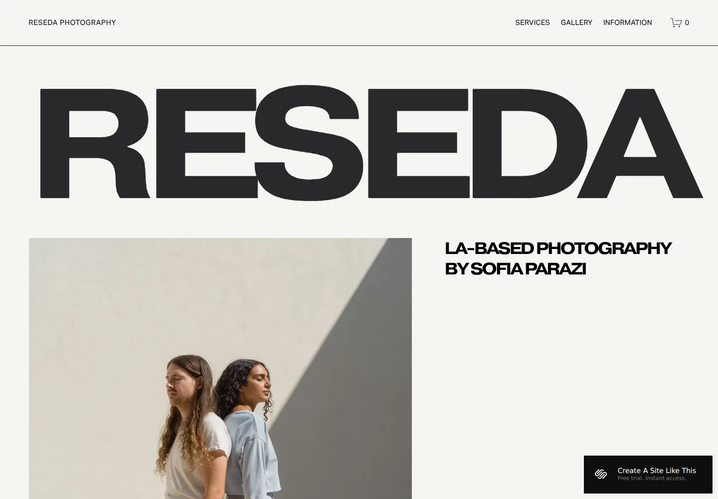
Reseda — official demo, captured October 18, 2026.
Reseda gives the business name enormous presence, then arranges photographs in a more editorial composition than a standard grid. Services and gallery links remain visible in the header.
We'd choose it for a photographer with consistent art direction and a recognizable style. The layout makes a small, carefully edited set of images feel intentional. It is less useful if the portfolio relies on showing many unrelated photographs at once. Our Reseda review explores that balance between brand presence and the work.
View Reseda on Squarespace · Preview demo · Read our Reseda review
2. Beaumont — A quiet, refined portfolio
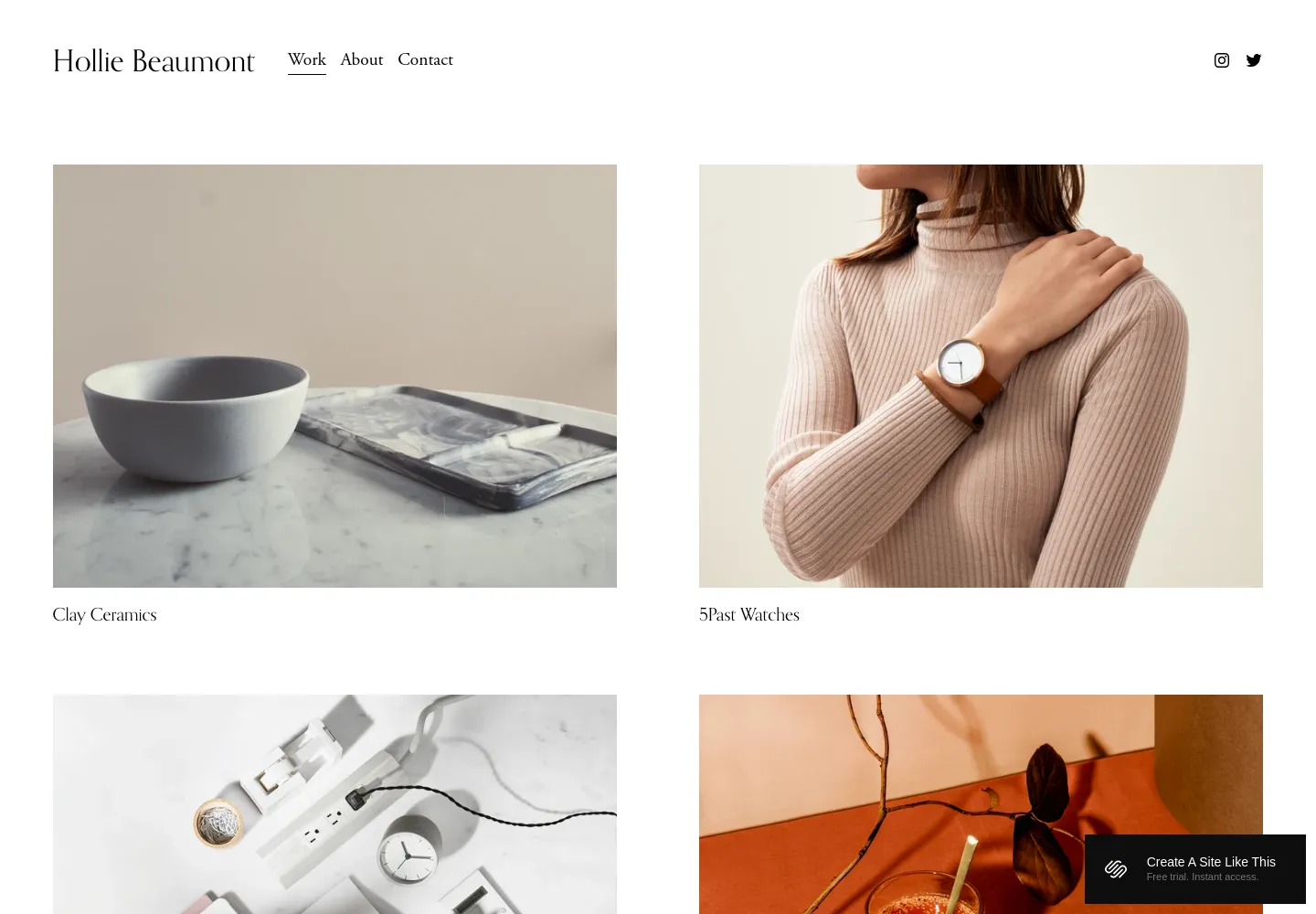
Beaumont — official demo, captured October 18, 2026.
Beaumont uses a white background, restrained headings, and an uncluttered project grid. It gives the images a calm frame without imposing a strong visual personality of its own.
That can suit a photographer whose style should carry the page. We'd choose it for a tightly edited portfolio with consistent crops and image quality. It is less personal at first glance than Ortiz, so the experience of working with you would need a clear supporting place. Reseda makes a bigger brand statement; Beaumont is more willing to step back.
View Beaumont on Squarespace · Preview demo · Read our Beaumont review
3. Novo — A portfolio organized into complete stories
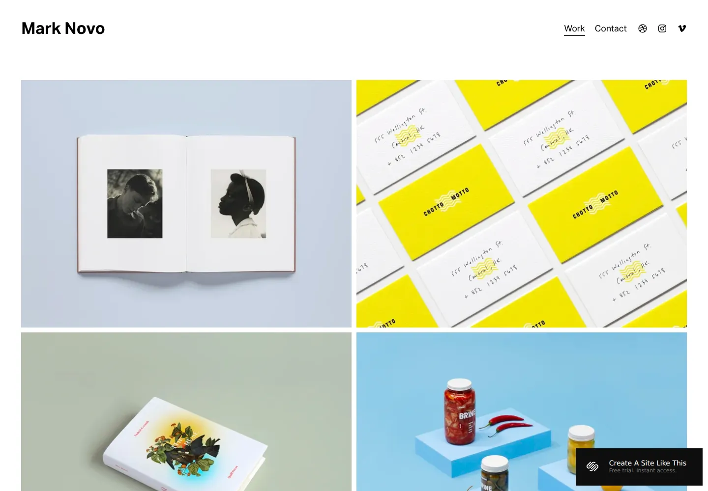
Novo — official demo, captured October 18, 2026.
Novo's project grid is useful when each thumbnail leads into a distinct body of work. The simple header lets several projects sit together without much surrounding explanation.
For wedding photography, that makes it a sensible starting point for presenting individual celebrations as stories. We'd choose it when the depth of a full gallery matters more than a few standalone favorites. It is a design-portfolio adaptation, but the project-based structure transfers naturally. The opening may need a clearer service introduction than the original creative demo provides.
View Novo on Squarespace · Preview demo · Read our Novo review
4. Ortiz — The photographer as part of the decision
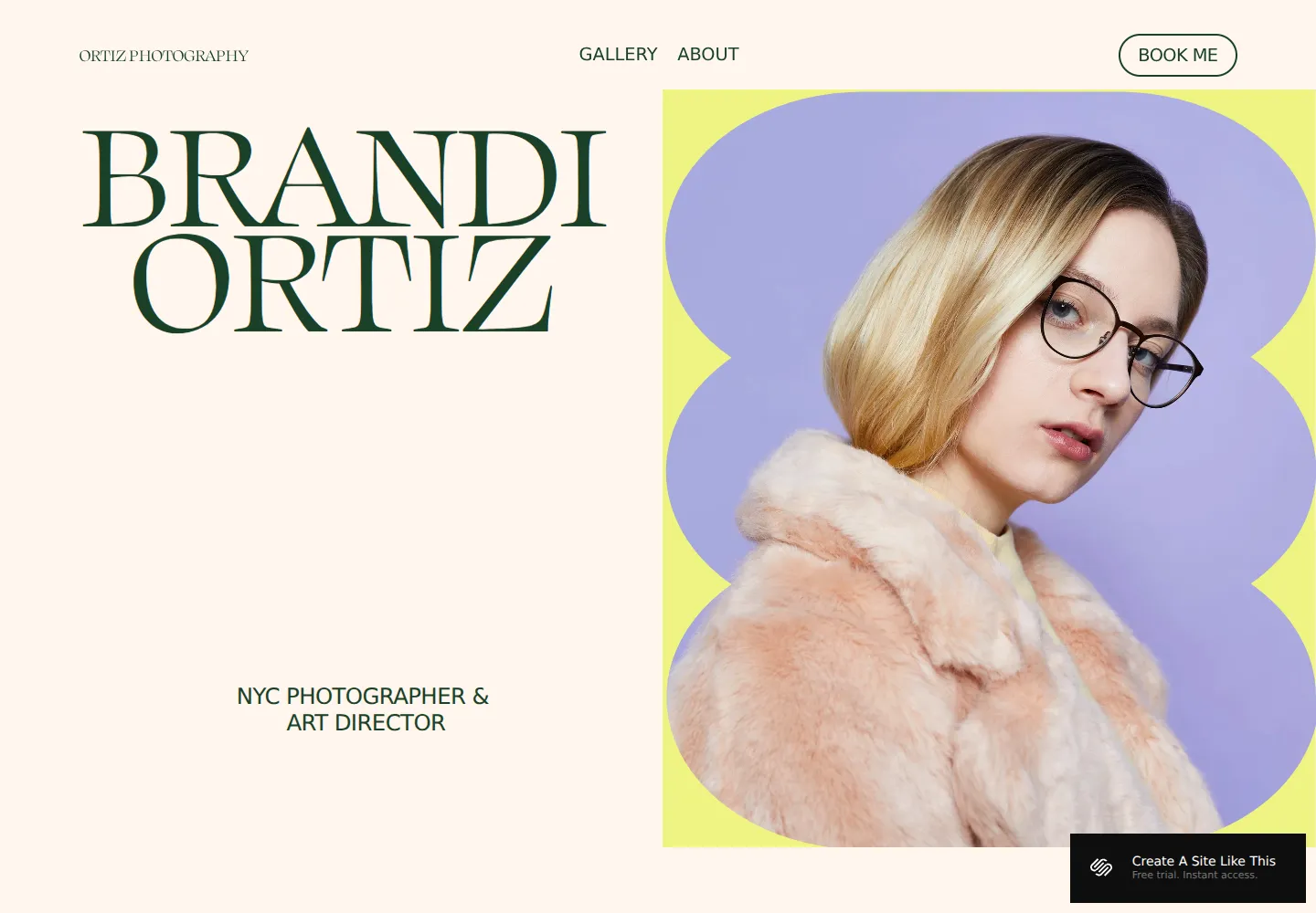
Ortiz — official demo, captured October 18, 2026.
Ortiz places a large portrait beside oversized serif lettering and a prominent booking button. The opening introduces a person with a point of view, not simply a collection of images.
That can be a strong fit for a wedding photographer whose manner and presence are part of the appeal. We'd choose it when clients are likely to care how it feels to spend the day with you. Beaumont keeps the photographer in the background; Ortiz deliberately brings them forward.
View Ortiz on Squarespace · Preview demo · Read our Ortiz review
5. Balboa — Work plus a concise professional introduction
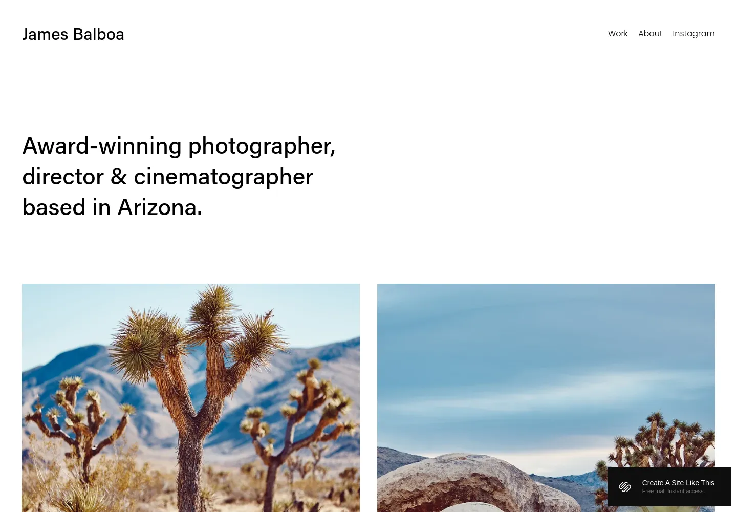
Balboa — official demo, captured October 18, 2026.
Balboa opens with a short statement about the photographer before moving into a clean image grid. It gives the professional a little context without making a portrait the centerpiece.
We'd choose it for someone who wants a portfolio-led site with a more explicit introduction than Novo. The design feels balanced and straightforward. It is less visually distinctive than Reseda, but that restraint can be useful when the photographs themselves already have a strong character. Our Balboa review takes a closer look.
View Balboa on Squarespace · Preview demo · Read our Balboa review
6. Spark — A paid photography-focused alternative
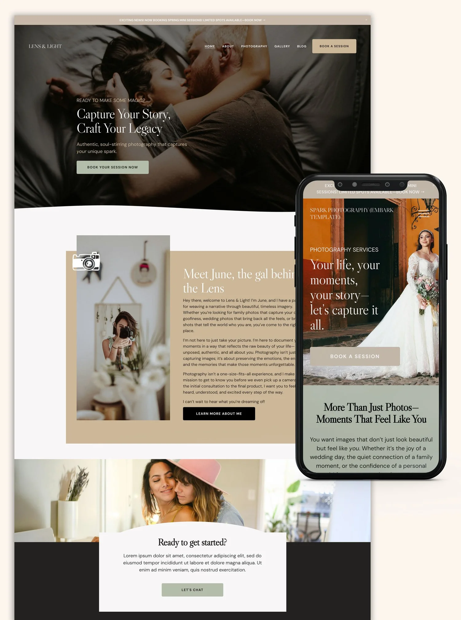
Spark — seller-provided preview, credited to The Look & The Feel.
Spark by The Look & The Feel is designed for photographers and offers a more developed visual brand presentation. We'd compare it when you want a coordinated photography website from the outset. Judge it with your own image style in mind; the demo's atmosphere is part of its appeal.
View Spark and current details · Directory listing
Our recommendation
Reseda and Beaumont are the first pair we'd compare: a stronger editorial identity or a quieter setting for the images. Novo suits complete wedding stories, Ortiz gives the photographer more presence, and Balboa sits comfortably between a portfolio and a professional introduction.
For a broader selection, see our Squarespace templates for photographers. Our portfolio template guide offers other image-led layouts, and the template directory includes independent designs to compare alongside the native options.