
Best Squarespace Templates for Podcasts and Podcasters
We may earn a commission if you buy or sign up through links on this page.
A podcast website can be the home of the show, the home of its host, or one part of a larger business. Those choices change what should appear first. A visitor looking for an episode doesn't need to work through a coaching pitch before finding something to listen to.
Paloma is our first pick for a personality-led show. Sundew gives the latest interview a stronger editorial spotlight, while Transmission has a more graphic, contemporary identity. Myhra, Meriden, and Waverly make sense when the podcast sits alongside other work.
1. Paloma — A show with a recognizable host
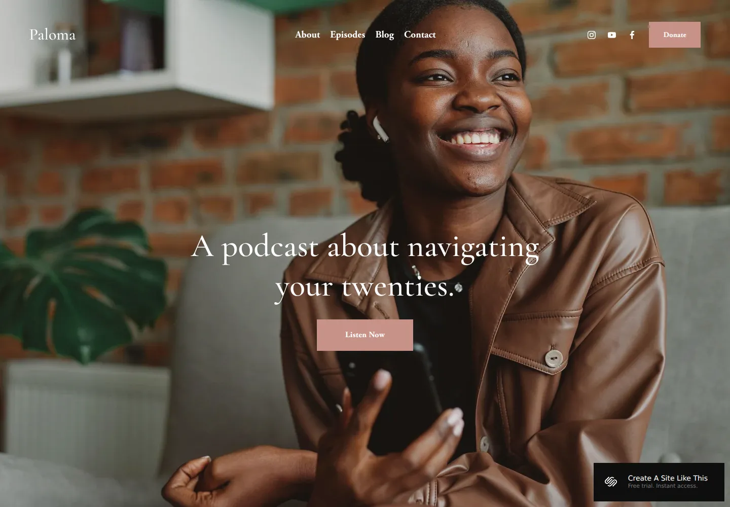
Paloma — official demo, captured October 18, 2026.
Paloma opens with a large portrait, a short explanation of the podcast, and an immediate listening invitation. The warm photograph and restrained typography make the show feel personal.
We'd choose it when the host is a meaningful part of why people listen. It gives a newcomer a clear sense of the person and subject without requiring a long introduction. It is less visually magazine-like than Sundew and less graphic than Transmission. Our Paloma review explores its show-first structure in more detail.
View Paloma on Squarespace · Preview demo · Read our Paloma review
2. Sundew — An interview show with an editorial rhythm
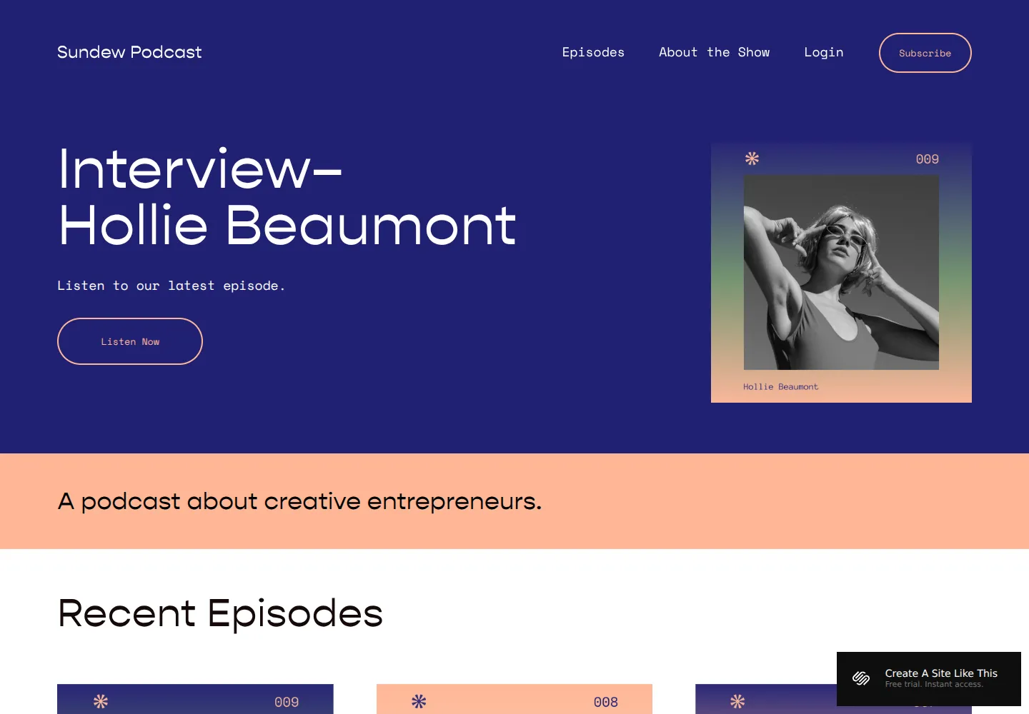
Sundew — official demo, captured October 18, 2026.
Sundew uses a strong blue opening, a prominent interview headline, and a small framed guest image. Recent episodes appear directly below, making the latest story and the wider archive feel connected.
That is a good match for a show where the individual guest or topic should lead. We'd choose it over Paloma when the content is more important than one large host portrait. The visual identity is more assertive, so your episode imagery and titles need enough consistency to support the presentation.
View Sundew on Squarespace · Preview demo · Read our Sundew review
3. Transmission — A graphic, contemporary audio brand
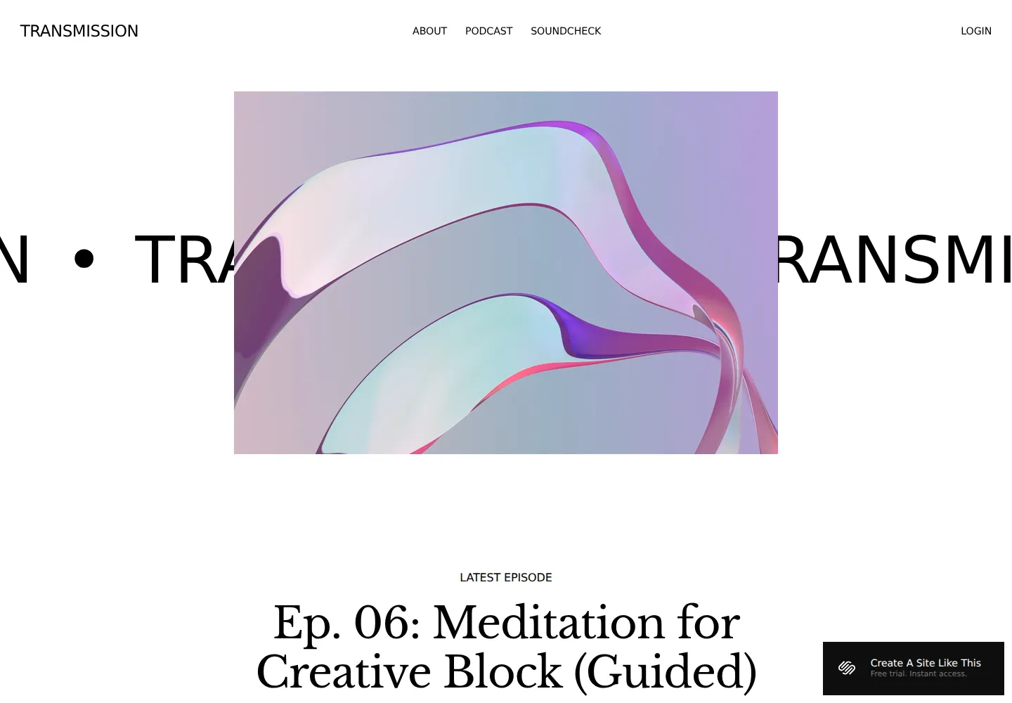
Transmission — official demo, captured October 18, 2026.
Transmission opens with a large abstract image and oversized lettering, followed by a latest-episode section. The white background and graphic composition give it a more design-conscious identity than the warmer Paloma demo.
We'd shortlist it for a show with a distinctive visual system or a subject that suits a less personal introduction. It is especially interesting when the podcast should feel like a publication or creative project. A host-led conversational show may find Paloma a more natural fit.
View Transmission on Squarespace · Preview demo · Read our Transmission review
4. Myhra — A podcast inside a broader practice
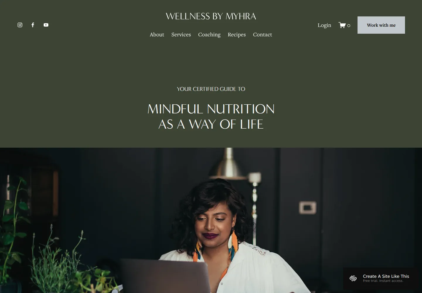
Myhra — official demo, captured October 18, 2026.
Myhra's wellness presentation gives services and educational content a calm setting. The centered opening and dark green palette create a reflective tone rather than a newsy one.
We'd adapt it when the podcast supports a coaching or educational practice. It is less direct as a standalone show website because episodes aren't the original organizing idea. The reason to choose Myhra is that wider business context. If the show itself is what people are coming for, start with Paloma, Sundew, or Transmission instead.
View Myhra on Squarespace · Preview demo · Read our Myhra review
5. Meriden — A host with several offers
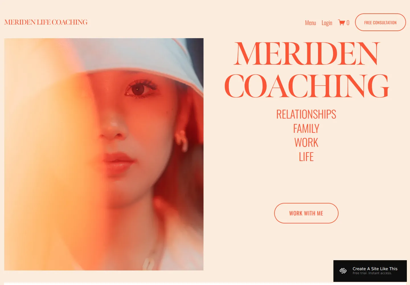
Meriden — official demo, captured October 18, 2026.
Meriden's portrait-led coaching demo makes the person and their different areas of work visible. That can suit a host whose podcast sits alongside speaking, programs, or a personal practice.
We'd choose it when the website needs to introduce the whole business rather than just the feed. It would need an intentional place for episodes, but the personal-brand structure is already close. Myhra is quieter and more content-oriented; Meriden gives the host a more expressive visual presence.
View Meriden on Squarespace · Preview demo · Read our Meriden review
6. Waverly — A compact personal home for a creator
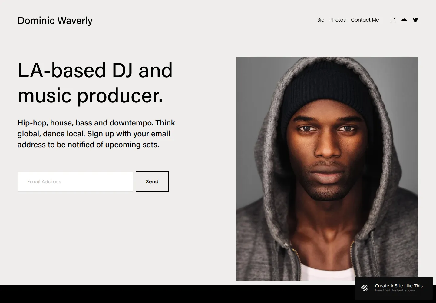
Waverly — official demo, captured October 18, 2026.
Waverly pairs a short introduction and email signup with a large portrait. Its musician demo is sparse and direct, without a long service-business opening.
We'd consider it for a creator whose podcast is one part of a broader public identity. It is not our first recommendation for an extensive episode archive, but it can make a good personal home linking out to the show. The value is its compactness and clear personal introduction.
View Waverly on Squarespace · Preview demo · Read our Waverly review
Show first or host first?
Start with Paloma for a host-led podcast, Sundew for an interview-led publication, or Transmission for a stronger graphic brand. The remaining options belong to a different decision: how to place a podcast inside the host's wider work.
Our blog template guide is useful if written show notes and articles will be substantial. You can explore other designs in the template directory or describe the show to our template finder.