
Best Squarespace Templates for Personal Trainers
We may earn a commission if you buy or sign up through links on this page.
A trainer's website can feel like an introduction to a person or an invitation into a whole training environment. Those are different impressions, and the template you choose sets that expectation before anyone reads your packages.
Cole is our first pick for an independent personal trainer. Lakshi feels more conversational and personal, while Klipsan is better suited to a trainer with a facility to show. We've also included alternatives for nutrition-led coaching and a more editorial fitness brand.
These recommendations focus on presentation: how prominently the trainer appears, how the page introduces the offer, and how well the design supports the content you already have.
1. Cole — A strong first choice for independent trainers
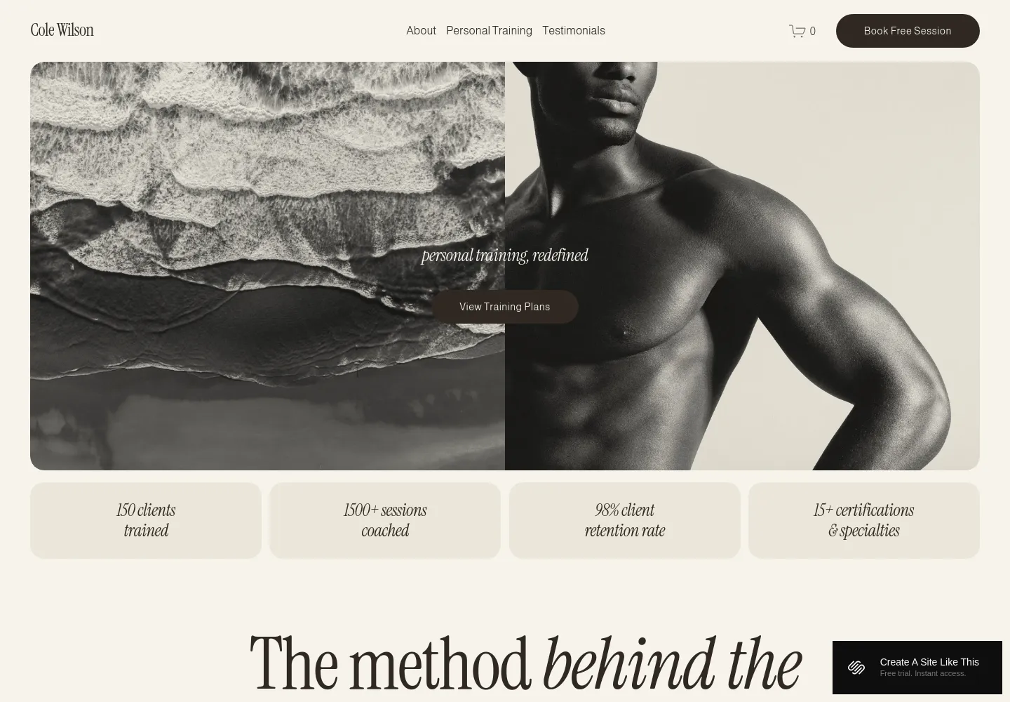
Cole — official demo, captured October 18, 2026.
Cole opens with a large training photograph, understated navigation, and a booking button. The narrow strip of figures beneath the opening image gives way to an explanation of the trainer's method. That sequence makes sense for someone selling their own expertise: first an impression, then a reason to believe it.
The warm neutral colors and serif headings soften what could otherwise be an aggressive fitness design. We'd choose it for strength coaching or personal training that wants to feel considered and individual. Its opening image does a lot of work, so a good photograph of you training matters here.
View Cole on Squarespace · Preview demo · Read our Cole review
2. Lakshi — A trainer who also offers nutrition support
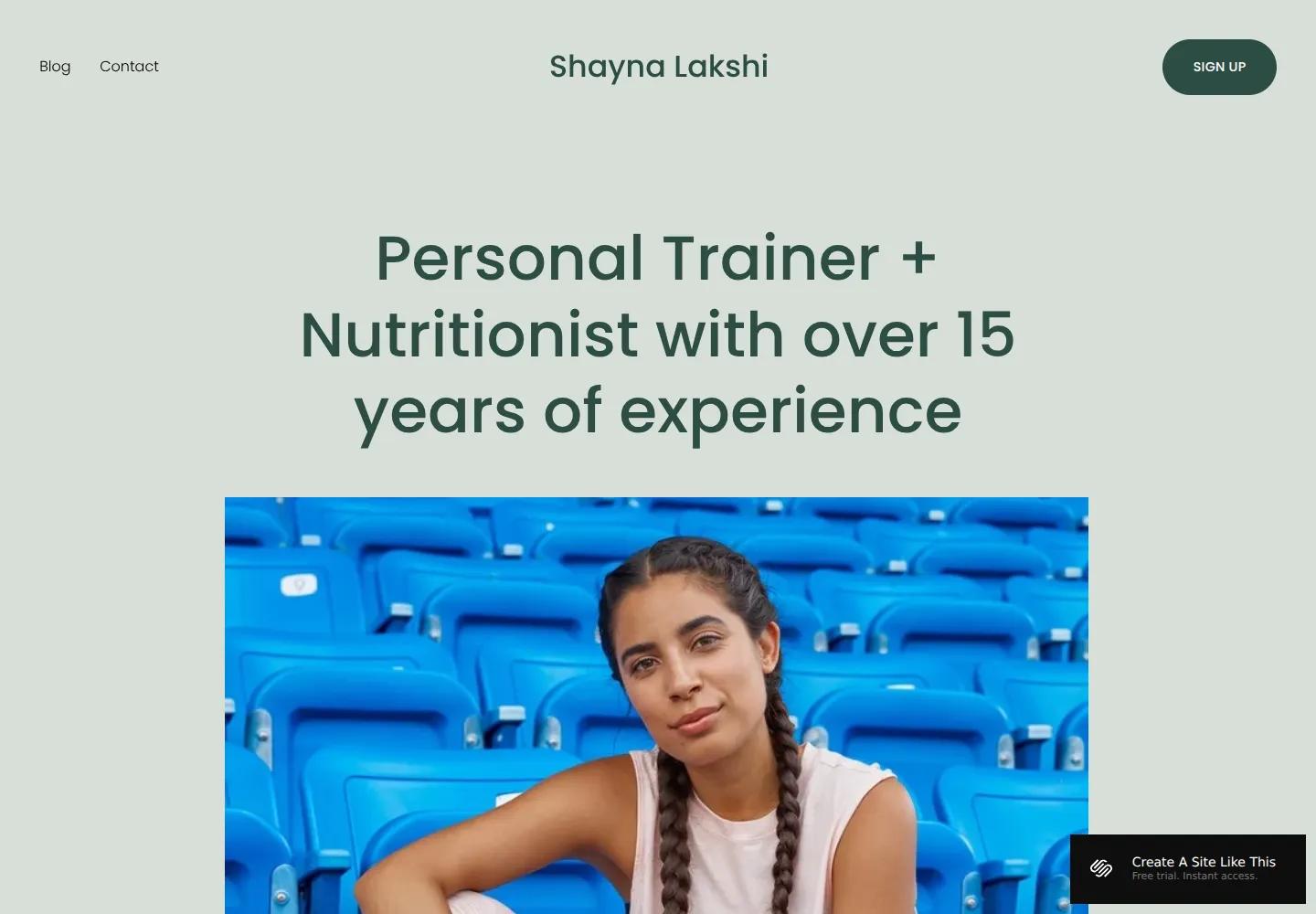
Lakshi — official demo, captured October 18, 2026.
Lakshi introduces the professional by name, states the training-and-nutrition focus in a large headline, and follows it with a portrait. It feels more like meeting someone than entering a gym. The pale green background and rounded lettering reinforce that approachable tone.
This is a closer fit than a facility template for a coach whose clients are buying an ongoing relationship. Compared with Cole, the opening depends more on your positioning and personality than on an athletic action shot. We'd shortlist it for someone whose offer combines exercise, habits, and nutrition education.
View Lakshi on Squarespace · Preview demo · Read our Lakshi review
3. Klipsan — Training attached to a physical gym
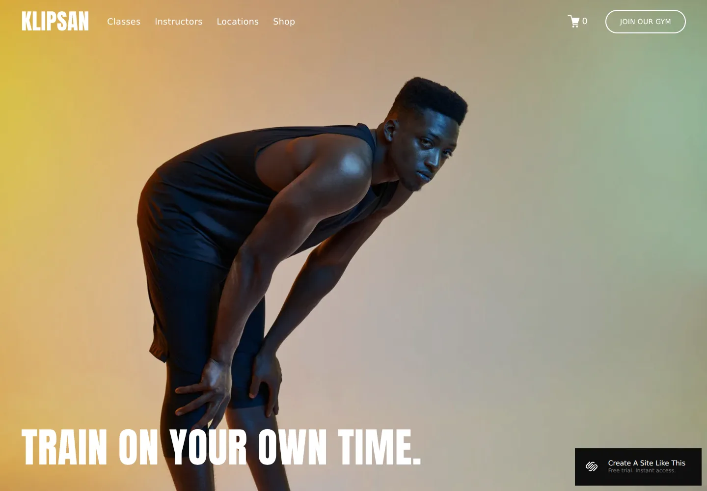
Klipsan — official demo, captured October 18, 2026.
Klipsan's oversized workout photograph and condensed display lettering feel energetic from the first screen. Classes, instructors, and locations are visible in the navigation, so the business reads as a place with multiple things happening rather than a single coach's practice.
That's useful when the room, equipment, and community are part of what clients buy. For an online-only trainer, it creates more of a facility impression than you need. If you're comparing several gym-oriented designs, our broader Squarespace template collection is another place to explore the available styles.
View Klipsan on Squarespace · Preview demo · Read our Klipsan review
4. Myhra — Coaching supported by useful content
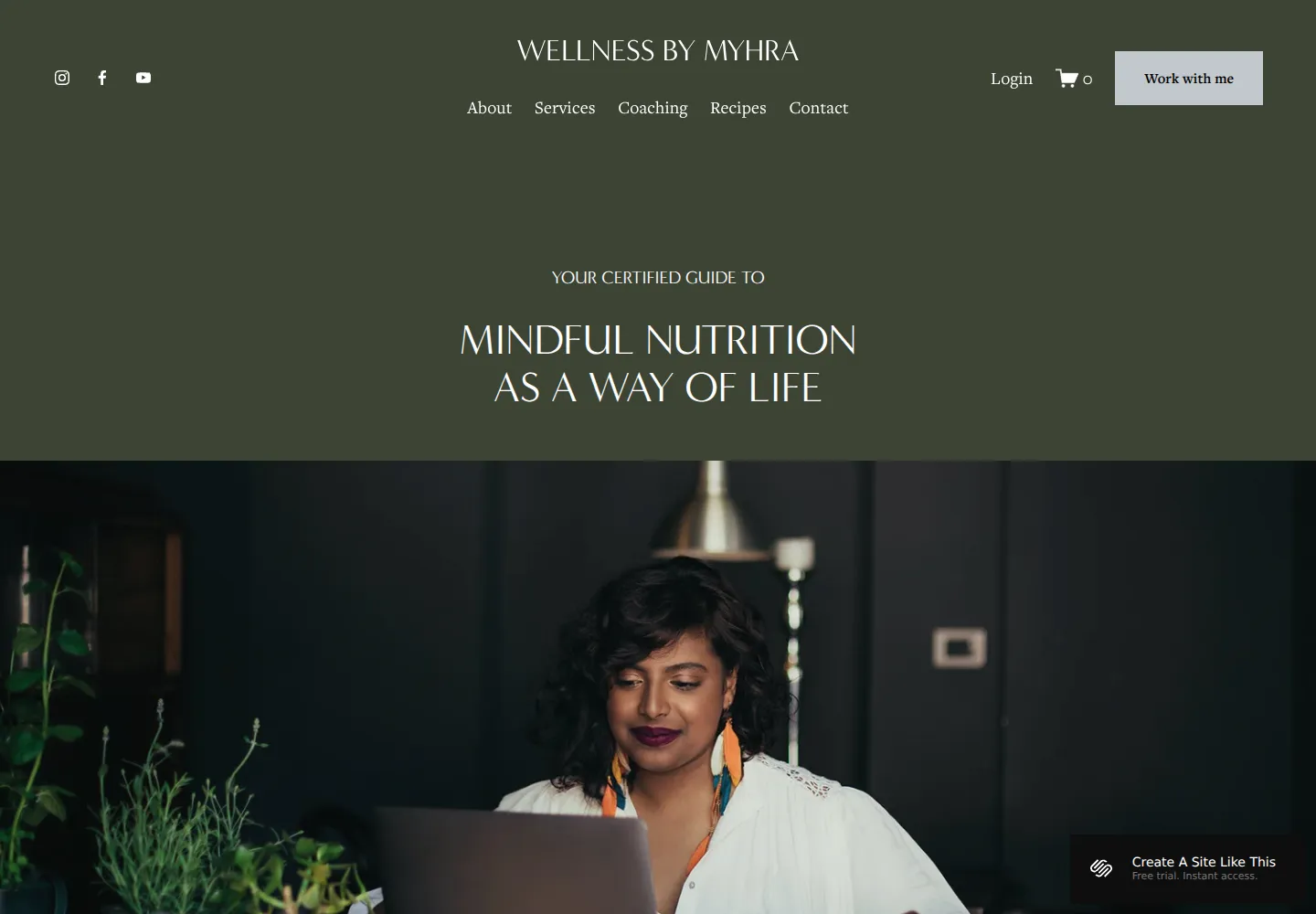
Myhra — official demo, captured October 18, 2026.
Myhra takes a quieter approach. Its dark green opening, centered headline, and large portrait introduce a wellness professional, with services, coaching, and recipes in the navigation. There is a natural place for educational material alongside the offer.
We'd choose this for a trainer who publishes regularly or whose work extends beyond workouts. The tradeoff is that it needs a clear training identity: without it, the demo's nutrition emphasis can dominate. Lakshi is the more direct personal introduction; Myhra gives a broader practice more room.
View Myhra on Squarespace · Preview demo · Read our Myhra review
5. Clean Freak — A paid option with an editorial feel

Clean Freak — seller-provided preview, credited to 23&9 Creative.
Clean Freak by 23&9 Creative is worth comparing when the visual direction of the native fitness demos feels too familiar. The seller includes service-oriented page designs and editing guidance. We'd consider it for a trainer building a broader personal brand; it isn't a fitness-specific system.
View Clean Freak and current details · Directory listing
Which would we choose?
For a trainer starting with one clear service, we'd open Cole and Lakshi side by side. Cole sells the training identity more visually; Lakshi introduces the person more explicitly. Klipsan enters the shortlist when you have a gym, instructors, or a location to promote. Myhra makes sense when your writing and educational material are part of why clients follow you.
The useful test is whether your own content fits the opening naturally. If the whole first screen needs explaining away, a different starting layout will probably save you time. Our guide to choosing a Squarespace template goes further into that decision.