
Best Squarespace Templates for Medspas
We may earn a commission if you buy or sign up through links on this page.
Medspa websites often sit between two visual languages: the reassurance of a professional practice and the atmosphere of a beauty brand. The right starting point depends on which side of that balance fits your business. A decorative wellness page and a stark clinical page create very different expectations.
Clune is our first native pick for a medspa. Florence offers a warmer, local-spa presentation, while Clove puts the people behind the practice further forward. We've also included a product-led option and a paid practice-oriented alternative.
1. Clune — A clean, treatment-led first impression
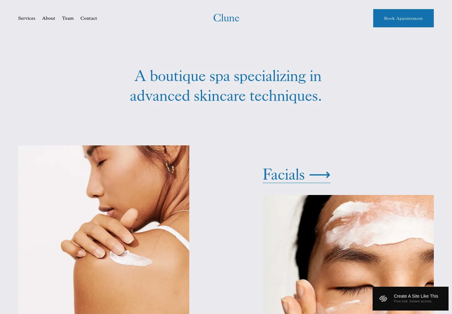
Clune — official demo, captured October 18, 2026.
Clune introduces a boutique skincare spa with a short centered statement, a collage of close-up treatment images, and a visible appointment button. Blue type on a pale background creates a precise, restrained impression.
We'd choose it for a medspa that wants treatments to be visible without turning the homepage into a dense menu. The composition has enough visual polish to feel considered, but doesn't depend on elaborate graphics. Of the native options here, it is the closest starting point for a skincare-led practice. Our Clune review looks at that presentation in more detail.
View Clune on Squarespace · Preview demo · Read our Clune review
2. Florence — A warmer, more approachable spa
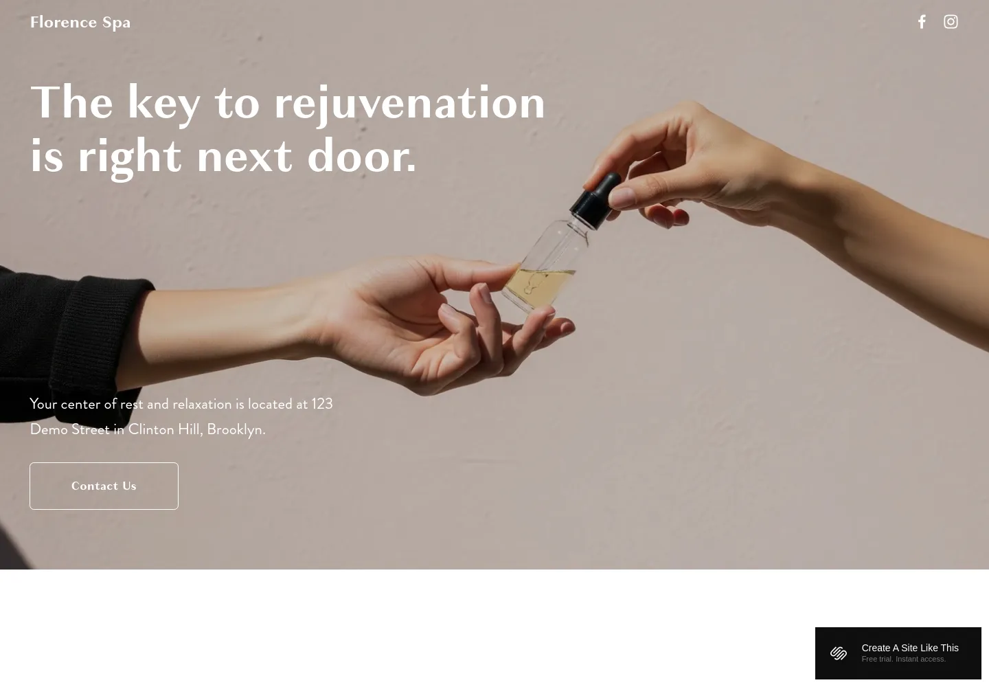
Florence — official demo, captured October 18, 2026.
Florence uses a large treatment photograph and a friendly opening line to make the business feel local and accessible. Its softer palette and broad image area introduce an experience rather than a clinical catalog.
That can suit a medspa whose brand emphasizes hospitality and personal attention. We'd choose Clune if the treatment structure should lead, and Florence if the atmosphere is the main distinction. The first photograph matters: the design will inherit much of its tone from the image you place there.
View Florence on Squarespace · Preview demo · Read our Florence review
3. Clove — A practice where the team matters

Clove — official demo, captured October 18, 2026.
Clove's demo introduces a mental-health collective through a photograph of professionals in conversation. Team and services are prominent in the navigation, and the opening feels people-oriented rather than product-oriented.
For a medspa, this is an adaptation worth considering when the professionals and their approach should be central. It is less suitable if you want a strongly beauty-led brand from the first screen. We'd choose it for the way it introduces a practice, rather than trying to preserve the therapy subject matter.
View Clove on Squarespace · Preview demo · Read our Clove review
4. Looped — A beauty brand with a substantial retail identity
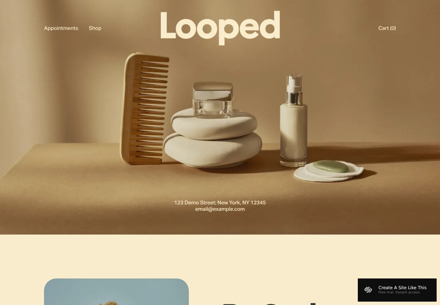
Looped — official demo, captured October 18, 2026.
Looped's warm still-life opening and large wordmark give products a prominent role. The sparse navigation places appointments and the shop close together. It feels like a visual brand with services attached, rather than a treatment center first.
That makes it an alternative for a business where skincare products are a recognizable part of the identity. It would be a less natural choice if visitors primarily need to compare treatments or meet practitioners. The reason to pick Looped is that product-minded visual direction, not simply the fact that it can include a shop.
View Looped on Squarespace · Preview demo · Read our Looped review
5. Kintsugi — A fuller professional-practice design

Kintsugi — archived catalog screenshot; compare the seller’s current demo before purchase.
Kintsugi by Studio Mesa is a paid therapy-practice template with a calm arrangement for services and people. We'd consider it for a medspa wanting a more practice-oriented website. Its appeal is the coherent page design; the original therapy framing would need a different identity and content.
View Kintsugi and current details · Directory listing
Where we'd start
Clune has the strongest direct fit. Florence is the warmer alternative, Clove gives the team more importance, and Looped suits a business whose products deserve substantial visibility. Kintsugi belongs in the comparison when a fuller practice website is worth buying.
The premium template guide offers more independent shops to explore. For other ways to introduce a professional team, see our practitioner template guide or browse the template directory.