
Best Squarespace Templates for Graphic Designers
We may earn a commission if you buy or sign up through links on this page.
A portfolio layout changes how the work is read. A dense grid suggests range. A sequence of large projects slows someone down. A text-led index assumes the project names and your reputation can do some of the work before a thumbnail appears.
Novo is our first choice for a designer with a varied visual portfolio. Cami is better when a personal introduction belongs near the top, while Hawley offers a more minimal index. Otto and two paid alternatives give you other ways to balance the work and the designer behind it.
1. Novo — A portfolio with visual range
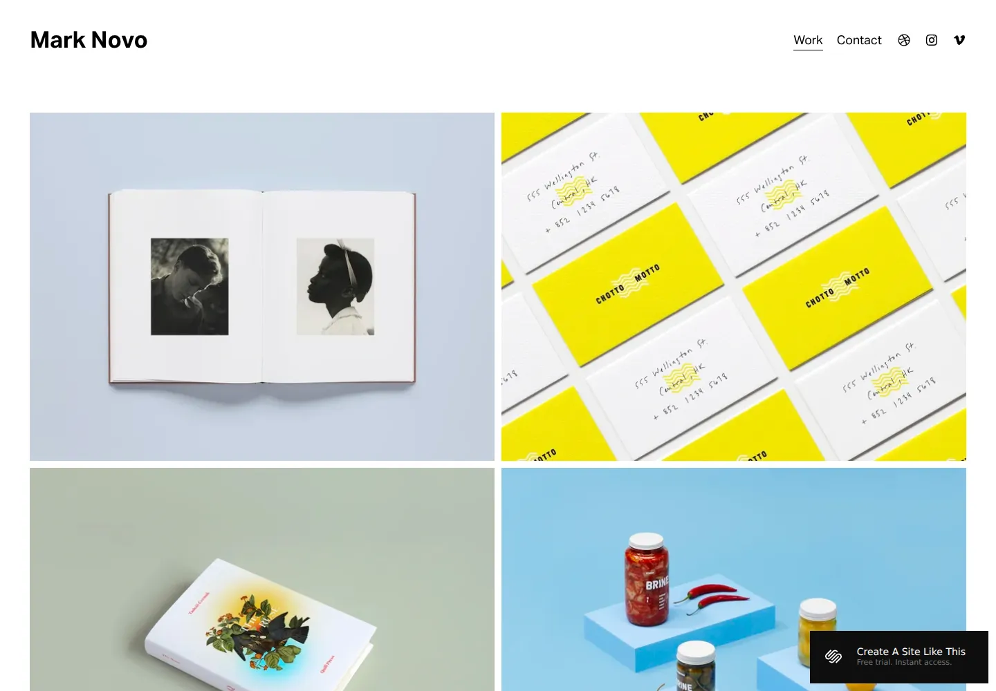
Novo — official demo, captured October 18, 2026.
Novo's opening grid puts several projects in view almost immediately. The simple header and restrained labels leave plenty of room for different colors, formats, and visual identities to sit together.
We'd choose it for branding, packaging, or multidisciplinary design work where the range itself is persuasive. The tradeoff is that individual thumbnails need to work hard. A portfolio dominated by subtle typography or small details may benefit from larger project introductions. Our Novo review explores the layout's project-first character.
View Novo on Squarespace · Preview demo · Read our Novo review
2. Cami — A designer with a clear personal position
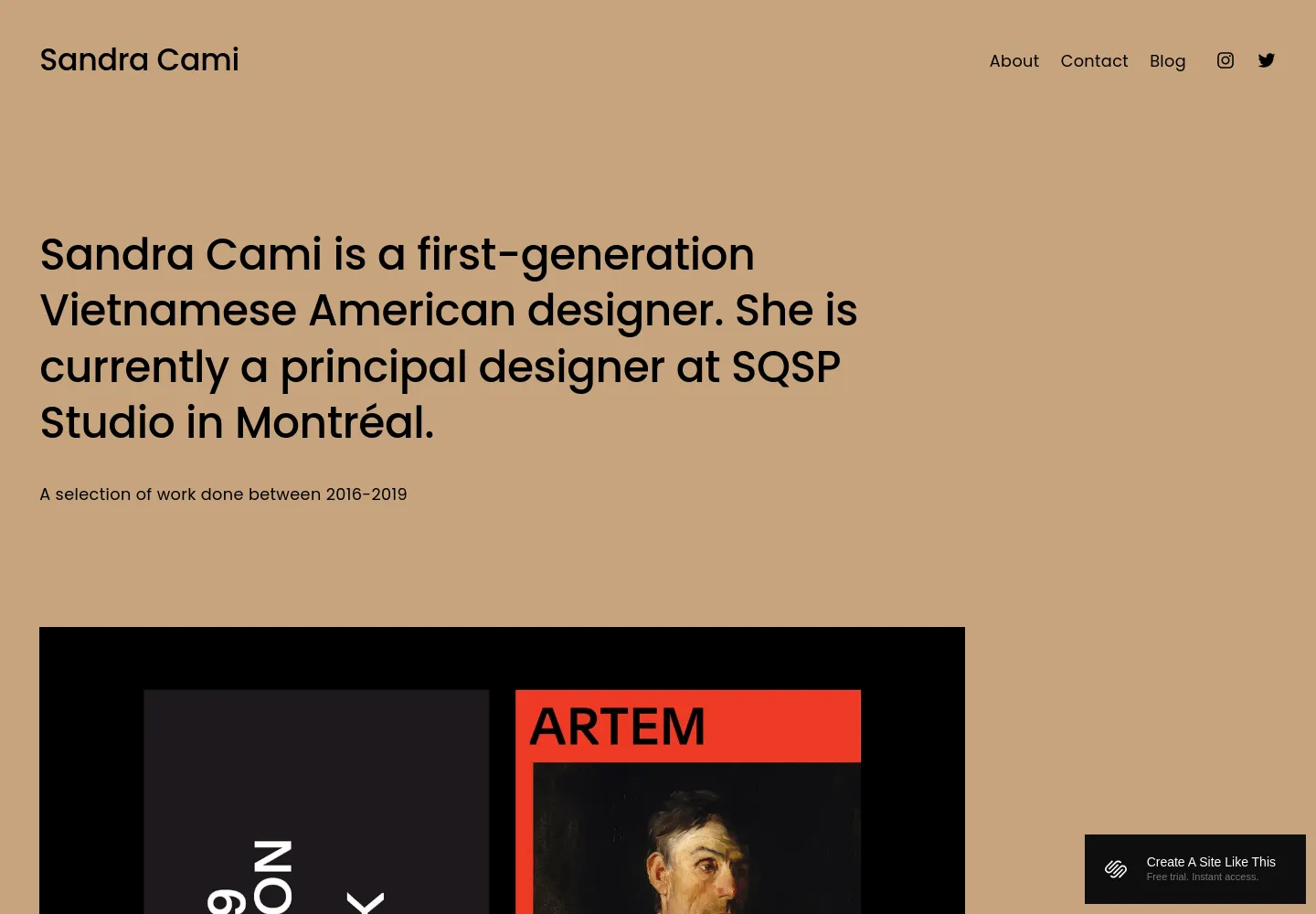
Cami — official demo, captured October 18, 2026.
Cami starts with a substantial introduction to the designer, then moves into large project images. The warm background makes the page feel less like a neutral gallery and more like a particular person's studio.
That is useful when the way you think is part of what clients hire. We'd choose it for an independent designer or small practice with a few strong projects and something specific to say. Novo is faster to browse; Cami gives the visitor a little more context before the work starts speaking.
View Cami on Squarespace · Preview demo · Read our Cami review
3. Hawley — A deliberately minimal project index
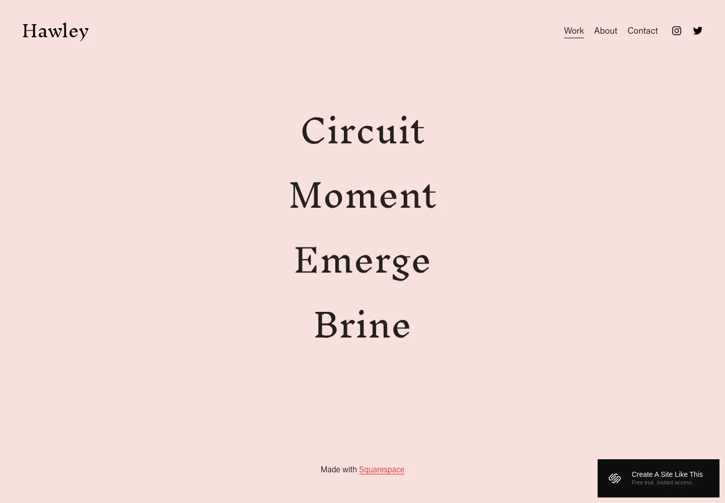
Hawley — official demo, captured October 18, 2026.
Hawley's opening is a short, centered list of project names on a pale background. It is striking because it removes the usual wall of thumbnails. The portfolio begins with typography and curiosity rather than an immediate survey of the work.
We'd consider it for a designer comfortable with that restraint. It may feel less helpful for a prospective client who wants to assess visual fit in seconds. The strongest reason to choose Hawley is that intentional browsing experience, not a belief that minimalism automatically makes the work look better.
View Hawley on Squarespace · Preview demo · Read our Hawley review
4. Otto — The designer as well as the portfolio
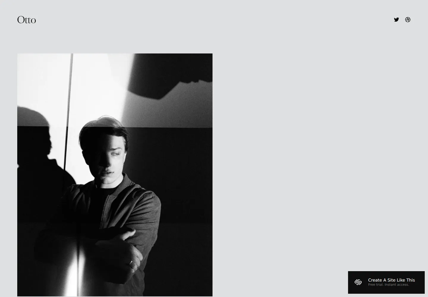
Otto — official demo, captured October 18, 2026.
Otto's opening gives a portrait a prominent place within an otherwise quiet, spacious design. The result feels more personal than Novo's grid and less verbally explanatory than Cami's opening statement.
We'd use it when the designer's identity should be visible but the website still needs room to breathe. It can suit an independent practice with a mixture of commissioned projects and experiments. A larger agency may want a clearer organizational introduction; Otto feels like a person's creative home.
View Otto on Squarespace · Preview demo · Read our Otto review
5. Opponent — A louder studio identity
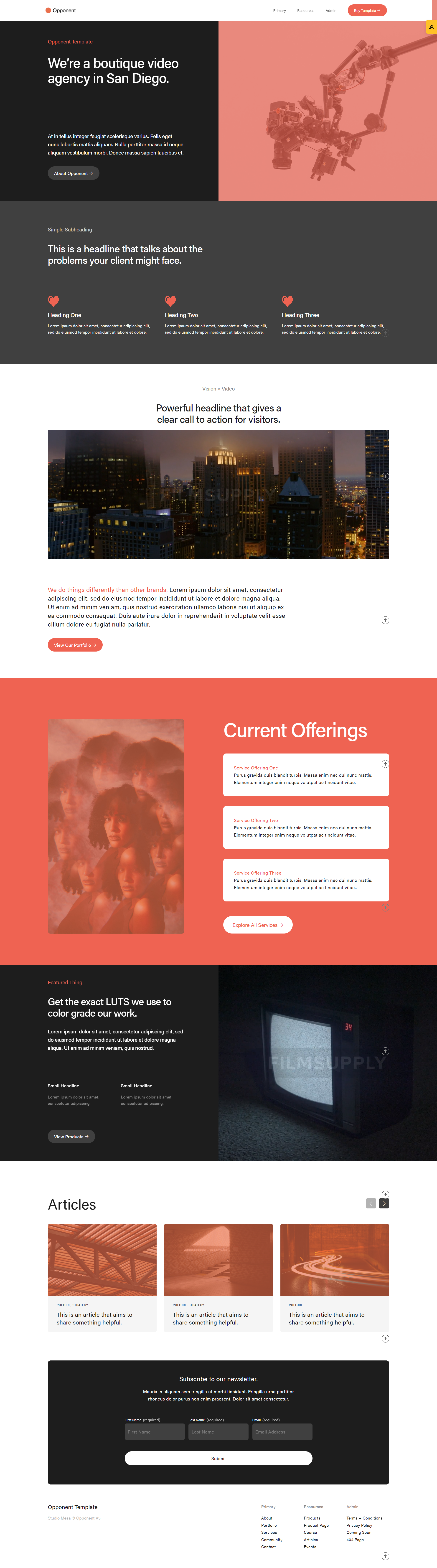
Opponent — archived catalog screenshot; compare the seller’s current demo before purchase.
Opponent by Studio Mesa is worth comparing for a design studio that wants strong typography and a portfolio-led site. Its fuller page set is more relevant when the business needs services and studio information alongside the work. We'd avoid choosing it solely to make a small portfolio feel larger.
View Opponent and current details · Directory listing
6. Spark — A photography-led paid alternative
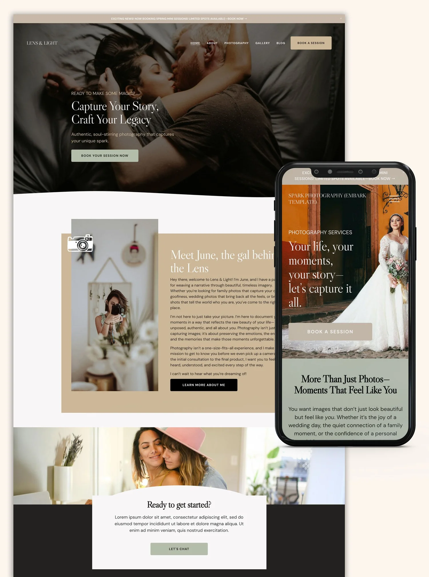
Spark — seller-provided preview, credited to The Look & The Feel.
Spark by The Look & The Feel is aimed at photographers, so this is an adaptation for designers whose work is presented through strong imagery. We'd consider it when art direction and photography carry the portfolio. For text-heavy case studies, Nolan or Cami may be a more natural starting point.
View Spark and current details · Directory listing
How much should the page explain?
Novo makes the fastest visual introduction. Cami gives the designer's point of view more room. Hawley asks the visitor to explore, and Otto places a person inside the portfolio. Those are meaningful differences even though each template can ultimately support the same business.
See our portfolio template guide for a broader selection, or explore templates for artists if your practice sits between commissioned design and personal work. The template directory includes more independent designs to compare.