
[Tutorial] How to Make Your Squarespace Header Fixed or "Sticky"

Have you ever noticed that there are two types of websites in the world?
One type keeps its navigation bar at the top of the page so that when you scroll down, it disappears.
If you want to click on their logo, navigate with their menu, or otherwise interact with the navigation, you have to scroll back up. They might use a "back to top" button somewhere on the screen to make it easier, or they might not.
There are a couple of benefits to this style of the website.
First and foremost, it opens up more screen real estate for the rest of the website. Most PCs are widescreen these days, which means there's plenty of space horizontally (that many sites don't take advantage of) and not as much space vertically. Every stretch of pixels is added space that can make a site more attractive above the fold.
Also, it's easier. A static navigation bar is the default behavior for a website, and you have to implement custom code to get the navigation bar to stay at the top of the screen while a user scrolls down.
The other type of site, obviously enough, makes their navigation bar "sticky" and pins it to the top of the viewport. As a user scrolls down, the navigation bar detaches from the top of the website and follows the user as they scroll.
In the old days, this was accomplished using iFrames and other quirks of web design. Today, you can do it with scripts and CSS. It's a lot easier and better for users and search engines. It does, however, require implementing that custom code.
On the plus side, this form of site design gives users easy access to navigation at all times. If you have essential links up there, like a store page or a call to action for a sale or something, it's handy to have those on-screen at all times. It improves sales, time on site, page views, and user experience. The harder you make it to browse your site, the worse your site will perform.
On the other hand, these can cut into the screen real estate available for the rest of your content, especially if they are too large.
These larger navigation bars are why designers tend to collapse them into something smaller when a user scrolls; the links are there, but they don't take as much space.
If you've found this page, I'm assuming that you've decided the second method is the one for you.
You want to keep your navigation bar visible at all times; you want it stuck to the top of the viewport no matter where the user is on the page, and you want to implement this custom code.
Here's how!
Squarespace 7.0 Code Injection
Those of you using Squarespace 7.1 are probably laughing right about now, and that's fine. I'll get to you in a moment. First, though, let's talk about 7.0.

In Squarespace 7.0, there are a host of different template families. Each of these template families works differently and uniquely. The different versions make giving instructions for any particular website tricky because you have to know which template family you're using, find specific instructions for that template, and implement them.
I'm going to give you two options here. The first is a simple copy-and-paste set of code. This code only works for the Brine template family, so if you're using something other than Brine (or using Brine that has been customized with different page classes), it won't work.
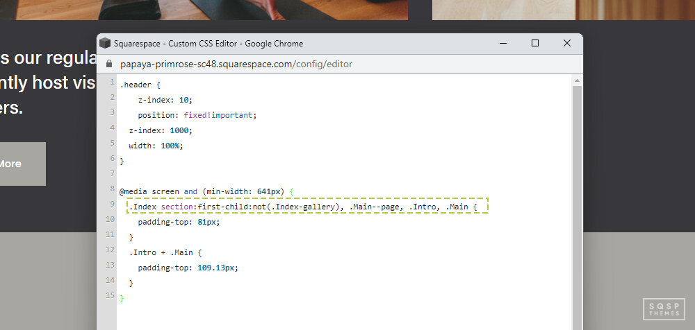
That code is this:
.Header {
  position: fixed!important;
  z-index: 1000;
  width: 100%;
}
@media screen and (min-width: 641px) {
  .Index section:first-child:not(.Index-gallery), .Main--page, .Intro, .Main {
    padding-top: 81px;
  }
  .Intro + .Main {
    padding-top: 0px;
  }
}
Copy this code as-is, from ".Header" to the final"}." Then, log into your Squarespace dashboard. On your dashboard, click on the Home menu, and then click on Design.

There should be an option called Custom CSS; click that top open the CSS editor window.
Simply paste in the code in that window, save it, and your site should now have a fixed, floating banner for navigation at the top.
Note that you want to paste this in at the top if you have any other custom CSS. If you have any code that edits the navigation bar specifically, they might conflict, so you may need to talk directly to a developer to figure out how to reconcile the two.
Now, what is this code, and what does it do? I'm going to give you a rundown of how it was composed so that you can replicate it on other template families.
Here's an annotated version of the code:
.Header {
  /*This is the class your header is contained in.*/
  position: fixed !important;
  /*This code sets the "fixed" attribute, forcing the header to stay at the top, and flags it as important so other directives do not overwrite it./*
  z-index: 1000;
  /*This ensures that the floating header is on top of all other page elements with a lower z-index value.*/
  width: 100%;
  /*This ensures that the header takes up the full width of the screen.*/}
/*The following code adds extra padding to the header so it isn’t cut off, and then removes that extra padding from non-header elements that share the same class.*/
@media screen and (min-width: 641px) {
  .Index section:first-child:not(.Index-gallery), .Main--page, .Intro, .Main  {
  /*This additional code applies the header tweaks to pages other than your main homepage.*/
    padding-top: 81px;
  }
  .Intro + .Main {
    padding-top: 0px;
  }
}
Don't worry if that's a little confusing. Here's how you can engineer it for yourself. If you don't want to dig into code directly, feel free to skip this section.
Just copy and paste the code above, tweak the values as necessary, and call it good. If you're using a non-Brine template, you can likely find similar code for your template (search for "<Template> Fixed Header CSS"), and you should be good to go. Alternatively, contact a developer to figure it out for you.
Step 1: Determine the header class. Right-click on your site's header and click "Inspect Element," and look for the class.
It will typically be something like ".header" or ".Header". Pay attention to capitalization!

Step 2: Set the Fixed attribute. Just like above in the example, you need to set the "position: fixed !important;" attribute for the header. This code sets it as fixed but will probably make it fall behind other content.

Step 3: Set the Z-index attribute. Think of the Z index like sheets of paper. Each element of your site is a piece of paper arranged on a page. When you shuffle them around, they need to be on top of one another, or they can't slide past each other. A higher Z index means it's closer to the top. Setting a Z-index of 1000 is probably overkill, but it ensures that nothing else will be on top unless you specify an even higher Z index elsewhere. It also gives you plenty of room to layer other things later if you get deep into custom code and layering. That's outside the scope of this post, though.

Step 4: Set an appropriate width. For Brine, the default header is 100% of the screen, so we set 100% in the code above. If you want it to be a different width, set a different percentage here.
Step 5: You'll notice that the header now covers up the top X number of pixels of your content.
This spacing issue happens because the header and content start at the top of the page. Fixed headers can cause some overlap and spacing issues. You can fix this by adding padding. Go back to your inspect element and highlight your header.

You can navigate through the element inspector to see how tall it is in pixels. That's the number you set as your padding.
Note here that the padding is not added to the header; it's added to the content underneath the header to push it lower. You need to identify the class for the main content, which is the ".Index" in the example code (and Brine) above.
You'll need to identify this main page class for each type of page (Page, Blog post, About, etc.) and add them to the classes that get the padding. That's what the ".Main--page", ".Intro", and ".Main" sections are all about. Other templates may have different classes for their page styles. Again, you can find these by inspecting your page elements.
Step 6: Fix excess padding.
You may have noticed that when you added the padding to your content, it applied it to each section of content, not just to the content as a whole. To remove the excess padding, you need to add the code to the first section but not to any child sections. Luckily, this is a CSS core element, not a template-specific element.
Just add "section:first-child:not" to the attribute, as shown in the example code above.
Once you have all of that set up, you're done! That wasn't too bad, was it? Okay, so it was if you're not familiar with CSS or with web development in general. So, if you want a video tutorial of it, you can check this page. That page also has another alternative that makes your header transparent, but it's vastly more complicated and requires a JavaScript injection, so I'm not going to dig into it here.
Fixed Headers in Squarespace 7.1
So, the nice thing about Squarespace 7.1 is that all of the templates run on the same code base.
The different base templates are the same code, with additional elements added and removed in modular snippets.
That's why you can change from any 7.1 templates to another without having to rebuild your site. All you're doing is adding and removing elements to match.
What this means is that, no matter what template you have on 7.1, the instructions for adding a fixed header are the same. It's even easier than all of the above because you don't need custom code.
In fact, Squarespace added the option to use a fixed header as a default settings choice you can make.
Step 1: Log into your Squarespace account. Make sure you're on the right account if you manage more than one. Once you have your site up and open, click on the Edit button in the corner.
Step 2: Edit the site header. Mouse over the top header bar of your site and click on the Edit Header button that appears.
There are many different options for editing your header here, including changing padding, spacing, and position. Feel free to tweak these as much as you like.
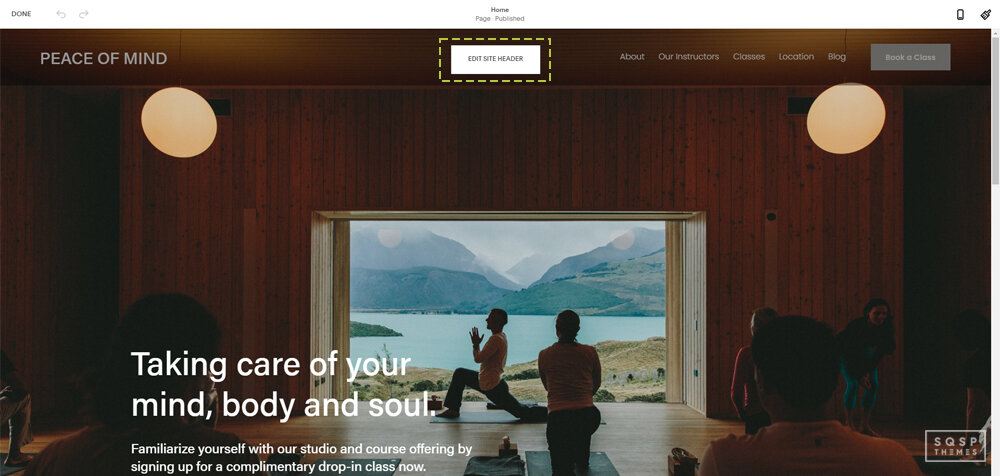
Step 3: Set the header as fixed. To do this, click on the Style tab for your header editor. A bit down the menu, you'll see "Fixed Position" as a toggle button. Toggle this to on.

Step 4: Choose a style.
There are two different options here: Basic and Scroll Back. "Basic" means that your header is fixed to the top of your page at all times. The user scrolls down, and it's there. The user scrolls up, and it's there. This is the default behavior.
Scroll Back is a little more complicated. When the user scrolls down on your page, your header will stay at the top. However, if they decide to scroll back up, the header will reappear as soon as their viewport moves up.

This is a "best of both worlds" option for some people. It gives your page content more room to breathe but makes your header more accessible if anyone wants it, without needing to scroll back to the top.
The only caveat is that there's no way of knowing how the navigation will work without the user discovering it for themselves.
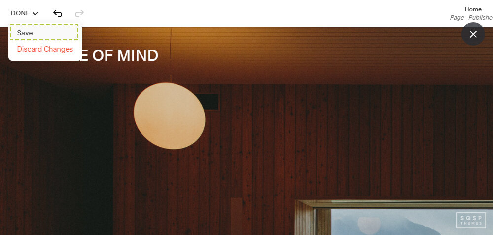
Step 5: Save and exit.
Click the Done and Save buttons in the upper corner to save your changes. Once you've saved them, you're good to go!
See, wasn't that a lot easier than 7.0's method?