Our Favorite Squarespace CSS Codes in 2025
Want complete control over your Squarespace website's look? These CSS codes are your secret weapon! What if you want a design change that Squarespace doesn't offer in its settings, and you can't find the perfect plugin? That's where the CSS Editor comes in. Squarespace gives you the power to add your own custom code. This functionality opens up endless possibilities for adding unique elements, scripts, appearance tweaks, and more!
Want to learn CSS?
If you want to learn CSS for Squarespace, check out these courses.
Want to skip CSS with an Animation plugin?
There are 2 extensions that allow you to customize and style your site without touching any of the snippets below. SquareKicker and Spark Plugin.
Disclaimer
Before we begin, I have to lay down a bit of groundwork. Using the CSS Editor is a powerful tool, but it does come with a drawback: malformed code or improperly handled code can be detrimental to your site.
While you can change many elements of your site with CSS, Squarespace says explicitly, "You should only use CSS to change fonts, colors, and backgrounds. Other CSS changes could potentially harm your site."
That said, nothing prevents you from making other changes to your site. As long as your CSS code is implemented correctly, it won't hurt your site. There are just a few caveats.
If you're using a 7.0 Template and want to change templates, you'll need to reapply custom code; it doesn't transfer over. It does on 7.1.
Squarespace will not offer support or troubleshooting for custom code. If your CSS breaks something, they won't help you fix it.
Squarespace does not consider custom code when they update their platform. So, if they change a CSS class in their design and it breaks your code, well, you have to fix it yourself.
Custom CSS has a 128,000-character limit. This should be way, way more than you'll need, but it's worth keeping in mind if you're doing a ton of CSS customizations.
Finally, keep in mind that the custom CSS editor isn't the only way to make custom code edits to your site. There are several options, which may be a better fit for your use case.
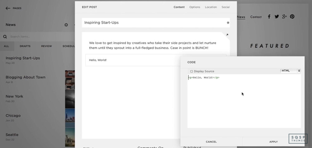
Code Block (Basic): This is a content block that can execute custom CSS, HTML, or Markdown, for a specific page. Suitable for content-level or page-level changes. Available on all plans.
Code Block (Advanced): This is the same block, but it's also capable of adding iframes (not recommended for SEO reasons) and JavaScript. It's only available on Business and Commerce plans.
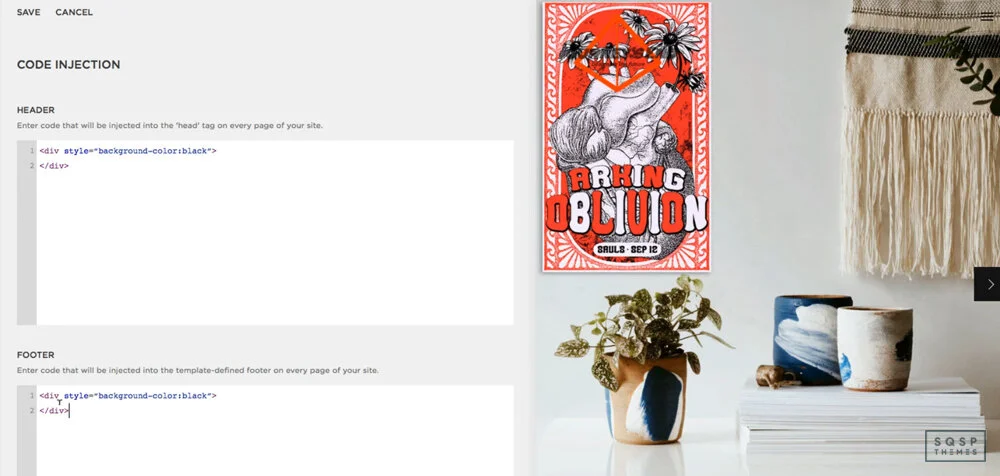
Code Injection: This option injects site-wide code, like the Facebook Tracking Pixel or a live chat service. Only available on Business and Commerce.
CSS Editor: This is the primary tool we'll be using today. Available on all plans, it allows you to add custom CSS to your site on a page level. Squarespace says not to make layout changes with it, but it's okay if you do it right. For a sleeker-looking CSS editor try Resurface.
Embed Block: This is a unique code block that executes embed code, so you can embed content from sites like Facebook, Instagram, and anything else that uses oEmbed. Available on all plans.
Squarespace Developer Platform: This tool makes significant changes to a template in 7.0 only. Only available in Business and Commerce, think of it as an advanced dev tool.
You're also wholly barred from running server-side code outside of the code injection feature, which is limited. You can't do any SQL, Ruby, PHP, or anything of the like.
Anyway, with all that said, let's dig into the cool things you can do with CSS! There's a lot, so stick around to explore.
Cool CSS Tweaks and Hacks
Sidebar Plugin
Starting with precisely what Squarespace says not to do, check out this sidebar option. It's formatted as a plugin, so you don't have to muck about with too much code directly. Instead, it changes the layout and formatting of your site to add a sidebar, which can display content like an author bio, a recent posts block, or a newsletter opt-in. It's very robust and super beneficial for marketing purposes, so check it out!
CTA Animations
Now this one is cool. Did you know that CSS – pure CSS, no other scripting involved – can make animations? There are some awesome things you can do with this. Many websites with parallax backgrounds and slide-in elements as you scroll use CSS for it, but that's not quite what I have for you here.
On a website, you've probably seen cases where an element wiggles on a timer every 30 seconds or so. A button will occasionally wobble, a call to action will bounce a bit, or a box will lightly flash. Years ago, you had to use animation with a .gif or (shudder) a Flash animation to do that. Today, you can do that with CSS.
Check out https://animate.style/. This site is a massive resource for CSS snippets for tiny little animations, like bounce, flash, pulse, swing, and wobble. There are dozens of them (two scroll bars to the right, if you can't access most of them), complete with demos and installation guides.
Now, this site is aimed at using CSS in any context, not specifically Squarespace. So you'll have to use the code injection feature to embed their core script and then use custom CSS elements to flag the elements you want animated. But it's pretty simple, so give it a try!
Simple Fade
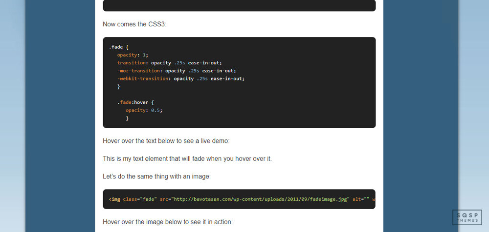
This CSS technique is a straightforward tweak, and you've probably seen something like it before. When you hover over an element, such as an image or a menu button, colors will fade in. For pictures, it can be used to highlight them, add color over them, or fade them out a bit. For menu items, it's excellent for highlighting a background color to show users which item their cursor is on. It's easy, very lightweight, and a perfect upgrade for usability.
This page has code snippets for three different use cases: fading text, highlighting images, and backgrounds for menu items. Pick your use case, copy and paste the code, and you're good to go.
Color Gradients
If you're not aware, a gradient is when two colors fade into one another by passing through the shades in between. They're great for subtle color transitions and significant variances from one side of an element to another.
In the past, if you wanted something to be a gradient, you had to do a bunch of tricky work with an image manipulator to get the colors just how you liked it. Even then, if users were browsing your site with a larger or smaller screen than you designed for, things would look off and weird.
With CSS, you can implement a gradient that works. You specify the element, you select the colors, and the code does the rest.
"Doesn't it require a lot of tedium to pick and specify colors?" Not at all! It would - if you were doing it manually, but why would you ever need to do that? This generator is an excellent tool for precisely this purpose. It lets you pick anchor colors on either end, transition colors in the middle, and specify how far along the bar you want the transition. You can even click to add more anchor points for additional colors and make a whole rainbow.
You can do both linear and radial (circular) gradients, and you can specify exact hex color codes if you have colors as part of your branding. All of the code generates dynamically below the generator, so you can copy and paste it when you have it tweaked the way you want it.
Rounded Corners
This technique is another one of those elements that are deceptively simple. You wouldn't think it would be challenging to make rounded corners around an image or text element, would you? Yet, if you've ever tried to do it without weird custom code, it's nonsense! Back in the day, you even had to do things with perfectly aligned background images, tables with lined-up elements for borders, and other nonsense.
All of that is in the past now. CSS allows you to make easy, rounded corners for anything. Want rounded corners on an image? Want a rounded box to highlight a call to action? Want your lightbox to have rounded corners? It's easy with a bit of CSS.
This technique is just one of dozens of simple CSS tweaks you can do, provided by W3Schools. W3Schools is a web design organization that provides thousands of simple tutorials on everything from HTML to advanced CSS animation. This page details the rounded corners element, and you can browse all of the other CSS tweaks through the sidebar.
Hidden Elements
Now for one, that's a little more serious.
One issue that many sites have, Squarespace included, is mobile rendering using responsive design. Specifically, the site parses all of the code on the page and loads every element, adjusting what displays based on the viewport's size (aka your browser).
Hidden elements are usually fine. Except for one thing - what happens if you have, say, a sidebar with a couple of images in it? That sidebar isn't going to load on mobile because it would be way too cramped. But, since the site loads the content before determining what displays, you're still spending time loading the images in the sidebar. These resources delay the load speeds on your site.
If you check your Google PageSpeed Insights report and you see "defer offscreen images" as an error, this is what it's referencing.
The solution to this is usually lazy loading, but there's a new CSS element called content-visibility that helps with this. It's relatively new, and it's not supported by every browser just yet, but it's hugely valuable. Lazy loading is most likely going to get more support in the next few years. This page details the element, how it works, and how to use it. Check it out!
Simple Appearance Tweaks
There are a handful of tweaks on this page that do tiny little cosmetic things that, nevertheless, dramatically change the appearance of your site. What tweaks?
Remove the underline from links, which Squarespace adds by default.
Remove hyphens (-) from the text on the mobile display when text wraps.
Remove excess space at the bottom of a Brine-based template.
Narrow the column where your blog content displays.
Limit mobile product page displays to one product per row.
These are all relatively simple, minor tweaks, but they can completely change the feel of your site to make it much more modern and sleeker. It might not seem like much, but give them a try, and you'll see how important they are.
Other Compilations of CSS Hacks
I'm only scratching the surface of what you can do with CSS here. Already, several of the links up above are pages with dozens of CSS tweaks on them, but there are way more out there, including more advanced guides.
Here are a few you can check out.
HUGE LIST OF SQUARESPACE HACKS AND TWEAKS (WITH LINKS AND EXAMPLES). This page has everything from creating a summary block to hiding tags in blog posts. They aren't all CSS, but they're all clever and valuable regardless.
“50 Design Tweaks” from Five Design Co. As it says on the tin, this page has 50 different tweaks you can add to your site. These include adding hover animations and dropping shadows to making images circular, using custom bullet point designs. Almost all of them are simple CSS, too.
“35 Code Snippets” from Paige Brunton. This article is another extensive list of CSS hacks, including adding header styles, customizing your "read more" link, and dividing your backgrounds into two segments. Many of them are niche, but if you like the design options they give you, they're great.
With all of these resources, you should be able to do pretty much anything you can envision for your site.
So what's your favorite CSS hack from this list? Do you have any that you'd like to share that aren't mentioned on this list? Are you stuck on implementing any of these on your site? Let me know!


